Product
Introducing Socket Fix for Safe, Automated Dependency Upgrades
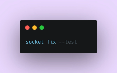
Automatically fix and test dependency updates with socket fix—a new CLI tool that turns CVE alerts into safe, automated upgrades.
react-modal
Advanced tools
The react-modal npm package is a library that provides accessible modal dialog components for React applications. It allows developers to create and manage modals in an accessible way, following the WAI-ARIA guidelines for modality. The package offers features such as locking the background scroll when a modal is open, setting the app element, and customizing styles and behaviors of the modal.
Basic Modal Usage
This code demonstrates how to create a basic modal using react-modal. It includes a button to open the modal and a button inside the modal to close it.
{"import React, { useState } from 'react';\nimport Modal from 'react-modal';\n\nconst App = () => {\n const [modalIsOpen, setModalIsOpen] = useState(false);\n\n function openModal() {\n setModalIsOpen(true);\n }\n\n function closeModal() {\n setModalIsOpen(false);\n }\n\n return (\n <div>\n <button onClick={openModal}>Open Modal</button>\n <Modal\n isOpen={modalIsOpen}\n onRequestClose={closeModal}\n contentLabel='Example Modal'\n >\n <h2>Hello</h2>\n <button onClick={closeModal}>close</button>\n <div>I am a modal</div>\n </Modal>\n </div>\n );\n};\n\nexport default App;"}Custom Styles
This code snippet shows how to apply custom styles to a modal using the 'style' prop.
{"import React from 'react';\nimport Modal from 'react-modal';\n\nconst customStyles = {\n content: {\n top: '50%',\n left: '50%',\n right: 'auto',\n bottom: 'auto',\n marginRight: '-50%',\n transform: 'translate(-50%, -50%)'\n }\n};\n\nconst App = () => {\n return (\n <Modal\n isOpen={true}\n style={customStyles}\n contentLabel='Example Modal'\n >\n <h2>Hello</h2>\n <button>close</button>\n <div>I am a modal with custom styles</div>\n </Modal>\n );\n};\n\nexport default App;"}Accessibility Features
This example demonstrates how to enhance the accessibility of a modal by setting the app element and using ARIA attributes.
{"import React from 'react';\nimport Modal from 'react-modal';\n\nModal.setAppElement('#yourAppElement');\n\nconst App = () => {\n return (\n <Modal\n isOpen={true}\n aria={{\n labelledby: 'heading',\n describedby: 'full_description'\n }}\n contentLabel='Accessible Example Modal'\n >\n <h2 id='heading'>Hello</h2>\n <div id='full_description'>I am an accessible modal</div>\n <button>close</button>\n </Modal>\n );\n};\n\nexport default App;"}React Bootstrap provides a Bootstrap-based modal component. It is similar to react-modal but also includes a wide range of other Bootstrap components for use in React.
Material-UI offers a Dialog component that is similar to react-modal. It follows Material Design guidelines and integrates well with other Material-UI components.
reactstrap is another Bootstrap-based library that includes a Modal component. It is similar to react-modal but is specifically designed for use with Bootstrap 4.
Accessible modal dialog component for React.JS
A initial support for React 16 is available under the branch next.
Please, when open a new PR set the target branch next for react-modal@3.x and master for 2.x.
Note that it can be unstable.
To install the stable version you can use npm or yarn:
For a stable version:

$ npm install react-modal@next
$ yarn add react-modal@next

For previous version of React:

$ npm install react-modal@stable
$ yarn add react-modal@stable
The Modal object has one required prop:
isOpen to render its children.Example:
<Modal
  isOpen={bool}
  onAfterOpen={afterOpenFn}
  onRequestClose={requestCloseFn}
  closeTimeoutMS={n}
  style={customStyle}
  contentLabel="Modal"
>
  <h1>Modal Content</h1>
  <p>Etc.</p>
</Modal>
Use the prop
contentLabelwhich addsaria-labelto the modal if there is no label text visible on the screen, otherwise specify the element including the label text usingaria-labelledby
The app element allows you to specify the portion of your app that should be hidden (via aria-hidden) to prevent assistive technologies such as screenreaders from reading content outside of the content of your modal.
It's optional and if not specified it will try to use
document.body as your app element.
If you are doing server-side rendering, you should use this property.
It can be specified in the following ways:
Modal.setAppElement(appElement);
Modal.setAppElement('#your-app-element');
Use the property aria to pass any additional aria attributes. It accepts
an object where the keys are the names of the attributes without the prefix
aria-.
Example:
<Modal
  isOpen={modalIsOpen}
  aria={{
    labelledby: "heading",
    describedby: "full_description"
  }}>
  <h1 id="heading">H1</h1>
  <div id="full_description">
    <p>Description goes here.</p>
  </div>
</Modal>
Styles are passed as an object with 2 keys, 'overlay' and 'content' like so
{
  overlay : {
    position          : 'fixed',
    top               : 0,
    left              : 0,
    right             : 0,
    bottom            : 0,
    backgroundColor   : 'rgba(255, 255, 255, 0.75)'
  },
  content : {
    position                   : 'absolute',
    top                        : '40px',
    left                       : '40px',
    right                      : '40px',
    bottom                     : '40px',
    border                     : '1px solid #ccc',
    background                 : '#fff',
    overflow                   : 'auto',
    WebkitOverflowScrolling    : 'touch',
    borderRadius               : '4px',
    outline                    : 'none',
    padding                    : '20px'

  }
}
Styles passed to the modal are merged in with the above defaults and applied to their respective elements. At this time, media queries will need to be handled by the consumer.
If you prefer not to use inline styles or are unable to do so in your project,
you can pass className and overlayClassName props to the Modal. If you do
this then none of the default styles will apply and you will have full control
over styling via CSS.
If you want to override default content and overlay classes you can pass object
with three required properties: base, afterOpen, beforeClose.
<Modal
  ...
  className={{
    base: 'myClass',
    afterOpen: 'myClass_after-open',
    beforeClose: 'myClass_before-close'
  }}
  overlayClassName={{
    base: 'myOverlayClass',
    afterOpen: 'myOverlayClass_after-open',
    beforeClose: 'myOverlayClass_before-close'
  }}
  ...
>
You can also pass a portalClassName to change the wrapper's class (ReactModalPortal).
This doesn't affect styling as no styles are applied to this element by default.
The default styles above are available on Modal.defaultStyles. Changes to this
object will apply to all instances of the modal.
You can choose an element for the modal to be appended to, rather than using
body tag. To do this, provide a function to parentSelector prop that return
the element to be used.
function getParent() {
  return document.querySelector('#root');
}

<Modal
  ...
  parentSelector={getParent}
  ...
>
  <p>Modal Content.</p>
</Modal>
When the modal is opened a ReactModal__Body--open class is added to the body tag.
You can use this to remove scrolling on the the body while the modal is open.
/* Remove scroll on the body when react-modal is open */
.ReactModal__Body--open {
    overflow: hidden;
}
Inside an app:
import React from 'react';
import ReactDOM from 'react-dom';
import Modal from 'react-modal';

const customStyles = {
  content : {
    top                   : '50%',
    left                  : '50%',
    right                 : 'auto',
    bottom                : 'auto',
    marginRight           : '-50%',
    transform             : 'translate(-50%, -50%)'
  }
};

class App extends React.Component {
  constructor() {
    super();

    this.state = {
      modalIsOpen: false
    };

    this.openModal = this.openModal.bind(this);
    this.afterOpenModal = this.afterOpenModal.bind(this);
    this.closeModal = this.closeModal.bind(this);
  }

  openModal() {
    this.setState({modalIsOpen: true});
  }

  afterOpenModal() {
    // references are now sync'd and can be accessed.
    this.subtitle.style.color = '#f00';
  }

  closeModal() {
    this.setState({modalIsOpen: false});
  }

  render() {
    return (
      <div>
        <button onClick={this.openModal}>Open Modal</button>
        <Modal
          isOpen={this.state.modalIsOpen}
          onAfterOpen={this.afterOpenModal}
          onRequestClose={this.closeModal}
          style={customStyles}
          contentLabel="Example Modal"
        >

          <h2 ref={subtitle => this.subtitle = subtitle}>Hello</h2>
          <button onClick={this.closeModal}>close</button>
          <div>I am a modal</div>
          <form>
            <input />
            <button>tab navigation</button>
            <button>stays</button>
            <button>inside</button>
            <button>the modal</button>
          </form>
        </Modal>
      </div>
    );
  }
}

ReactDOM.render(<App />, appElement);
When using React Test Utils with this library, here are some things to keep in mind:
isOpen={true} on the modal component for it to render its children..portal property, as in ReactDOM.findDOMNode(renderedModal.portal) or TestUtils.scryRenderedDOMComponentsWithClass(Modal.portal, 'my-modal-class') to acquire a handle to the inner contents of your modal.By default the modal is closed when clicking outside of it (the overlay area). If you want to prevent this behavior you can pass the 'shouldCloseOnOverlayClick' prop with 'false' value.
<Modal
  isOpen={bool}
  onAfterOpen={afterOpenFn}
  onRequestClose={requestCloseFn}
  closeTimeoutMS={n}
  shouldCloseOnOverlayClick={false}
  style={customStyle}
  contentLabel="No Overlay Click Modal"
>

  <h1>Force Modal</h1>
  <p>Modal cannot be closed when clicking the overlay area</p>
  <button onClick={handleCloseFunc}>Close Modal...</button>
</Modal>
FAQs
Accessible modal dialog component for React.JS
The npm package react-modal receives a total of 1,140,620 weekly downloads. As such, react-modal popularity was classified as popular.
We found that react-modal demonstrated a healthy version release cadence and project activity because the last version was released less than a year ago. It has 1 open source maintainer collaborating on the project.
Did you know?

Socket for GitHub automatically highlights issues in each pull request and monitors the health of all your open source dependencies. Discover the contents of your packages and block harmful activity before you install or update your dependencies.

Product
Automatically fix and test dependency updates with socket fix—a new CLI tool that turns CVE alerts into safe, automated upgrades.

Security News
CISA denies CVE funding issues amid backlash over a new CVE foundation formed by board members, raising concerns about transparency and program governance.

Product
We’re excited to announce a powerful new capability in Socket: historical data and enhanced analytics.