Product
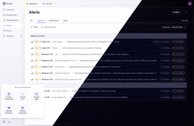
A Fresh Look for the Socket Dashboard
We’ve redesigned the Socket dashboard with simpler navigation, less visual clutter, and a cleaner UI that highlights what really matters.
By André Staltz, Jeppe Hasseriis, Nolan Lawson - Jun 23, 2025
react-modalisa
Advanced tools
react-modalisa is a modal component library for React. It is fully customizable and accessible, offering you the freedom and flexibility to create modal experiences for all types of users.
Version 1.0.0 !!
The react-modalisa package provides a customizable modal component for React applications. This component allows you to create accessible and visually appealing modals with various themes and customization options. This documentation will guide you on how to install and use the Modal component in your React project.
To install the 'react-modalisa' package, run the following command:
npm i react-modalisa
To use the Modal component, you need to import it along with other necessary dependencies:
import React, { useState } from "react";
import { createPortal } from "react-dom";
import { Modal } from "react-modalisa";
Next, you can set up the state to control the visibility of the modal:
const [showModal, setShowModal] = useState(false);
You can also define a callback function for the button's click event:
const handleFirstBtnClick = () => {
  // Provide the logic you want to perform here
  // for example, an alert box to indicate successful Exit
  alert("Exit!");
  // and closed modal
  setShowModal(false);
};

const handleSecondBtnClick = () => {
  // Provide the validation logic you want to perform here
  // for example, an alert box to indicate successful validation
  alert("Validation successful!");
};
To trigger the modal, use the following code:
<button onClick={() => setShowModal(true)}>open modal</button>
Finally, integrate the Modal component after the return:
{
  showModal &&
    createPortal(
      <Modal
        closeModal={() => setShowModal(false)} // Callback function to close the modal
        theme="success" // Theme of the modal ('validation', 'success', 'success-dark', 'alert', 'error')
        title="Title" // Title of the modal // Optional ! //
        textContent="Your text content!" // Text content of the modal
        modalSize="modal-medium" // Size of the modal ('modal-large' in this case)
        miniBtnActive={true} // Flag indicating whether the mini button is active // true or false
        FirstBtnActive={{
          text: "Close", // Text for the first button
          onFirstBtnClick: handleFirstBtnClick, // Callback function when the first button is clicked
        }}
        DoubleBtnActive={{
          text: "Validation", // Text for the second button
          onSecondBtnClick: handleSecondBtnClick, // Callback function when the second button is clicked
        }}
      />,
      document.body
    );
}
The Modal component provides several customization options:
theme (string): Sets the theme of the modal. Available options: "success", "success-dark", "alert", "error", "validation". title (string): Sets the title of the modal (optional). textContent (string): Sets the text content of the modal. modalSize (string): Sets the size of the modal. Available options: "modal-small", "modal-medium", "modal-large". miniBtnActive (boolean): Determines whether the mini button is active. FirstBtnActive (object): Configures the first button. Contains text (string) and onFirstBtnClick (callback function). DoubleBtnActive (object): Configures the second button. Contains text (string) and onSecondBtnClick (callback function).
If you encounter an error (ts(7016)) during installation, follow these steps:
1./ Create an index.d.ts file at the root of your project. 2/. Add the following line to the index.d.ts file:
declare module "react-modalisa";
FAQs
react-modalisa is a modal component library for React. It is fully customizable and accessible, offering you the freedom and flexibility to create modal experiences for all types of users.
The npm package react-modalisa receives a total of 18 weekly downloads. As such, react-modalisa popularity was classified as not popular.
We found that react-modalisa demonstrated a not healthy version release cadence and project activity because the last version was released a year ago. It has 1 open source maintainer collaborating on the project.
Did you know?

Socket for GitHub automatically highlights issues in each pull request and monitors the health of all your open source dependencies. Discover the contents of your packages and block harmful activity before you install or update your dependencies.
Product
We’ve redesigned the Socket dashboard with simpler navigation, less visual clutter, and a cleaner UI that highlights what really matters.

Industry Insights
Terry O’Daniel, Head of Security at Amplitude, shares insights on building high-impact security teams, aligning with engineering, and why AI gives defenders a fighting chance.

Security News
MCP spec updated with structured tool output, stronger OAuth 2.1 security, resource indicators, and protocol cleanups for safer, more reliable AI workflows.