react-mui-action-dialog
This React library simplifies the usage of Material-UI dialogs, removing the need to manage states manually. It offers convenient replicas of standard JavaScript dialog methods such as alert, confirm, and prompt, streamlining the implementation of common UX flows.
The library internally utilizes React Context to handle states, ensuring compatibility with most versions of React from version 17 onward.
Why?
The MUI Dialogs codebase is overly complex and lacks functionality. While the built-in JavaScript methods for alert, confirm, and prompt offer simplicity, they're not customizable and may fall short for complex scenarios.
My aim with this library is to create a user-friendly solution that meets both ease-of-use and complex use case requirements.
How to use?
Currently, it's hosted on GitHub. My plan is to transition it into an official npm package.
npm i github:synle/react-mui-action-dialog
Add the action dialog context to your root
To begin, wrap your app with ActionDialogsContext, a React context consumer that manages the dialog stack state.
import { ActionDialogsContext } from 'react-mui-action-dialog';

<ActionDialogsContext>
  <YourApp>
</ActionDialogsContext>
Use the ActionDialog hooks
Alert
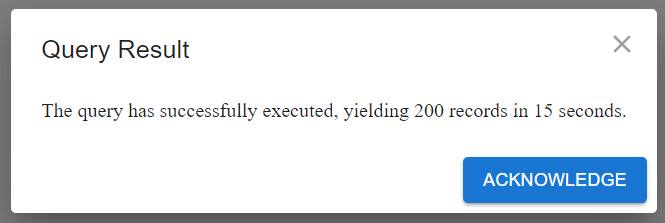
This alerts a simple message with an OK button, informing the user of an event.
import { useActionDialogs } from 'react-mui-action-dialog';
function MyComponent() {
const { alert } = useActionDialogs();
const onSubmit = async () => {
try {
await alert(
<>The query has successfully executed, yielding 200 records in 15 seconds.</>,
`Acknowledge`,
<>Query Result</>,
);
} catch (err) {}
};
return <button onClick={onSubmit}>My Action</button>;
}
Confirm
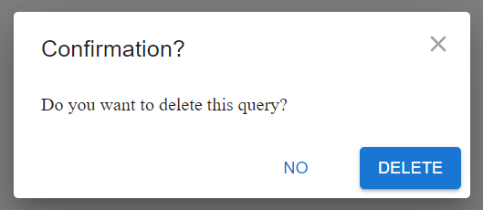
This prompts the user for a yes or no confirmation regarding an event.
import { useActionDialogs } from 'react-mui-action-dialog';
function MyComponent() {
const { confirm } = useActionDialogs();
const onSubmit = async () => {
try {
await confirm(
<>Do you want to delete this query?</>,
`Delete`,
<>Confirmation?</>,
);
} catch (err) {
}
};
return <button onClick={onSubmit}>Delete Query?</button>;
}
Prompt
This is a basic text input for requesting user input in free-form text, ideal for short-and-single inputs.

import { useActionDialogs } from 'react-mui-action-dialog';
function MyComponent() {
const { prompt } = useActionDialogs();
const onSubmit = async () => {
try {
const newName = await prompt({
title: 'Rename Query',
message: 'New Query Name',
value: 'default query value',
saveLabel: 'Save',
});
} catch (err) {}
};
return <button onClick={onSubmit}>Rename Query?</button>;
}
Choice
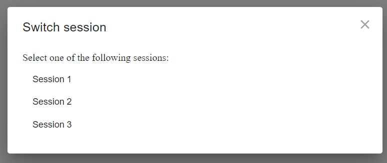
This presents a list of options for the user to choose from, similar to a single-select dropdown. The user must select one option.
function ChoiceExample() {
const { choice } = useActionDialogs();
const [session, setSession] = useState('');
const onSubmit = async () => {
try {
const newSession = await choice(
'Switch session',
'Select one of the following sessions:',
[
{ label: 'Session 1', value: 'session_1' },
{ label: 'Session 2', value: 'session_2' },
{ label: 'Session 3', value: 'session_3' },
],
true,
);
setSession(newSession);
} catch (err) {
setSession('');
}
};
return (
<>
<button onClick={onSubmit}>Switch Session</button>
<div>
<strong>New selected session:</strong> {session}
</div>
</>
);
}
Modal
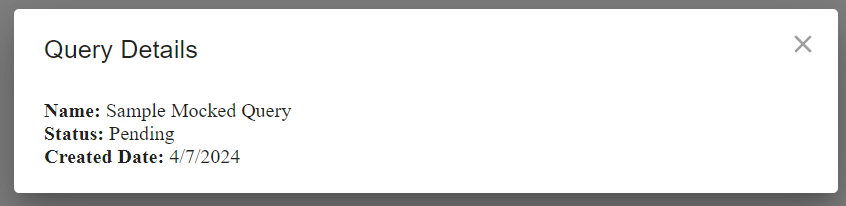
This displays custom modal content, suitable for complex use cases.
function ModalExample() {
const { modal } = useActionDialogs();
const onSubmit = async () => {
try {
await modal({
title: 'Query Details',
message: (
<>
<div>
<strong>Name:</strong> Sample Mocked Query
</div>
<div>
<strong>Status:</strong> Pending
</div>
<div>
<strong>Created Date:</strong> {new Date().toLocaleDateString()}
</div>
</>
),
});
} catch (err) {}
};
return (
<>
<button onClick={onSubmit}>Show Details</button>
</>
);
}
Reference your own component
If you prefer not to use inline components, you can define your component separately and then include it in the react hook.

import { useActionDialogs } from 'react-mui-action-dialog';
function MyChildComponent() {
return (
<>
<div>Hello world</div>
</>
);
}
export function ModalExampleWithChildComponent() {
const { modal } = useActionDialogs();
const onSubmit = async () => {
try {
await modal({
title: 'Simple Modal',
message: <MyChildComponent />,
modalRef: modalRef,
size: 'sm',
});
} catch (err) {}
};
return (
<>
<button onClick={onSubmit}>Show Modal</button>
</>
);
}
Dismiss the modal programmatically
For custom modals, manual dismissal post-action, like form submission or interactions, is crucial. This can be achieved via useActionDialogRef and .dismiss(). Here's a sample code snippet.
Dismiss via button click
This example features a modal with a dismiss button, allowing control from your component.

import { useActionDialogRef, useActionDialogs } from 'react-mui-action-dialog';
export function ModalExampleWithManualDismiss() {
const { modal } = useActionDialogs();
const modalRef = useActionDialogRef();
const onSubmit = async () => {
try {
await modal({
title: 'Manual Dismiss Modal',
message: (
<>
<div>
<button onClick={() => modalRef.current.dismiss()}>
Manually dismiss this dialog
</button>
</div>
</>
),
modalRef: modalRef,
size: 'sm',
});
} catch (err) {}
};
return (
<>
<button onClick={onSubmit}>Show Modal</button>
</>
);
}
Dismiss via form submission
This example features a modal with a form. Upon form submission, the modal closes automatically.
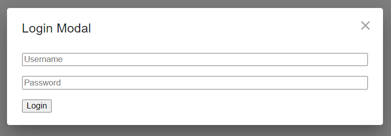
import { useActionDialogRef, useActionDialogs } from 'react-mui-action-dialog';
export function ModalExampleWithFormSubmit() {
const { modal } = useActionDialogs();
const modalRef = useActionDialogRef();
const onSubmit = async () => {
try {
await modal({
title: 'Login Modal',
message: (
<form
onSubmit={(e) => {
e.preventDefault();
modalRef.current.dismiss();
}}
style={{ display: 'flex', flexDirection: 'column', gap: '1rem' }}>
<input type='text' placeholder='Username' required />
<input type='password' placeholder='Password' required />
<div>
<button type='submit'>Login</button>
</div>
</form>
),
modalRef: modalRef,
size: 'sm',
});
} catch (err) {}
};
return (
<>
<button onClick={onSubmit}>Show Modal</button>
</>
);
}
Additional Samples:
For more code samples, you can find them in the Storybook examples located here: https://github.com/synle/react-mui-action-dialog/tree/main/src/stories .
I published a blog post, you can refer to the link for more information about the motivation behind this library here: https://www.linkedin.com/article/edit/7182404170941972480/
Local Dev Storybook
I've set up the Storybook locally. You can interact with the live demo on your local machine. Use the following setup:
npm install
npm run dev
Future Plans


