Product
Announcing Precomputed Reachability Analysis in Socket
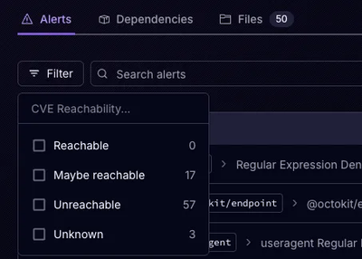
Socket’s precomputed reachability slashes false positives by flagging up to 80% of vulnerabilities as irrelevant, with no setup and instant results.
react-mui-speeddial-raphael-fork
Advanced tools
A Speed dial according to the Material Design guide. Scroll down to "Speed dial" for an introduction.
Additionally to the Google referencem this component adds optional labels beneath the action buttons.
npm i --save react-mui-speeddial-raphael-fork

import { SpeedDial, SpeedDialItem } from 'react-mui-speeddial';

// just some icons for illustration (example only):
import ContentAdd from 'material-ui/svg-icons/content/add';
import NavigationClose from 'material-ui/svg-icons/navigation/close';
import NewGameIcon from 'material-ui/svg-icons/av/playlist-add';
import NewPageIcon from 'material-ui/svg-icons/action/note-add';


render() {
  return (
    <SpeedDial
      fabContentOpen={
        <ContentAdd />
      }
      fabContentClose={
        <NavigationClose />
      }
    >

      <SpeedDialItem
        label="new game"
        fabContent={<NewGameIcon/>}
        onTouchTap={this.startNewGame}
      />

      <SpeedDialItem
        label="new page"
        fabContent={<NewPageIcon/>}
        onTouchTap={this.startNewPage}
      />

    </SpeedDial>
  );
 }
This shows a standard Floating Action Button (FAB)
with a + icon. Once clicked, two mini FABs appear above and the main FAB
transforms into a "close" icon.
<SpeedDial> propsopen = You can use this property to manually open/close the speed dials.
If not specified, then the component will control itself automatically.effect = The appear/disappear effect to use during open/close. Available
options are:
nonefade-staggered (default)fadeslidefabProps = props to pass to the internal <FloatingActionButton>
component. Use this to style the FAB, for example.fabContentOpen = children for the FAB in the closed state. This is
usually an <SvgIcon> or <FontIcon> telling the user that clicking the
FAB will open additional choices.fabContentClose = children for the FAB in the opened state. If not
specified, the value of fabContentOpen will be used instead.onOpenCloseRequest = optional callback; called when the user clicks
the main FABchildren = the children of the <SpeedDial> component should be
<SpeedDialItem> instances (see below).style = CSS style of the root container. Use this to position the FAB.
Note that position must remain relative or absolute. You might also
want to encapsulate the <SpeedDial> in a positioned parent container to
avoid problems.itemsPosition = show buttons above or below the main button<SpeedDialItem> propsfabContent = usually a <SvgIcon> or <FontIcon> to specify the icon
to display in the mini-FAB.label = an optional label to display on the left of the mini-FAB. This
can be a simple text or even other React components. The content is
vertically aligned to the FAB.onTouchTap = called when the user clicks the mini-FAB (not called when
the label is clicked)secondary, backgroundColor, style, iconStyle = material-ui FloatingActionButton exposed propsThis project is licensed under the terms of the MIT license
FAQs
a speed dial component for Material UI
The npm package react-mui-speeddial-raphael-fork receives a total of 4 weekly downloads. As such, react-mui-speeddial-raphael-fork popularity was classified as not popular.
We found that react-mui-speeddial-raphael-fork demonstrated a not healthy version release cadence and project activity because the last version was released a year ago. It has 1 open source maintainer collaborating on the project.
Did you know?

Socket for GitHub automatically highlights issues in each pull request and monitors the health of all your open source dependencies. Discover the contents of your packages and block harmful activity before you install or update your dependencies.

Product
Socket’s precomputed reachability slashes false positives by flagging up to 80% of vulnerabilities as irrelevant, with no setup and instant results.

Product
Socket is launching experimental protection for Chrome extensions, scanning for malware and risky permissions to prevent silent supply chain attacks.

Product
Add secure dependency scanning to Claude Desktop with Socket MCP, a one-click extension that keeps your coding conversations safe from malicious packages.