Research
Using Trusted Protocols Against You: Gmail as a C2 Mechanism
Socket uncovers malicious packages on PyPI using Gmail's SMTP protocol for command and control (C2) to exfiltrate data and execute commands.
react-multi-carousel
Advanced tools
react-multi-carousel is a flexible and responsive carousel component for React applications. It allows developers to create carousels with multiple items, custom breakpoints, and various navigation options.
Basic Carousel
This code demonstrates a basic carousel setup with different breakpoints for various screen sizes. The carousel will display a different number of items based on the screen width.
import React from 'react';
import Carousel from 'react-multi-carousel';
import 'react-multi-carousel/lib/styles.css';

const responsive = {
  superLargeDesktop: {
    breakpoint: { max: 4000, min: 3000 },
    items: 5
  },
  desktop: {
    breakpoint: { max: 3000, min: 1024 },
    items: 3
  },
  tablet: {
    breakpoint: { max: 1024, min: 464 },
    items: 2
  },
  mobile: {
    breakpoint: { max: 464, min: 0 },
    items: 1
  }
};

const BasicCarousel = () => (
  <Carousel responsive={responsive}>
    <div>Item 1</div>
    <div>Item 2</div>
    <div>Item 3</div>
    <div>Item 4</div>
    <div>Item 5</div>
  </Carousel>
);

export default BasicCarousel;
Custom Navigation Buttons
This code demonstrates how to use custom navigation buttons in the carousel. The `customLeftArrow` and `customRightArrow` props allow you to pass custom components for the navigation buttons.
import React from 'react';
import Carousel from 'react-multi-carousel';
import 'react-multi-carousel/lib/styles.css';

const CustomLeftArrow = ({ onClick }) => (
  <button onClick={onClick} className="custom-left-arrow">Left</button>
);

const CustomRightArrow = ({ onClick }) => (
  <button onClick={onClick} className="custom-right-arrow">Right</button>
);

const CustomNavigationCarousel = () => (
  <Carousel
    customLeftArrow={<CustomLeftArrow />}
    customRightArrow={<CustomRightArrow />}
  >
    <div>Item 1</div>
    <div>Item 2</div>
    <div>Item 3</div>
    <div>Item 4</div>
    <div>Item 5</div>
  </Carousel>
);

export default CustomNavigationCarousel;
Auto Play
This code demonstrates how to enable auto play in the carousel. The `autoPlay` prop is set to true, and the `autoPlaySpeed` prop is set to 3000 milliseconds (3 seconds).
import React from 'react';
import Carousel from 'react-multi-carousel';
import 'react-multi-carousel/lib/styles.css';

const AutoPlayCarousel = () => (
  <Carousel
    autoPlay={true}
    autoPlaySpeed={3000}
  >
    <div>Item 1</div>
    <div>Item 2</div>
    <div>Item 3</div>
    <div>Item 4</div>
    <div>Item 5</div>
  </Carousel>
);

export default AutoPlayCarousel;react-slick is a popular carousel component for React that is based on the slick-carousel library. It offers a wide range of features including lazy loading, custom navigation, and responsive design. Compared to react-multi-carousel, react-slick has a larger community and more extensive documentation.
swiper is a modern and highly customizable slider component for React. It supports a wide range of features such as virtual slides, parallax effects, and touch interactions. Swiper is known for its performance and flexibility, making it a strong alternative to react-multi-carousel.
react-responsive-carousel is a lightweight and responsive carousel component for React. It offers basic carousel functionalities with a focus on simplicity and ease of use. While it may not have as many features as react-multi-carousel, it is a good choice for simple carousel needs.
$ npm install react-multi-carousel --save
It works if you don't ask for too much.
Implementing a queue data structure for the infinite mode to work better;
The current most common solution is to detect the device type of the user based on the user agent. (server-side or client-side).
The end result will either be "mobile", "tablet" or "desktop", so based on these device types, we decided how many items we are showing in the Carousel.
Demo can be found at here.
Codes is at here.
const responsive = {
  desktop: {
    breakpoint: { max: 3000, min: 1024 },
    items: 3
  },
  tablet: {
    breakpoint: { max: 1024, min: 464 },
    items: 2
  },
  mobile: {
    breakpoint: { max: 464, min: 0 },
    items: 1
  }
};
<Carousel
  disableSwipeOnMobile
  disableDrag
  responsive={responsive}
  forSSR
  slidesToSlide={2}
  infinite={true}
  className='test'
  removeArrowOnDeviceType={['tablet', 'mobile']}
  deviceType={this.props.deviceType}
>
  {fakerData.map(card => {
    return <Card {...card} />;
  })}
</Carousel>
responsive: responsiveType;
deviceType?: string;
forSSR?: boolean;
slidesToSlide?: number; // number of slides on each slide.
disableDrag?: boolean; // for desktop
removeArrow?: boolean;
disableSwipeOnMobile?: boolean;
removeArrowOnDeviceType?: string | Array<string>;
children: React.ReactNode | null;
customLeftArrow?: React.ReactElement<any> | null;
customRightArrow?: React.ReactElement<any> | null;
infinite?: boolean;
contentClassName?: string;
itemClassName?:string;
containerClassName?: string;
transition?:string;
| Name | Type | Default | Description |
|---|---|---|---|
responsive | Object | {} | How many items to show on each breakpoint. |
deviceType | string | none | Only pass this when use for server-side rendering, what to pass can be found in the example folder. |
forSSR | bool | false | For SSR |
slidesToSlide | number | 1 | How many slides to slide. |
FAQs
Production-ready, lightweight fully customizable React carousel component that rocks supports multiple items and SSR(Server-side rendering) with typescript.
The npm package react-multi-carousel receives a total of 161,193 weekly downloads. As such, react-multi-carousel popularity was classified as popular.
We found that react-multi-carousel demonstrated a healthy version release cadence and project activity because the last version was released less than a year ago. It has 1 open source maintainer collaborating on the project.
Did you know?

Socket for GitHub automatically highlights issues in each pull request and monitors the health of all your open source dependencies. Discover the contents of your packages and block harmful activity before you install or update your dependencies.

Research
Socket uncovers malicious packages on PyPI using Gmail's SMTP protocol for command and control (C2) to exfiltrate data and execute commands.

Product
We redesigned Socket's first logged-in page to display rich and insightful visualizations about your repositories protected against supply chain threats.

Product
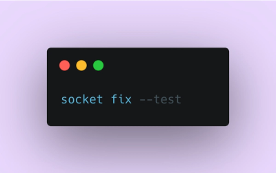
Automatically fix and test dependency updates with socket fix—a new CLI tool that turns CVE alerts into safe, automated upgrades.