react-native-animated-nav-tab-bar

A simple and customizable React Native component that implements an animated bottom tab bar for React Navigation v6.
- 60FPS
- Support for iPhoneX
- Lots of customization
- Bottom Tab Bar Floating style
📆 Updates / Changelog
Changelog.md
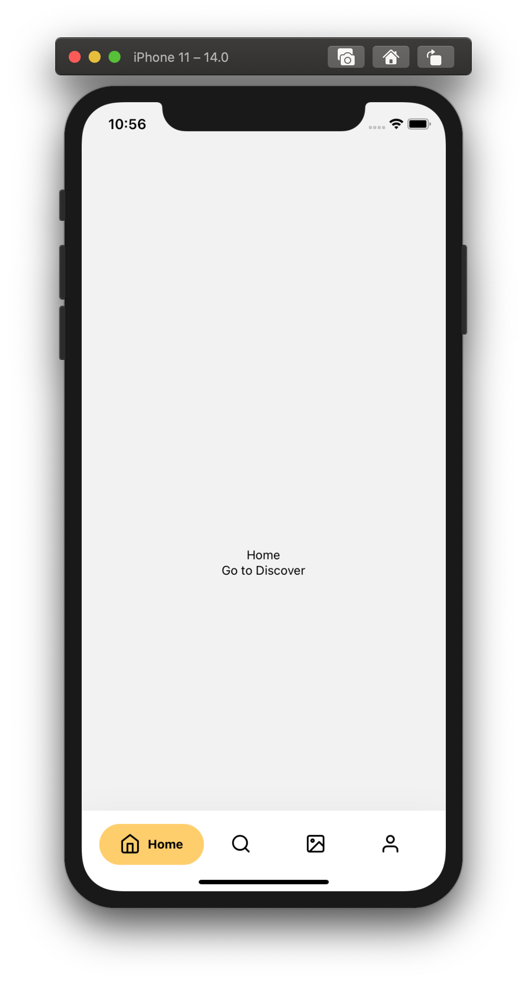
Animation Preview

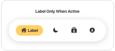
Customization Preview
Other possible Customizations
Tab Bar Icons
Layout
Let's get to know you!
👋 If your app is deployed to AppStore/GooglePlay and you're using this package, send me a DM on Twitter @torgeadelin
Prerequisites
In order to use the component, you need to have React Navigation v6 installed.
You also need styled-components.
Installation
If using yarn
yarn add react-native-animated-nav-tab-bar
If using npm
npm install react-native-animated-nav-tab-bar
Usage
Notice
If you updated the package to a new version, don't forget to run npm run start -- --reset-cache to have the latest version.
Import
import { AnimatedTabBarNavigator } from "react-native-animated-nav-tab-bar";
import {
AnimatedTabBarNavigator,
DotSize,
TabElementDisplayOptions,
TabButtonLayout,
IAppearanceOptions
} from 'react-native-animated-nav-tab-bar'
Initialize
Then create a navigator using the navigation builder that you imported, and create your navigation! Look at the example below.
...

const Tabs = AnimatedTabBarNavigator();

export default () => (
  <Tabs.Navigator
    // default configuration from React Navigation
    tabBarOptions={{
      activeTintColor: "#2F7C6E",
      inactiveTintColor: "#222222"
    }}
  >

    // Home Screen
    <Tabs.Screen name="Home" component={Home} />

    // Other screens go here.
    ...

  </Tabs.Navigator>
)
Add Icons
If you'd like to add icons to your Bottom Navigation
you can use react-native-vector-icons. Look at an example of how to add icons to your tab bar.
Example
import Icon from 'react-native-vector-icons/Feather';

...

export default () =>
  <Tabs.Navigator
    tabBarOptions={{
      activeTintColor: "#2F7C6E",
      inactiveTintColor: "#222222"
    }}
  >
    <Tabs.Screen
      name="Home"
      component={Home}
      options={{
        tabBarIcon: ({ focused, color, size }) => (
            <Icon
                name="Home"
                size={size ? size : 24}
                color={focused ? color : "#222222"}
                focused={focused}
                color={color}
            />
        )
      }}
    />
    </Tabs.Navigator>

...
Documentation
The navigation component takes two main props which help you customize your navigation. tabBarOptions is the default prop from React Navigation which you can use to specify different tint colors and more (see available options below). for all the details. The second prop is appearance. Here you'll be able to adjust several properties of the tab bar as you wish. See the available properties above.
Troubleshooting
- My tab doesn't reflect the
tabStyle object when I set paddingTop. Solution: You must provide the same value for paddingTop in both tabStyle object and topPadding property from appearance. This is due to the fact that the dot / active background uses position absolute, and the parent's padding top does not affect it.
- My appearance prop style doesn't apply. Solution: Up until version 3.1.2 there was a typo with the appearance prop. (Instead of appearance it was appearence). It has been fixed in 3.1.3 and you should make sure you're using the right spelling too if you update to 3.1.3.
Contributing
Pull requests are always welcome! Feel free to open a new GitHub issue for any changes that can be made.
If you raise an issue, please add proper steps to reproduce it and proper logs. Thanks!
Working on your first Pull Request? You can learn how from this free series How to Contribute to an Open Source Project on GitHub
Author
Catalin Torge @torgeadelin
License
MIT