Product
Introducing Reachability for PHP
Reachability analysis for PHP is now available in experimental, helping teams identify which vulnerabilities are actually exploitable.
react-native-animated-progress
Advanced tools
Need an animated and customizable ProgressBar? Here it ts!
Need a lightweight and easy-to-use Progress Bar? Here it is!
A cross-platform Progress Bar component with different customize options.

Open a Terminal in the project root and run:
npm install react-native-animated-progress
import React from "react";
import { View, Text } from "react-native";
import ProgressBar from "react-native-animated-progress";

const App = () => {
  return (
    <View
      style={{ flex: 1, justifyContent: "space-evenly", paddingHorizontal: 16 }}
    >
      <View>
        <Text style={{ marginBottom: 20 }}>Default with indeterminate</Text>
        <ProgressBar indeterminate backgroundColor="#4a0072" />
      </View>
      <View>
        <Text style={{ marginBottom: 20 }}>
          Default with indeterminate and increased height
        </Text>
        <ProgressBar height={5} indeterminate backgroundColor="#4a0072" />
      </View>
      <View>
        <Text style={{ marginBottom: 20 }}>
          Progress with animation and increased height
        </Text>
        <ProgressBar progress={60} height={7} backgroundColor="#4a0072" />
      </View>
      <View>
        <Text style={{ marginBottom: 20 }}>Progress without animation</Text>
        <ProgressBar
          progress={30}
          height={7}
          backgroundColor="#4a0072"
          animated={false}
        />
      </View>
    </View>
  );
};
export default App;
height - integer (Default - 2)Sets the height of the bar.
backgroundColor - string (Default - none)Sets the color of the progress bar.
animated - boolean (Default - true)Chooses wheter to animate the progress or not
indeterminate - boolean (Default - false)Sets the bar to animate constantly as a loading progress.
progress - integer - From 0 to 100 (Default - 0)Chooses the point where the progress should animate to, based on the progress bar width.
trackColor - string (Default - #A6A6A6)Sets the color of the progress bar track.
FAQs
Need an animated and customizable ProgressBar? Here it ts!
The npm package react-native-animated-progress receives a total of 913 weekly downloads. As such, react-native-animated-progress popularity was classified as not popular.
We found that react-native-animated-progress demonstrated a not healthy version release cadence and project activity because the last version was released a year ago. It has 2 open source maintainers collaborating on the project.
Did you know?

Socket for GitHub automatically highlights issues in each pull request and monitors the health of all your open source dependencies. Discover the contents of your packages and block harmful activity before you install or update your dependencies.

Product
Reachability analysis for PHP is now available in experimental, helping teams identify which vulnerabilities are actually exploitable.

Product
Export Socket alert data to your own cloud storage in JSON, CSV, or Parquet, with flexible snapshot or incremental delivery.

Research
/Security News
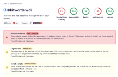
Bitwarden CLI 2026.4.0 was compromised in the Checkmarx supply chain campaign after attackers abused a GitHub Action in Bitwarden’s CI/CD pipeline.