
React Native Auto Size Text
React Native component for Android and iOS that provides several ways to resize text within a certain dimension/parent.
Port of auto_size_text


Table of Contents
Installation
yarn
yarn react-native-auto-size-text
npm
npm i react-native-auto-size-text
Usage
Import react-native-auto-size-text and ResizeTextMode
import { AutoSizeText, ResizeTextMode } from 'react-native-auto-size-text';
Choose one of the modes below:
MaxLines

Required props: fontSize, numberOfLines and mode.
<AutoSizeText
	fontSize={32}
	numberOfLines={2}
	mode={ResizeTextMode.max_lines}>
	This string will be automatically resized to fit on two lines.
</AutoSizeText>
MinFontSize

Required props: minFontSize, numberOfLines and mode.
<AutoSizeText
	numberOfLines={3}
	minFontSize={21}
	mode={ResizeTextMode.min_font_size}>
	This string's size will not be smaller than 21. It will be automatically
	resized to fit on 3 lines.
</AutoSizeText>
Group
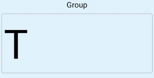
Required props: mode.
<AutoSizeText
	mode={ResizeTextMode.group}>
	This mode will fit the available space and sync their text size
</AutoSizeText>
StepGranularity
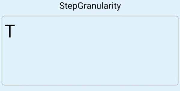
Required props: fontSize, numberOfLines, granularity and mode.
<AutoSizeText
	fontSize={48}
	numberOfLines={4}
	granularity={10}
	mode={ResizeTextMode.step_granularity}>
	This String changes its size with a stepGranularity of 10. It will be automatically
	resized to fit on 4 lines.
</AutoSizeText>
PresetFontSizes
Required props: fontSizePresets, numberOfLines and mode.
<AutoSizeText
	fontSizePresets={[64,  42,  24]}
	numberOfLines={4}
	mode={ResizeTextMode.preset_font_sizes}>
	This String has only three allowed sizes: 64, 42 and 24.
	It will be automatically resized to fit on 4 lines.
	With this setting, you have most control
</AutoSizeText>
OverflowReplacement
Required props: fontSize, numberOfLines, overFlowReplacement and mode.
<AutoSizeText
	fontSize={32}
	numberOfLines={3}
	overFlowReplacement={'Text overflowing'}
	mode={ResizeTextMode.overflow_replacement}>
	This String's size will not be smaller than 32.
	It will be automatically resized to fit on 3 lines.
	Otherwise it will be replaced by a replacement string. Here's an example.
</AutoSizeText>
Props
fontSize | Font size | number | 14 |
numberOfLines | Number of lines before rescaling | number | none |
mode | Resize text mode | ResizeTextMode | ResizeTextMode.max_lines |
minFontSize | Minimum font size | number | none |
granularity | Text resize granularity | number | none |
fontSizePresets | Font size presets | number[] | none |
Overflowreplacement | Replacement if the text overflows parent | string | '' |
style | Text style | | function: () => {} |
TextProps | All other <Text/> props | | function: () => {} |
Example with all modes
import React, {useState} from 'react';
import {ScrollView, StyleSheet, Text, TextInput, View} from 'react-native';
import {AutoSizeText, ResizeTextMode} from 'react-native-auto-size-text';

const App = () => {
  const [text, setText] = useState<string>('');

  return (
    <ScrollView
      style={styles.scrollViewContainer}
      contentContainerStyle={styles.container}>
      <TextInput
        style={styles.input}
        onChangeText={e => setText(e)}
        value={text}
      />

      <Text>MaxLines</Text>

      <View style={styles.textWrapper}>
        <AutoSizeText
          fontSize={64}
          numberOfLines={2}
          mode={ResizeTextMode.max_lines}>
          {text}
        </AutoSizeText>
      </View>

      <Text>MinFontSize</Text>
      <View style={styles.textWrapper}>
        <AutoSizeText
          numberOfLines={3}
          minFontSize={18}
          mode={ResizeTextMode.min_font_size}>
          {text}
        </AutoSizeText>
      </View>

      <Text>PresetFontSizes</Text>
      <View style={styles.textWrapper}>
        <AutoSizeText
          fontSizePresets={[50, 30, 10]}
          numberOfLines={3}
          mode={ResizeTextMode.preset_font_sizes}>
          {text}
        </AutoSizeText>
      </View>

      <Text>OverflowReplacement</Text>
      <View style={styles.textWrapper}>
        <AutoSizeText
          fontSize={12}
          numberOfLines={1}
          mode={ResizeTextMode.overflow_replacement}
          overFlowReplacement={'Text overflowing'}>
          {text}
        </AutoSizeText>
      </View>

      <Text>Group</Text>

      <View style={styles.textWrapper}>
        <AutoSizeText mode={ResizeTextMode.group} fontSize={2048}>
          {text}
        </AutoSizeText>
      </View>

      <Text>StepGranularity</Text>
      <View style={styles.textWrapper}>
        <AutoSizeText
          mode={ResizeTextMode.step_granularity}
          fontSize={64}
          numberOfLines={2}
          granularity={10}>
          {text}
        </AutoSizeText>
      </View>
    </ScrollView>
  );
};

const styles = StyleSheet.create({
  container: {
    justifyContent: 'center',
    alignItems: 'center',
  },
  textWrapper: {
    borderColor: '#bcbcbc',
    borderRadius: 10,
    width: '80%',
    margin: 16,
    height: 200,
    borderWidth: 2,
  },

  scrollViewContainer: {
    flex: 1,
  },
  input: {
    height: 80,
    width: '100%',
    margin: 12,
    borderWidth: 1,
  },
});

export default App;
Contributing
Contributions are what make the open source community such an amazing place to be learn, inspire, and create. Any contributions you make are greatly appreciated.
- Fork the Project
- Create your Feature Branch (
git checkout -b feature/AmazingFeature)
- Commit your Changes (
git commit -m 'Add some AmazingFeature')
- Push to the Branch (
git push origin feature/AmazingFeature)
- Open a Pull Request