
Product
Introducing Reports: An Extensible Reporting Framework for Socket Data
Explore exportable charts for vulnerabilities, dependencies, and usage with Reports, Socket’s new extensible reporting framework.
By André Staltz - Apr 21, 2026
react-native-big-calendar
Advanced tools
  [
Cross-platform gcal/outlook like calendar component for React Native.
It's a hard task to debug this library on three platforms. I usually develop with the Web version first, then confirm its functionality with real devices. My PC is Linux and my phone is Android, so on Android it is easy to test, but to debug on iOS, I have to bring my Macbook Pro from my garage and connect my wife's iPhone and test it. Every time I launch my MacBook Pro, it requires updating Xcode or even performing a full system update.. It takes so long time to start debug. As React Native works on iOS better than Android, I always sometimes skip testing it, so there should be a bug on iOS. If you help me debug it, I would much appreciate!

dayjs and calendarizenpm install --save react-native-big-calendar
Or if you use Yarn:
yarn add react-native-big-calendar
Please ensure peer dependencies are installed.
npm install react react-native
If you use TypeScript ensure @types/react and @types/react-native is installed. react-native-big-calendar internally uses them.
npm install --save-dev @types/react @types/react-native
If you are using this module on the Web, please install react-native-web.
npm install react-native-web
If you are using Create React App, you are ready to go 🎉
For more details, please refer to the official react-native-web installation guide.
https://github.com/necolas/react-native-web
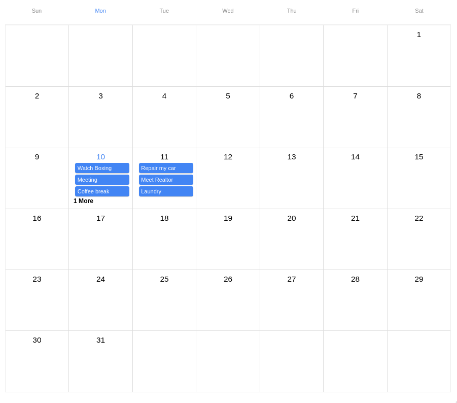
import { Calendar } from 'react-native-big-calendar'

const events = [
  {
    title: 'Meeting',
    start: new Date(2020, 1, 11, 10, 0),
    end: new Date(2020, 1, 11, 10, 30),
  },
  {
    title: 'Coffee break',
    start: new Date(2020, 1, 11, 15, 45),
    end: new Date(2020, 1, 11, 16, 30),
  },
]

function App() {
  return <Calendar events={events} height={600} />
}
Summary
export interface CalendarProps<T extends ICalendarEventBase> {
  events: T
  height: number
  overlapOffset?: number
  hourRowHeight?: number
  ampm?: boolean
  date?: Date
  eventCellStyle?: EventCellStyle<T>
  eventCellAccessibilityProps?: AccessibilityProps
  eventCellTextColor?: string
  allDayEventCellStyle?: allDayEventCellStyle<>
  allDayEventCellAccessibilityProps?: AccessibilityProps
  calendarCellAccessibilityPropsForMonthView?: AccessiblityProps
  allDayEventCellTextColor?: string
  calendarContainerStyle?: ViewStyle
  calendarCellAccessibilityProps?: AccessibilityProps
  headerContainerStyle?: ViewStyle
  headerContainerAccessibilityProps?: AccessibilityProps
  headerCellAccessibilityProps?: AccessibilityProps
  bodyContainerStyle?: ViewStyle
  renderEvent?: (
    event: T,
    touchableOpacityProps: CalendarTouchableOpacityProps,
  ) => ReactElement | null
  renderHeader?: React.ComponentType<CalendarHeaderProps<T> & { mode: Mode }>
  renderHeaderForMonthView?: React.ComponentType<CalendarHeaderForMonthViewProps>
  renderMultiDayEventPadding?: (
    event: T,
    touchableOpacityProps: CalendarTouchableOpacityProps,
  ) => ReactElement | null
  locale?: string
  hideNowIndicator?: boolean
  mode?: Mode
  scrollOffsetMinutes?: number
  showTime?: boolean
  minHour?: number
  maxHour?: number
  swipeEnabled?: boolean
  weekStartsOn?: WeekNum
  weekEndsOn?: WeekNum
  onChangeDate?: DateRangeHandler
  onPressCell?: (date: Date) => void
  onPressDateHeader?: (date: Date) => void
  onPressEvent?: (event: ICalendarEvent<T>) => void
  eventMinHeightForMonthView?: number
  activeDate?: Date
  moreLabel?: string
  showAdjacentMonths?: boolean
  sortedMonthView?: boolean
  showVerticalScrollIndicator?: boolean
  verticalScrollEnabled?: boolean
  timeslots?: number
}
<Calendar /> Props are:
| name | required | type | description |
|---|---|---|---|
events | yes | ICalendarEvent<T>[] | The events which will be rendered on the calendar. You can extend the type ICalendarEvent by providing a value to generic type T (see ./stories/events.tsx for an example). with optional children to display custom components inside the event, and optional event renderer function to take complete control over the rendered event (advanced feature). Events occurring during the same time range will be layered, offset, and assigned a unique color. |
height | yes | number | Calendar height. |
hideNowIndicator | no | boolean | Hides the indicator for the current time. By default the now indicator is shown. |
hourRowHeight | no | number | Hour row height |
onPressEvent | no | (event: ICalendarEvent<T>) => void | Event handler which will be fired when the user clicks an event. |
onChangeDate | no | ([start: Date, end: Date]) => void | Event handler which will be fired when the current date range changed. |
onPressCell | no | (date: Date) => void | Event handler which will be fired when the current date cell is clicked. The minute set to 0. |
onLongPressCell | no | (date: Date) => void | Same as above but triggered by a long press. |
onPressDateHeader | no | (date: Date) => void | Event handler which will be fired when the user clicks a date from the header. |
mode | no | 'month' | 'week' | '3days' | 'day' | 'schedule' | 'custom' | |
eventCellStyle | no | ViewStyle | (event: ICalendarEvent<T>) => ViewStyle | The style of Event cell. Accepts either style object (static) or function (dynamic). |
eventCellAccessiblityProps | no | AccessibilityProps | Accessibility properties of Event cell |
eventCellTextColor | no | string | The color of Event cell text. |
allDayEventCellStyle | no | ViewStyle | (event: ICalendarEvent<T>) => ViewStyle | The style of all day Event cell. Accepts either style object (static) or function (dynamic). |
allDayEventCellTextColor | no | string | The color of all day Event cell text. |
allDayEventCellAccessibilityProps | no | AccessibilityProps | Accessibility properties of all day Event cell text. |
calendarCellAccessibilityProps | no | AccessibilityProps | Accessibility properties of cells in calendar body, including the cells for hour. |
calendarCellAccessibilityPropsForMonthView | no | AccessibilityProps | Accessibility properties of date cells in calendar body for month view. |
headerContentStyle | no | ViewStyle | The style of the Header's content. Accepts a style object (static). |
headerContainerAccessibilityProps | no | AccessibilityProps | Accessiblity propertiees for Header container. Use set this to control ScreenReader to identify the entire Header row as a single accessible element |
headerCellAccessibilityProps | no | AccessibilityProps | Accessiblity propertiees for Header cell. |
dayHeaderStyle | no | ViewStyle | The style of the Header's day numbers. Accepts a style object (static). |
dayHeaderHighlightColor | no | string | The style of the Header's highlighted day number. Accepts a style object (static). |
weekDayHeaderHighlightColor | no | string | The style of the Header's highlighted week day. Accepts a style object (static). |
scrollOffsetMinutes | no | number | Scroll to specific minutes in a day. e.g.) set 480 to scroll to 8am when the calendar rendered. |
date | no | Date | Initial date of calendar. Defaults to new Date (current time). |
onSwipeEnd | no | (date: Date) => void | Event handler which will be fired when swiping left or right. Memoize your function to prevent unnecesary re-renders |
swipeEnabled | no | boolean | |
showTime | no | boolean | |
minHour | no | number | The first hour that will be displayed in week/day modes. |
maxHour | no | number | The final hour that will be displayed in week/day modes. |
ampm | no | boolean | Use 12 hours time format instead of 24 hours. |
weekStartsOn | no | 0 | 1 | 2 | 3 | 4 | 5 | 6 | Which day the week starts on. Sunday is 0. |
weekEndsOn | no | 0 | 1 | 2 | 3 | 4 | 5 | 6 | Which day the week ends on. Sunday is 0. |
locale | no | string | Custom locale. See I18n section |
overlapOffset | no | number | Adjusts the indentation of events that occur during the same time period. Defaults to 20 on web and 8 on mobile. |
isRTL | no | boolean | Switches the direction of the layout for use with RTL languages. Defaults to false. |
renderEvent | no | EventRenderer | Custom event renderer. See the type definition below. |
renderHeader | no | HeaderRenderer | Custom header renderer. |
eventMinHeightForMonthView | no | number | Minimun height for events in month view. Should match the min-height of your custom events. Defaults to 22. |
activeDate | no | Date | Date highlighted in header. Defaults to today (current time). |
headerComponent | no | ReactElement | Calendar body header component. |
headerComponentStyle | no | ViewStyle | Calendar body header component wrapper styling. Accepts a style object (static) |
hourStyle | no | TextStyle | Calendar body hours styling. Accepts a style object (static) |
showAllDayEventCell | no | boolean | Boolean for showing/hiding the all day event cell |
moreLabel | no | string | String to replace More label in month view. Default: '{moreCount} More'. {moreCount} is replaced by number of extra events |
showAdjacentMonths | no | boolean | Boolean for showing/hiding adjacent months in month view. Defaults to true |
sortedMonthView | no | boolean | (for performance) Boolean for sorting events in month view. Defaults to true |
isEventOrderingEnabled | no | boolean | (for performance) Boolean for sorting events in all view. Defaults to true |
renderCustomDateForMonth | no | boolean | Custom renderer for Date Cell |
disableMonthEventCellPress | no | boolean | Prevent Month view event cells from being pressed. Defaults to false |
itemSeparatorComponent | no | ReactElement | React Component for separate items in schedule mode. but not at the top or bottom. Refer React Native FlatList ItemSeparatorComponent for more info. |
enrichedEventsByDate | no | Record<string, T[] | (for performanace) Enriched events dictionary that will be used instead of building it inside the library. |
enableEnrichedEvents | no | boolean | (for performance) Boolean for enabling enrichedEvents logic. Defaults to false |
eventsAreSorted | no | boolean | (for performance) Boolean for skip sorting the events inside the library due they are already sorted. Defaults to false |
showWeekNumber | no | boolean | Show week number. Week number will be shown at top left corner for week/day mode and at start of each row for month mode |
weekNumberPrefix | no | string | Prefix for week number. For month mode, the prefix will be shown in header row. |
maxVisibleEventCount | no | number | Maximum number of events to show in a cell in month view. If the number of events exceeds this value, the cell will show the moreLabel. Defaults to 3. |
timeslots | no | number | Number of timeslots to render per Hour. Default to 0 |
hourComponent | no | HourRenderer | Custom hour renderer |
scheduleMonthSeparatorStyle | no | TextStyle | Schedule mode month separator styling. Accepts a style object (static) |
verticalScrollEnabled | no | boolean | Indicates if the body of the calendar should be scrollable |
renderMultiDayEventPadding | no | EventRenderer | Custom renderer for multiday event padding in monthview. Use this to adjust the height of multiday event in monthview, to prevent overlapping with events in other days. |
type EventRenderer<T> = (
  event: ICalendarEvent<T>,
  touchableOpacityProps: CalendarTouchableOpacityProps,
) => ReactElement | null
For more information, see Storybook
interface ICalendarEventBase {
  start: Date
  end: Date
  title: string
  children?: ReactElement | null
  disabled?: boolean
}
type HourRenderer = {
  appm: boolean
  hour: number
}
All day events should start and end on 0 in hour, minutes, and seconds (T00:00:00). For example:
{
    title: 'all day event',
    start: "2021-12-24T00:00:00.000Z",
    end: "2021-12-24T00:00:00.000Z", // same date as `start`
}
You can specify custom event render function which receives the calculated TouchableOpacity prop and event.
renderEvent must return a ReactElement.TouchableOpacity or any DOM element which accepts positioning and click events (onPress, ...).export interface MyCustomEventType {
color: string
}
const renderEvent = <T extends ICalendarEventBase>(
event: T,
touchableOpacityProps: CalendarTouchableOpacityProps,
) => (
<TouchableOpacity {...touchableOpacityProps}>
<Text>{`My custom event: ${event.title} with a color: ${event.color}`}</Text>
</TouchableOpacity>
)
<Calendar renderEvent={renderEvent} />
Your events can contain a prop children An example can be found here.
const eventNotes = useMemo(
  () => (
    <View style={{ marginTop: 3 }}>
      <Text style={{ fontSize: 10, color: 'white' }}> Phone number: 555-123-4567 </Text>
      <Text style={{ fontSize: 10, color: 'white' }}> Arrive 15 minutes early </Text>
    </View>
  ),
  [],
)

export const myEvents: ICalendarEventBase[] = [
  {
    title: 'Custom reminder',
    start: dayjs().set('hour', 16).set('minute', 0).toDate(),
    end: dayjs().set('hour', 17).set('minute', 0).toDate(),
    children: eventNotes,
  },
]
You can customize the calendar by passing the theme prop. theme should be like this interface partially:
export interface Palette {
  main: string
  contrastText: string
}

export type Typography = Pick<
  TextStyle,
  'fontFamily' | 'fontWeight' | 'fontSize' | 'lineHeight' | 'letterSpacing' | 'textAlign'
>

export interface ThemeInterface {
  palette: {
    primary: Palette
    nowIndicator: string
    gray: {
      100: string
      200: string
      300: string
      500: string
      800: string
    }
    moreLabel: string
  }
  isRTL: boolean
  typography: {
    fontFamily?: string
    xs: Typography
    sm: Typography
    xl: Typography
    moreLabel: Typography
  }
  eventCellOverlappings: readonly Palette[]
  moreLabel: TextStyle
}
For example:
const darkTheme = {
  palette: {
    primary: {
      main: '#6185d0',
      contrastText: '#000',
    },
    gray: {
      '100': '#333',
      '200': '#666',
      '300': '#888',
      '500': '#aaa',
      '800': '#ccc',
    },
  },
}

<Calendar
  height={SCREEN_HEIGHT}
  theme={darkTheme}
/>
Please specity your locale via locale prop and import day.js locale file:
import 'dayjs/locale/ja'

<Calendar
  locale="ja"
  {/* ... */}
/>
You can find your dayjs locale here:
https://github.com/iamkun/dayjs/tree/dev/src/locale
We create and cache a dictionary keyed by date with all the events properties plus the overlapping counting:
{
    [YYYY-MM-DD]: [
        {
            ...all event information,
            overlapPosition: int
            overlapCount: int
        }
    ]
}
When an event spans multiple days, we create a new event for each day it spans. For example, an event that starts on 2021-05-01 and ends on 2021-05-03 will be represented as 3 events, one for each day with the following time props:
--- First day
2021-05-01: {
   ...other data
   start: event start datetime
   end: current day midnight
}
-- All the intermediate days:
2021-05-02: {
   ...other data
   start: previous day midnight
   end: current day midnight
}
-- Final day
2021-05-03: {
   ...other data
   start: previous day midnight
   end: event start datetime
}
Optimised renderer get each event from the dictionary and render them without adding any extra logic like filtering or sorting.
You can build the dictionary by yourself and send it to the library through the prop enrichedEventsByDate.
This is specially useful for example when you want to build the dictionary in a background job.
After checking this repo, please run:
yarn install
yarn sync-rndemo
cd rndemo
yarn install
Start React Native development server in the demo directory:
cd rndemo
yarn start
Then, open another terminal and run:
# For ios
pod install
yarn ios

# For Android
yarn android
Every time you modify code of this library, you should run the following command in the root directory:
yarn sync-rndemo


If you are using this library, please send a PR to add your organization!
v4 branch.main branch.
First, thank you for your interest in this project. As this library is getting famous, lots of people are requesting features they need. I would like to respond all of them as possible, but there are limited hours I'm working on this. To be a full-time open sourcer and make this project sustainable, I've decided to add the enterprise support.
Enterprise customers are able to obtain:
Note that some Enterprise features will be merged to the OSS version too.
If you are interested in those features, please send an email to: ketsume0211@gmail.com
I'm a freelance software engineer specialized in React, React Native and TypeScript. Also available for GraphQL and RDB backend, and Node.JS applications.
If you are interested in hiring me, please send an email to: ketsume0211@gmail.com
I'm based in Japan (by the beautiful sea), so a remote contract job is especially welcome.
FAQs
  [
Socket for GitHub automatically highlights issues in each pull request and monitors the health of all your open source dependencies. Discover the contents of your packages and block harmful activity before you install or update your dependencies.
Product
Explore exportable charts for vulnerabilities, dependencies, and usage with Reports, Socket’s new extensible reporting framework.

Product
Socket for Jira lets teams turn alerts into Jira tickets with manual creation, automated ticketing rules, and two-way sync.

Company News
Socket won two 2026 Reppy Awards from RepVue, ranking in the top 5% of all sales orgs. AE Alexandra Lister shares what it's like to grow a sales career here.