react-native-calendar-strip
Easy to use and visually stunning calendar component for React Native.
Table of Contents
Install
Usage
Props
Animations
Localization
Device Specific Notes
Local Development
Contributing
License
Install
$ npm install react-native-calendar-strip
$ yarn add react-native-calendar-strip
Usage
Scrollable CalendarStrip — New in 2.x
The scrollable prop was introduced in 2.0.0 and features a bi-directional infinite scroller. It recycles days using RecyclerListView, shifting the dates as the ends are reached. The Chrome debugger can cause issues with this updating due to a RN setTimeout bug. To prevent date shifts at the ends of the scroller, set the minDate and maxDate range to a year or less.
The refactor to support scrollable introduced internal changes to the CalendarDay component. Users of the dayComponent prop may need to adjust their custom day component to accommodate the props passed to it.
import { View, StyleSheet } from 'react-native';
import CalendarStrip from 'react-native-calendar-strip';

const Example = () => (
  <View style={styles.container}>
    <CalendarStrip
      scrollable
      style={{height:200, paddingTop: 20, paddingBottom: 10}}
      calendarColor={'#3343CE'}
      calendarHeaderStyle={{color: 'white'}}
      dateNumberStyle={{color: 'white'}}
      dateNameStyle={{color: 'white'}}
      iconContainer={{flex: 0.1}}
    />
  </View>
);

const styles = StyleSheet.create({
  container: { flex: 1 }
});
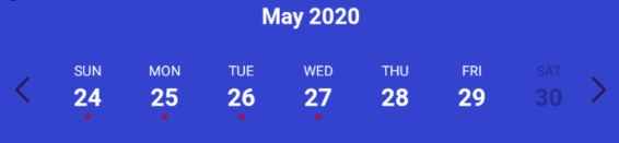
Simple "out of the box" Example
You can use this component without any styling or customization. Just import it in your project and render it:
import { View, StyleSheet } from 'react-native';
import CalendarStrip from 'react-native-calendar-strip';

const Example = () => (
  <View style={styles.container}>
    <CalendarStrip
      style={{height:150, paddingTop: 20, paddingBottom: 10}}
    />
  </View>
);

const styles = StyleSheet.create({
  container: { flex: 1 }
});
Styling and animations Example
Even though this component works withouth any customization, it is possible to customize almost everything, so you can make it as beautiful as you want:
import React, {Component} from 'react';
import {
AppRegistry,
View
} from 'react-native';
import moment from 'moment';
import CalendarStrip from 'react-native-calendar-strip';
class Example extends Component {
let datesWhitelist = [{
start: moment(),
end: moment().add(3, 'days')
}];
let datesBlacklist = [ moment().add(1, 'days') ];
render() {
return (
<View>
<CalendarStrip
calendarAnimation={{type: 'sequence', duration: 30}}
daySelectionAnimation={{type: 'border', duration: 200, borderWidth: 1, borderHighlightColor: 'white'}}
style={{height: 100, paddingTop: 20, paddingBottom: 10}}
calendarHeaderStyle={{color: 'white'}}
calendarColor={'#7743CE'}
dateNumberStyle={{color: 'white'}}
dateNameStyle={{color: 'white'}}
highlightDateNumberStyle={{color: 'yellow'}}
highlightDateNameStyle={{color: 'yellow'}}
disabledDateNameStyle={{color: 'grey'}}
disabledDateNumberStyle={{color: 'grey'}}
datesWhitelist={datesWhitelist}
datesBlacklist={datesBlacklist}
iconLeft={require('./img/left-arrow.png')}
iconRight={require('./img/right-arrow.png')}
iconContainer={{flex: 0.1}}
/>
</View>
);
}
}
AppRegistry.registerComponent('Example', () => Example);
Props
Initial data and onDateSelected handler
numDaysInWeek | Number of days shown in week. Applicable only when scrollable is false. | Number | 7 |
scrollable | Dates are scrollable if true. | Bool | False |
scrollerPaging | Dates are scrollable as a page (7 days) if true (Only works with scrollable set to true). | Bool | False |
startingDate | Date to be used for centering the calendar/showing the week based on that date. It is internally wrapped by moment so it accepts both Date and moment Date. | Any | |
selectedDate | Date to be used as pre selected Date. It is internally wrapped by moment so it accepts both Date and moment Date. | Any | |
onDateSelected | Function to be used as a callback when a date is selected. Receives param date Moment date. | Function | |
onWeekChanged | Function to be used as a callback when a week is changed. Receives params (start, end) Moment dates. | Function | |
onWeekScrollStart | Function to be used as a callback in scrollable mode when dates page starts gliding. Receives params (start, end) Moment dates. | Function | |
onWeekScrollEnd | Function to be used as a callback in scrollable mode when dates page stops gliding. Receives params (start, end) Moment dates. | Function | |
onHeaderSelected | Function to be used as a callback when the header is selected. Receives param object {weekStartDate, weekEndDate} Moment dates. | Function | |
headerText | Text to use in the header. Use with onWeekChanged to receive the visible start & end dates. | String | |
updateWeek | Update the week view if other props change. If false, the week view won't change when other props change, but will still respond to left/right selectors. | Bool | True |
useIsoWeekday | start week on ISO day of week (default true). If false, starts week on startingDate parameter. | Bool | True |
minDate | minimum date that the calendar may navigate to. A week is allowed if minDate falls within the current week. | Any | |
maxDate | maximum date that the calendar may navigate to. A week is allowed if maxDate falls within the current week. | Any | |
datesWhitelist | Array of dates that are enabled, or a function callback which receives a date param and returns true if enabled. Array supports ranges specified with an object entry in the array. Check example Below | Array or Func | |
datesBlacklist | Array of dates that are disabled, or a function callback. Same format as datesWhitelist. This overrides dates in datesWhitelist. | Array or Func | |
markedDates | Dates that are marked with dots or lines. Format as markedDatesFormat. | Array or Func | [] |
scrollToOnSetSelectedDate | Controls whether to reposition the scroller to the date passed to setSelectedDate. | Bool | True |
datesWhitelist Array Example
datesWhitelist = [
moment(),
{
start: (Date or moment Date),
end: (Date or moment Date)
}
];
return (
<CalendarStrip
datesWhitelist={datesWhitelist}
/>
);
datesBlacklist Callback Example
const datesBlacklistFunc = date => {
return date.isoWeekday() === 6;
}
return (
<CalendarStrip
datesBlacklist={datesBlacklistFunc}
/>
);
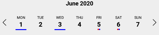
markedDates Example
markedDates may be an array of dates with dots/lines, or a callback that returns the same shaped object for a date passed to it.
markedDatesArray = [
{
date: '(string, Date or Moment object)',
dots: [
{
color: <string>,
selectedColor: <string> (optional),
},
],
},
{
date: '(string, Date or Moment object)',
lines: [
{
color: <string>,
selectedColor: <string> (optional),
},
],
},
];
markedDatesFunc = date => {
if (date.isoWeekday() === 4) {
return {
dots:[{
color: <string>,
selectedColor: <string> (optional),
}]
};
}
if (date.isoWeekday() === 6) {
return {
lines:[{
color: <string>,
selectedColor: <string> (optional),
}]
};
}
return {};
}
Hiding Components
showMonth | Show or hide the month label. | Bool | True |
showDate | Show or hide all the dates. | Bool | True |
showDayName | Show or hide the day name label | Bool | True |
showDayNumber | Show or hide the day number label | Bool | True |
Styling
style | Style for the top level CalendarStrip component. | Any | |
innerStyle | Style for the responsively sized inner view. This is necessary to account for padding/margin from the top level view. The inner view has style flex:1 by default. If this component is nested within another dynamically sized container, remove the flex style by passing in []. | Any | |
calendarHeaderStyle | Style for the header text of the calendar | Any | |
calendarHeaderContainerStyle | Style for the header text wrapper of the calendar | Any | |
calendarHeaderPosition | Position of the header text (above or below) | above, below | above |
calendarHeaderFormat | Format for the header text of the calendar. For options, refer to Moment documentation | String | |
dateNameStyle | Style for the name of the day on work days in dates strip | Any | |
dateNumberStyle | Style for the number of the day on work days in dates strip. | Any | |
dayContainerStyle | Style for all day containers. RNCS scales the width & height responsively, so take that into account if overriding them. | Any | |
weekendDateNameStyle | Style for the name of the day on weekend days in dates strip. | Any | |
weekendDateNumberStyle | Style for the number of the day on weekend days in dates strip. | Any | |
styleWeekend | Whether to style weekend dates separately. | Bool | True |
highlightDateNameStyle | Style for the selected name of the day in dates strip. | Any | |
highlightDateNumberStyle | Style for the selected number of the day in dates strip. | Any | |
highlightDateNumberContainerStyle | Style for the selected date number container. Similar to highlightDateNumberStyle, but this fixes the issue that some styles may have on iOS when using highlightDateNumberStyle. | Any | |
highlightDateContainerStyle | Style for the selected date container. | Object | |
disabledDateNameStyle | Style for disabled name of the day in dates strip (controlled by datesWhitelist & datesBlacklist). | Any | |
disabledDateNumberStyle | Style for disabled number of the day in dates strip (controlled by datesWhitelist & datesBlacklist). | Any | |
markedDatesStyle | Style for the marked dates marker. | Object | |
disabledDateOpacity | Opacity of disabled dates strip. | Number | 0.3 |
customDatesStyles | Custom per-date styling, overriding the styles above. Check Table Below . | Array or Func | [] |
shouldAllowFontScaling | Override the underlying Text element scaling to respect font settings | Bool | True |
upperCaseDays | Format text of the days to upper case or title case | Bool | True |
customDatesStyles
This prop may be passed an array of style objects or a callback which receives a date param and returns a style object for it. The format for the style object follows:
startDate | anything parseable by Moment. | Any | False (unused w/ callback) |
endDate | specify a range. If no endDate is supplied, startDate is treated as a single date. | Any | True (unused w/ callback) |
dateNameStyle | Text style for the name of the day. | Any | True |
dateNumberStyle | Text style for the number of the day. | Any | True |
highlightDateNameStyle | Text style for the selected name of the day. This overrides the global prop. | Any | True |
highlightDateNumberStyle | Text style for the selected number of the day. This overrides the global prop. | Any | True |
dateContainerStyle | Style for the date Container. | Any | True |
Array Usage Example:
let customDatesStyles = [];
let startDate = moment();
for (let i=0; i<6; i++) {
customDatesStyles.push({
startDate: startDate.clone().add(i, 'days'),
dateNameStyle: styles.dateNameStyle,
dateNumberStyle: styles.dateNumberStyle,
dateContainerStyle: { backgroundColor: `#${(`#00000${(Math.random() * (1 << 24) | 0).toString(16)}`).slice(-6)}` },
});
}
render() {
return (
<CalendarStrip
customDatesStyles={customDatesStyles}
...
/>
);
}
Callback Usage Example:
const customDatesStylesFunc = date => {
if (date.isoWeekday() === 5) {
return {
dateNameStyle: {color: 'blue'},
dateNumberStyle: {color: 'purple'},
dateContainerStyle: {color: 'yellow'},
}
}
}
render() {
return (
<CalendarStrip
customDatesStyles={customDatesStylesFunc}
...
/>
);
}
Responsive Sizing
maxDayComponentSize | Maximum size that CalendarDay will responsively size up to. | Number | 80 |
minDayComponentSize | Minimum size that CalendarDay will responsively size down to. | Number | 10 |
responsiveSizingOffset | Adjust the responsive sizing. May be positive (increase size) or negative (decrease size). This value is added to the calculated day component width | Number | 0 |
dayComponentHeight | Fixed height for the CalendarDay component or custom dayComponent. | Number | |
Icon Sizing
iconLeft | Icon to be used for the left icon. It accepts require statement with url to the image (require('./img/icon.png')), or object with remote uri {uri: 'http://example.com/image.png'} | Any | |
iconRight | Icon to be used for the right icon. It accepts require statement with url to the image (require('./img/icon.png')), or object with remote uri {uri: 'http://example.com/image.png'} | Any | |
iconStyle | Style that is applied to both left and right icons. It is applied before iconLeftStyle or iconRightStyle. | Any | |
iconLeftStyle | Style for left icon. It will override all of the other styles applied to icons. | Any | |
iconRightStyle | Style for right icon. It will override all of the other styles applied to icons. | Any | |
iconContainer | Style for the container of icons. (Example usage is to add flex property to it so in the portrait mode, it will shrink the dates strip) | Any | |
leftSelector | Component for the left selector control. May be an instance of any React component. This overrides the icon* props above. Passing in an empty array [] hides this control. | Any | |
rightSelector | Component for the right selector control. May be an instance of any React component. This overrides the icon* props above. Passing in an empty array [] hides this control. | Any | |
Custom Day component
Methods
Methods may be accessed through the instantiated component's ref.
getSelectedDate() | Returns the currently selected date. If no date is selected, returns undefined. |
setSelectedDate(date) | Sets the selected date. date may be a Moment object, ISO8601 date string, or any format that Moment is able to parse. It is the responsibility of the caller to select a date that makes sense (e.g. within the current week view). Passing in a value of 0 effectively clears the selected date. scrollToOnSetSelectedDate controls whether the scroller repositions to the selected date. |
getNextWeek() | Advance to the next week. |
getPreviousWeek() | Rewind to the previous week. |
updateWeekView(date) | Show the week starting on date. |
Animations
Week Strip Animation
Week Strip Animation Options
The calendarAnimation prop accepts an object in the following format:
Type | Pick which type of animation you would like to show | sequence or parallel |
duration | duration of animation in milliseconds | Number (ms) |
useNativeDriver | Use Animated's native driver (default true) | Bool |
Day Selection Animation
Day Selection Animation Options
The daySelectionAnimation prop accepts an object in the following format:
Type | Pick which type of animation you would like to show | border or background |
duration | duration of animation in milliseconds | Number (ms) |
borderWidth | Selected day's border width. Required if the type is set to border. | Number |
borderHighlightColor | Selected day's border color. Required if the type is set to border. | String |
highlightColor | Highlighted color of selected date. Required if the type is set to background. | String |
animType | optional config options passed to LayoutAnimation | any |
animUpdateType | optional config options passed to LayoutAnimation | any |
animProperty | optional config options passed to LayoutAnimation | any |
animSpringDamping | optional config options passed to LayoutAnimation | any |
Localization
locale | Locale for dates | Object |
This prop is used for adding localization to react-native-calendar-strip component. The localization rules are the same as moments and can be found in moments documentation
name | The name of the locale (ex. 'fr') | String |
config | The config object holding all of the localization strings.. | Object |
Build Release info
To properly make a release build, import the appropriate "Locale" module using the following steps. Not importing the locale module will crash the release build (though the dev build will work).
1- import momentJs module:
$ yarn add moment
or
$ npm install moment
2- Go to your index.js and import the specific "Locale" after the main moment import. Ex:
import 'moment';
import 'moment/locale/fr';  // language must match config
import moment from 'moment-timezone';  // only if timezone is needed
The locale import must match the language specified in the locale config (example below).
Example of one locale object is:
const locale = {
name: 'fr',
config: {
months: 'Janvier_Février_Mars_Avril_Mai_Juin_Juillet_Août_Septembre_Octobre_Novembre_Décembre'.split(
'_'
),
monthsShort: 'Janv_Févr_Mars_Avr_Mai_Juin_Juil_Août_Sept_Oct_Nov_Déc'.split(
'_'
),
weekdays: 'Dimanche_Lundi_Mardi_Mercredi_Jeudi_Vendredi_Samedi'.split('_'),
weekdaysShort: 'Dim_Lun_Mar_Mer_Jeu_Ven_Sam'.split('_'),
weekdaysMin: 'Di_Lu_Ma_Me_Je_Ve_Sa'.split('_'),
longDateFormat: {
LT: 'HH:mm',
LTS: 'HH:mm:ss',
L: 'DD/MM/YYYY',
LL: 'D MMMM YYYY',
LLL: 'D MMMM YYYY LT',
LLLL: 'dddd D MMMM YYYY LT'
},
calendar: {
sameDay: "[Aujourd'hui à] LT",
nextDay: '[Demain à] LT',
nextWeek: 'dddd [à] LT',
lastDay: '[Hier à] LT',
lastWeek: 'dddd [dernier à] LT',
sameElse: 'L'
},
relativeTime: {
future: 'dans %s',
past: 'il y a %s',
s: 'quelques secondes',
m: 'une minute',
mm: '%d minutes',
h: 'une heure',
hh: '%d heures',
d: 'un jour',
dd: '%d jours',
M: 'un mois',
MM: '%d mois',
y: 'une année',
yy: '%d années'
},
ordinalParse: /\d{1,2}(er|ème)/,
ordinal: function(number) {
return number + (number === 1 ? 'er' : 'ème');
},
meridiemParse: /PD|MD/,
isPM: function(input) {
return input.charAt(0) === 'M';
},
meridiem: function(hours, minutes, isLower) {
return hours < 12 ? 'PD' : 'MD';
},
week: {
dow: 1,
doy: 4
}
}
};
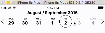
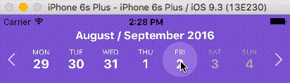
Device Specific Notes
- OnePlus devices use OnePlus Slate font by default which causes text being cut off in the date number in react-native-calendar-strip. To overcome this change the default font of the device or use a specific font throughout your app.
Development with Sample Application
To facilitate development, the example directory has a sample app.
cd example
npm run cp
npm install
npm start
The CalendarStrip source files are copied from the project root directory into example/CalendarStrip using npm run cp. If a source file is modified, it must be copied over again with npm run cp.
Contributing
Contributions are welcome!
- Fork it.
- Create your feature branch:
git checkout -b my-new-feature
- Commit your changes:
git commit -am 'Add some feature'
- Push to the branch:
git push origin my-new-feature
- Submit a pull request :D
Or open up an issue.
Contributors
Thanks goes to these wonderful people (emoji key):
Discussion and Collaboration
In addition to the Github Issues page, there is a Discord group for React Native with a channel specifically for react-native-calendar-strip. Thanks @MichelDiz for setting that up.
License
Licensed under the MIT License.


