react-native-daterange-picker
A React Native component for picking date ranges or single dates.
- Completely customizable
- Uses Moment.js for handling dates
Installation
yarn add react-native-daterange-picker
or
npm install --save react-native-daterange-picker
Usage
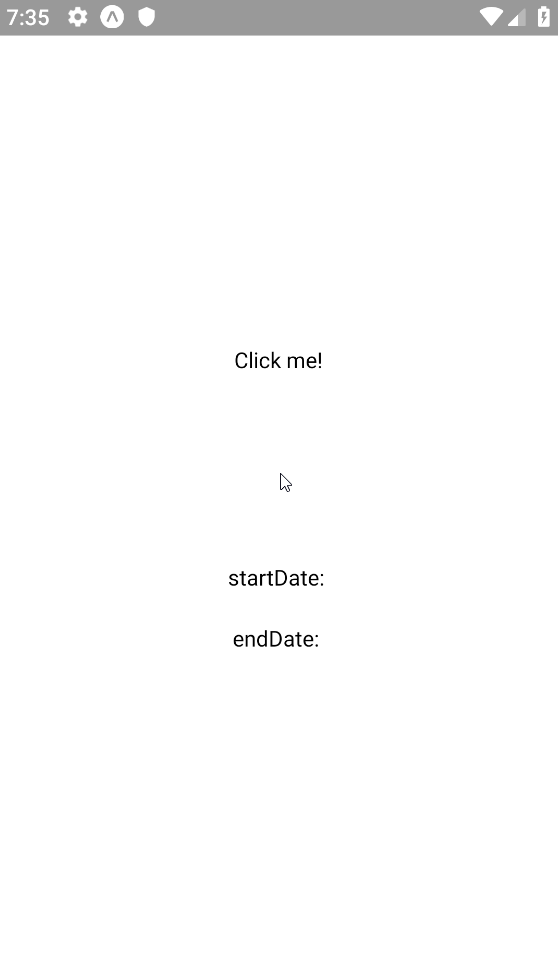
Date range
import React from "react";
import { StyleSheet, View, Text } from "react-native";
import moment from "moment";
import DateRangePicker from "react-native-daterange-picker";

export default class App extends React.Component {
  constructor(props) {
    super(props);
    this.state = {
      startDate: null,
      endDate: null,
      displayedDate: moment(),
    };
  }

  setDates = (dates) => {
    this.setState({
      ...dates,
    });
  };

  render() {
    const { startDate, endDate, displayedDate } = this.state;
    return (
      <View style={styles.container}>
        <DateRangePicker
          onChange={this.setDates}
          endDate={endDate}
          startDate={startDate}
          displayedDate={displayedDate}
          range
        >
          <Text>Click me!</Text>
        </DateRangePicker>
      </View>
    );
  }
}

const styles = StyleSheet.create({
  container: {
    flex: 1,
    backgroundColor: "#fff",
    alignItems: "center",
    justifyContent: "center",
  },
});
Single date
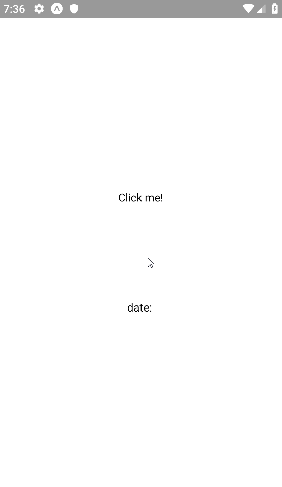
Use the date prop instead of the startDate and endDate props.
import React from "react";
import { StyleSheet, View, Text } from "react-native";
import moment from "moment";
import DateRangePicker from "react-native-daterange-picker";

export default class App extends React.Component {
  constructor(props) {
    super(props);
    this.state = {
      date: null,
      displayedDate: moment(),
    };
  }

  setDates = (dates) => {
    this.setState({
      ...dates,
    });
  };

  render() {
    const { date, displayedDate } = this.state;
    return (
      <View style={styles.container}>
        <DateRangePicker
          onChange={this.setDates}
          date={date}
          displayedDate={displayedDate}
        >
          <Text>Click me!</Text>
        </DateRangePicker>
      </View>
    );
  }
}

const styles = StyleSheet.create({
  container: {
    flex: 1,
    backgroundColor: "#fff",
    alignItems: "center",
    justifyContent: "center",
  },
});
Minimum and maximum allowed dates

Use the minDate and maxDate props to disable the dates that aren't allowed.
import React from "react";
import { StyleSheet, View, Text } from "react-native";
import moment from "moment";
import DateRangePicker from "react-native-daterange-picker";

export default class App extends React.Component {
  constructor(props) {
    super(props);
    this.state = {
      startDate: null,
      endDate: null,
      displayedDate: moment(),
      minDate: moment().set("date", 17),
      maxDate: moment().set("date", 20),
    };
  }

  setDates = (dates) => {
    this.setState({
      ...dates,
    });
  };

  render() {
    const { startDate, endDate, displayedDate, minDate, maxDate } = this.state;
    return (
      <View style={styles.container}>
        <DateRangePicker
          onChange={this.setDates}
          startDate={startDate}
          endDate={endDate}
          minDate={minDate}
          maxDate={maxDate}
          range
          displayedDate={displayedDate}
        >
          <Text>Click me!</Text>
        </DateRangePicker>
      </View>
    );
  }
}

const styles = StyleSheet.create({
  container: {
    flex: 1,
    backgroundColor: "#fff",
    alignItems: "center",
    justifyContent: "center",
  },
});
Setting locale
Simply pass your custom Moment object with locale attached to it as a prop.
import React from "react";
import { StyleSheet, View, Text } from "react-native";
import DateRangePicker from "react-native-daterange-picker";

import moment from "moment/min/moment-with-locales";
moment.locale("en");

export default class App extends React.Component {
  constructor(props) {
    super(props);
    this.state = {
      startDate: null,
      endDate: null,
      displayedDate: moment(),
    };
  }

  setDates = (dates) => {
    this.setState({
      ...dates,
    });
  };

  render() {
    const { startDate, endDate, displayedDate } = this.state;
    return (
      <View style={styles.container}>
        <DateRangePicker
          onChange={this.setDates}
          endDate={endDate}
          startDate={startDate}
          displayedDate={displayedDate}
          range
          moment={moment}
        >
          <Text>Click me!</Text>
        </DateRangePicker>
      </View>
    );
  }
}

const styles = StyleSheet.create({
  container: {
    flex: 1,
    backgroundColor: "#fff",
    alignItems: "center",
    justifyContent: "center",
  },
});
Options
| Property | type | required? | defaultValue | Description |
|---|
| open | boolean | no | | Prop to control calendar visibility state. Passing this prop will disable the default function for toggling visibility off/on by clicking the backdrop/click me button. |
| onChange | function | yes | | Date change callback function. |
| startDate | Moment | yes (if range) | | Value of the picked start date. |
| endDate | Moment | yes (if range) | | Value of the picked end date. |
| date | Moment | yes (if no range) | | Value of the picked single date. |
| displayedDate | Moment | yes | | The date (year/month) which is being displayed on the picker. |
| minDate | Moment | no | | The minimum allowed date for the picker. |
| maxDate | Moment | no | | The maximum allowed date for the picker. |
| range | boolean | no | false | Allows you to pick between range and single date selection. |
| presetButtons | boolean | no | false | Enables preset buttons (Today / This Week / This Month) |
| dayHeaders | boolean | no | true | Allows you to enable/disable day headers. |
| backdropStyle | Object | no | | Styling for the backdrop of the picker. |
| containerStyle | Object | no | | Styling for the picker container. |
| headerStyle | Object | no | | Styling for header area. |
| headerTextStyle | Object | no | | Styling for header text. |
| dayStyle | Object | no | | Styling for a single day element. |
| dayTextStyle | Object | no | | Styling for the text of a single day element. |
| selectedStyle | Object | no | | Styling for selected day element(s). |
| selectedTextStyle | Object | no | | Styling for the text of selected day element(s). |
| dayHeaderStyle | Object | no | | Styling for selected day header element(s). |
| dayHeaderTextStyle | Object | no | | Styling for the text of day header element(s). |
| disabledStyle | Object | no | | Styling for disabled day element(s). |
| buttonStyle | Object | no | | Styling for the preset button(s). |
| buttonTextStyle | Object | no | | Styling for the text of preset button(s). |
| buttonContainerStyle | Object | no | | Styling for the preset button container. |
| monthPrevButton | Node | no | | Icon for previous button. |
| monthNextButton | Node | no | | Icon for next button. |
| monthButtonsStyle | Object | no | | Styling for month prev/next buttons. |
| moment | Moment | no | | Custom Moment object, useful for setting custom locale. |
Questions & Suggestions
Feel free to contact me at deniz@deniz.gg for your questions and suggestions.


