
Research
PyPI Package Disguised as Instagram Growth Tool Harvests User Credentials
A deceptive PyPI package posing as an Instagram growth tool collects user credentials and sends them to third-party bot services.
By Kush Pandya - Jun 06, 2025
react-native-dropdown-autocomplete
Advanced tools
[npm-badge]: https://img.shields.io/npm/v/react-native-dropdown-autocomplete.svg?colorA=6b7c93&colorB=5ab1b8&style=flat-square [npm-url]: https://www.npmjs.com/package/react-native-dropdown-autocomplete [npm-downloads]: https://img.shields.io/npm/dt/react


Based on https://bit.ly/2AFjUsj, the most significant advantage of this package among all others is that you can have multiple autocomplete's on your page after following instructions below. Works on Android and IOS.
npm i react-native-dropdown-autocomplete
withKeyboardAwareScrollView:import React, {Component} from "react";
import {StyleSheet, View, SafeAreaView} from "react-native";
import {Ionicons} from "@expo/vector-icons";
import shortid from "shortid";
import {Autocomplete, withKeyboardAwareScrollView} from "react-native-dropdown-autocomplete";
class HomeScreen extends Component {
handleSelectItem(item, index) {
const {onDropdownClose} = this.props;
onDropdownClose();
console.log(item);
}
render() {
const autocompletes = [...Array(10).keys()];
const apiUrl = "https://5b927fd14c818e001456e967.mockapi.io/branches";
const {scrollToInput, onDropdownClose, onDropdownShow} = this.props;
return (
<View style={styles.autocompletesContainer}>
<SafeAreaView>
{autocompletes.map(() => (
<Autocomplete
key={shortid.generate()}
style={styles.input}
scrollToInput={ev => scrollToInput(ev)}
handleSelectItem={(item, id) => this.handleSelectItem(item, id)}
onDropdownClose={() => onDropdownClose()}
onDropdownShow={() => onDropdownShow()}
renderIcon={() => (
<Ionicons name="ios-add-circle-outline" size={20} color="#c7c6c1" style={styles.plus} />
)}
fetchDataUrl={apiUrl}
minimumCharactersCount={2}
highlightText
valueExtractor={item => item.name}
rightContent
rightTextExtractor={item => item.properties}
/>
))}
</SafeAreaView>
</View>
);
}
}
const styles = StyleSheet.create({
autocompletesContainer: {
paddingTop: 0,
zIndex: 1,
width: "100%",
paddingHorizontal: 8,
},
input: {maxHeight: 40},
inputContainer: {
display: "flex",
flexShrink: 0,
flexGrow: 0,
flexDirection: "row",
flexWrap: "wrap",
alignItems: "center",
borderBottomWidth: 1,
borderColor: "#c7c6c1",
paddingVertical: 13,
paddingLeft: 12,
paddingRight: "5%",
width: "100%",
justifyContent: "flex-start",
},
container: {
flex: 1,
backgroundColor: "#ffffff",
},
plus: {
position: "absolute",
left: 15,
top: 10,
},
});
export default withKeyboardAwareScrollView(HomeScreen);
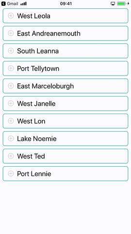
You can also pass fixed array of items to the Autocomplete
const data = [
  "Apples",
  "Broccoli",
  "Chicken",
  "Duck",
  "Eggs",
  "Fish",
  "Granola",
  "Hash Browns",
];
Change valueExtractor and pass the data to Autocomplete without fetchDataUrl
<Autocomplete data={data} valueExtractor={item => item} />
| name | description | type | default |
|---|---|---|---|
| autoCorrect | Disable auto-correct | Boolean | true |
| highlightText | Highlight search results | Boolean | true |
| rightContent | Render additional text to the right of the item | Boolean | false |
| resetOnSelect | Reset the input after choosing an item | Boolean | false |
| minimumCharactersCount | Perform API request after certain number of characters entered | Number | 2 |
| waitInterval | Timeout between user finished typing and new data fetch | Number | 400 |
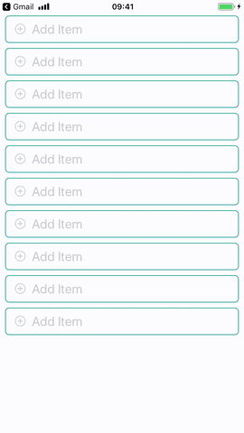
| placeholder | Autocomplete input placeholder text | String | Add Item |
| placeholderColor | Input placeholder color | String | #acada9 |
| spinnerSize | Size of activity indicator | String | small |
| spinnerColor | Activity indicator color | String | #129a8d |
| listHeader | Text at the beginning of suggestions | String | - |
| fetchDataUrl | Data source url | String | - |
| noDataText | Text to display when no results | String | No Results |
| inputContainerStyle | Styles for autocomplete container | Object | - |
| inputStyle | Styles for autocomplete input | Object | - |
| spinnerStyle | Styles for activity indicator | Object | - |
| noDataTextStyle | Styles for empty results text | Object | - |
| separatorStyle | Styles for item dividers | Object | - |
| listFooterStyle | Styles for list footer | Object | - |
| listHeaderStyle | Styles for list header | Object | - |
| rightContentStyle | Styles for right content | Object | - |
| rightContentItemStyle | Styles for right content text | Object | - |
| listHeaderTextStyle | Styles for list header text | Object | - |
| overlayStyle | Styles for overlay view | Object | - |
| pickerStyle | Styles for item picker view | Object | - |
| containerStyle | Styles for dropdown container view | Object | - |
| scrollToInput | Focus on selected field | Function | - |
| handleSelectItem | Selection callback (agrs: item, index) | Function | - |
| onDropdownShow | Show keyboard | Function | - |
| onDropdownClose | Hide keyboard | Function | - |
| renderIcon | Render icon near input | Function | - |
| valueExtractor | Extract value from item (args: item, index) | Function | ({ value }) => value |
| rightTextExtractor | Extract value from item (args: item, index) | Function | ({ value }) => value |
While developing our react-native application I found out that there's no autocomplete library available which can satisfy a need for > 1 autocomplete on a page. Styles were overlapping and due to position: "absolute" we weren't able to actually trigger TouchableOpacity on an element from the list on android device. We used a library which provides dropdown with auto-adjusting position using measureInWindow on a ref, we tweaked it a bit and with autocomplete input and time-slicing implementation we managed to get what we need. Still we can't interact with TextInput component while dropdown is opened but this is the best result we got using React Native Modal.
FAQs
[npm-badge]: https://img.shields.io/npm/v/react-native-dropdown-autocomplete.svg?colorA=6b7c93&colorB=5ab1b8&style=flat-square [npm-url]: https://www.npmjs.com/package/react-native-dropdown-autocomplete [npm-downloads]: https://img.shields.io/npm/dt/react
The npm package react-native-dropdown-autocomplete receives a total of 138 weekly downloads. As such, react-native-dropdown-autocomplete popularity was classified as not popular.
We found that react-native-dropdown-autocomplete demonstrated a not healthy version release cadence and project activity because the last version was released a year ago. It has 1 open source maintainer collaborating on the project.
Did you know?

Socket for GitHub automatically highlights issues in each pull request and monitors the health of all your open source dependencies. Discover the contents of your packages and block harmful activity before you install or update your dependencies.
Research
A deceptive PyPI package posing as an Instagram growth tool collects user credentials and sends them to third-party bot services.

Product
Socket now supports pylock.toml, enabling secure, reproducible Python builds with advanced scanning and full alignment with PEP 751's new standard.

Security News
Research
Socket uncovered two npm packages that register hidden HTTP endpoints to delete all files on command.