react-native-dropdown-autocomplete


Based on https://bit.ly/2AFjUsj, the most significant advantage of this package among all others is that you can have multiple autocomplete's on your page after following instructions below. Works on Android and IOS.
Usage
Install the package
npm i react-native-dropdown-autocomplete
Wrap the page you want to have autocomplete on with withKeyboardAwareScrollView:
import React, {Component} from "react";
import {StyleSheet, View, SafeAreaView} from "react-native";
import {Ionicons} from "@expo/vector-icons";
import shortid from "shortid";
import {Autocomplete, withKeyboardAwareScrollView} from "react-native-dropdown-autocomplete";
class HomeScreen extends Component {
handleSelectItem(item, index) {
const {onDropdownClose} = this.props;
onDropdownClose();
console.log(item);
}
render() {
const autocompletes = [...Array(10).keys()];
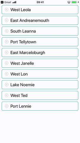
const apiUrl = "https://5b927fd14c818e001456e967.mockapi.io/branches";
const {scrollToInput, onDropdownClose, onDropdownShow} = this.props;
return (
<View style={styles.autocompletesContainer}>
<SafeAreaView>
{autocompletes.map(() => (
<Autocomplete
key={shortid.generate()}
style={styles.input}
scrollToInput={ev => scrollToInput(ev)}
handleSelectItem={(item, id) => this.handleSelectItem(item, id)}
onDropdownClose={() => onDropdownClose()}
onDropdownShow={() => onDropdownShow()}
renderIcon={() => (
<Ionicons name="ios-add-circle-outline" size={20} color="#c7c6c1" style={styles.plus} />
)}
fetchDataUrl={apiUrl}
minimumCharactersCount={2}
highlightText
valueExtractor={item => item.name}
rightContent
rightTextExtractor={item => item.properties}
/>
))}
</SafeAreaView>
</View>
);
}
}
const styles = StyleSheet.create({
autocompletesContainer: {
paddingTop: 0,
zIndex: 1,
width: "100%",
paddingHorizontal: 8,
},
input: {maxHeight: 40},
inputContainer: {
display: "flex",
flexShrink: 0,
flexGrow: 0,
flexDirection: "row",
flexWrap: "wrap",
alignItems: "center",
borderBottomWidth: 1,
borderColor: "#c7c6c1",
paddingVertical: 13,
paddingLeft: 12,
paddingRight: "5%",
width: "100%",
justifyContent: "flex-start",
},
container: {
flex: 1,
backgroundColor: "#ffffff",
},
plus: {
position: "absolute",
left: 15,
top: 10,
},
});
export default withKeyboardAwareScrollView(HomeScreen);
Properties
| autoCorrect | Disable auto-correct | Boolean | true |
| highlightText | Highlight search results | Boolean | true |
| rightContent | Render additional text to the right of the item | Boolean | false |
| minimumCharactersCount | Perform API request after certain number of characters entered | Number | 2 |
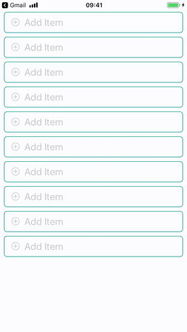
| placeholder | Autocomplete input placeholder text | String | Add Item |
| placeholderColor | Input placeholder color | String | #acada9 |
| spinnerSize | Size of activity indicator | String | small |
| spinnerColor | Activity indicator color | String | #129a8d |
| listHeader | Text at the beginning of suggestions | String | - |
| fetchDataUrl | Data source url | String | - |
| noDataText | Text to display when no results | String | No Results |
| inputContainerStyle | Styles for autocomplete container | Object | - |
| inputStyle | Styles for autocomplete input | Object | - |
| spinnerStyle | Styles for activity indicator | Object | - |
| noDataTextStyle | Styles for empty results text | Object | - |
| separatorStyle | Styles for item dividers | Object | - |
| listFooterStyle | Styles for list footer | Object | - |
| listHeaderStyle | Styles for list header | Object | - |
| rightContentStyle | Styles for right content | Object | - |
| rightContentItemStyle | Styles for right content text | Object | - |
| listHeaderTextStyle | Styles for list header text | Object | - |
| overlayStyle | Styles for overlay view | Object | - |
| pickerStyle | Styles for item picker view | Object | - |
| containerStyle | Styles for dropdown container view | Object | - |
scrollToInput | Focus on selected field | Function | -
handleSelectItem | Selection callback (agrs: item, index) | Function | -
onDropdownShow | Show keyboard | Function | -
onDropdownClose | Hide keyboard | Function | -
renderIcon | Render icon near input | Function | -
valueExtractor | Extract value from item (args: item, index) | Function | ({ value }) => value
rightTextExtractor | Extract value from item (args: item, index) | Function | ({ value }) => value
Authors:
Maksym Plotnikov
Maksym Kordiyak


