react-native-dropdown-with-search-and-checkbox
A customizable React Native dropdown component featuring search functionality and checkbox selection (single & multiple). Ideal for creating dynamic, user-friendly dropdowns in your mobile applications.
Features
- 🔍 Searchable Dropdown: Easily search through the options.
- ☑️ Checkbox Selection: Supports both single and multiple selection.
- 📱 Modal-based Dropdown: Beautiful modal dropdown UI.
- 🎨 Customizable Styles: Extensive styling options for every aspect of the dropdown.
Installation
Install the package using npm:
npm install react-native-dropdown-with-search-and-checkbox
Additionally, make sure to install the required dependencies:
npm install react-native-elements react-native-vector-icons
For React Native versions below 0.60, link react-native-vector-icons manually:
npx react-native link react-native-vector-icons
Usage
To use the dropdown in your React Native app, follow the example below:
Basic Example
import React, { useState } from 'react';
import { View, Text } from 'react-native';
import { DropdownSearch } from 'react-native-dropdown-with-search-and-checkbox';

const App = () => {
  const [selectedItems, setSelectedItems] = useState([]);

  const data = [
    { label: 'Apple', value: 'apple' },
    { label: 'Banana', value: 'banana' },
    { label: 'Mango', value: 'mango' },
  ];

  return (
    <View style={{ flex: 1, justifyContent: 'center' }}>
      <Text>Select Fruits</Text>
      <DropdownSearch
        label="Fruits"
        data={data}
        placeholder="Select fruits"
        multiSelect={true}
        showCheckbox="multiple"
        showFilter={true}
        onSelect={(items) => setSelectedItems(items)}
      />
    </View>
  );
};

export default App;
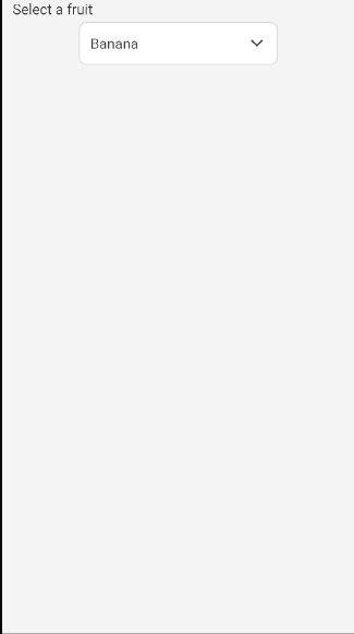
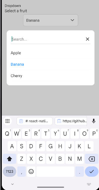
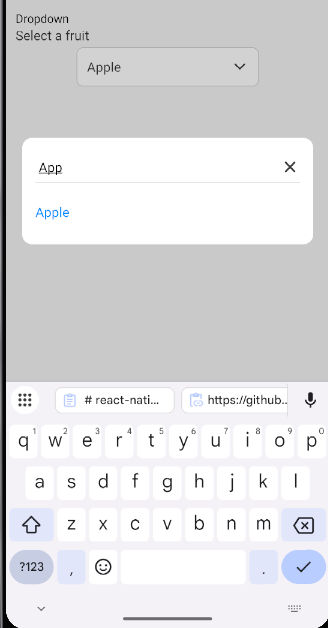
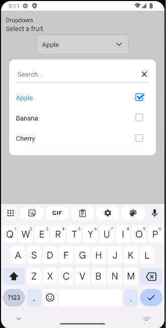
Example 1 Search with Single Select :
Screenshot
Props
data | array | [] | List of items to display in the dropdown |
onSelect | func | required | Callback function to handle selected items |
label | string | '' | Label displayed above the dropdown |
placeholder | string | 'Select...' | Placeholder text displayed when no selection is made |
labelKey | string | 'label' | The key name to access the label in each data item |
valueKey | string | 'value' | The key name to access the value in each data item |
multiSelect | bool | false | Enables or disables multiple selection |
showCheckbox | string | null | Set to 'multiple' to display checkboxes for multiple selection |
showFilter | bool | false | Shows the filter icon and search input |
saveButtonText | string | 'Save' | Text for the Save button when multiple items are selected |
placeholderStyle | object | {} | Custom styling for the placeholder text |
downArrowStyle | object | {} | Custom styling for the dropdown arrow icon |
filterIconStyle | object | {} | Custom styling for the filter icon |
searchInputStyle | object | {} | Custom styling for the search input |
dropdownButtonStyle | object | {} | Custom styling for the dropdown button |
checkboxStyle | object | {} | Custom styling for the checkbox |
checkboxColor | string | '#007bff' | Color for the checkbox |
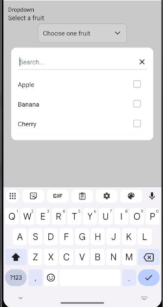
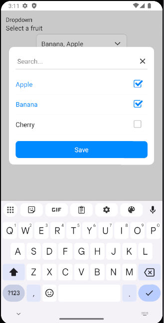
Example 2 Search with Multiple Select :
Screenshot
Example with Multiple Selection
import React, { useState } from 'react';
import { View, Text } from 'react-native';
import { DropdownSearch } from 'react-native-dropdown-with-search-and-checkbox';

const MultiSelectExample = () => {
  const [selectedItems, setSelectedItems] = useState([]);

  const data = [
    { label: 'Apple', value: 'apple' },
    { label: 'Banana', value: 'banana' },
    { label: 'Mango', value: 'mango' },
  ];

  return (
    <View style={{ flex: 1, justifyContent: 'center' }}>
      <Text>Multi-select Fruits</Text>
      <DropdownSearch
        label="Fruits"
        data={data}
        placeholder="Select fruits"
        multiSelect={true}
        showCheckbox="multiple"
        onSelect={(items) => setSelectedItems(items)}
      />
      <Text>Selected: {selectedItems.map(item => item.label).join(', ')}</Text>
    </View>
  );
};

export default MultiSelectExample;
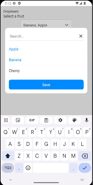
Example 3 Search with Multi Select :
Screenshot
License
MIT
Author
Bhumit Dara


