react-native-fast-toast
A Toast component for react-native, supports Android, IOS, Web, Windows
Features
- Normal, Success, Danger and Warning toasts
- Customizable and Icon support
- Smooth animation
- Fully typed with TypeScript
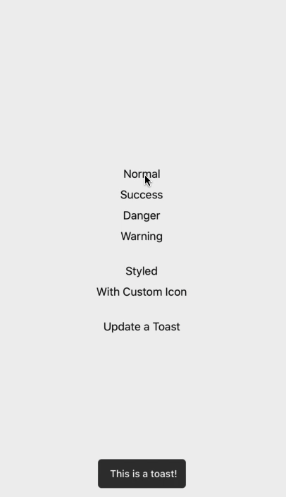
Demo
Install
Open a Terminal in the project root and run:
yarn add react-native-fast-toast
Basic Example
import React, { useEffect, useRef } from "react";
import { View } from "react-native";
import Toast from "react-native-fast-toast";

export default function App() {
  const toast = useRef(null);

  useEffect(() => {
    toast.current.show("Task finished successfully");
  }, []);

  return (
    <>
      <RestOfYourApp />
      <Toast ref={toast} />
    </>
  );
Global Example
If you want to have one Toast and use it everywhere on your app. do this in root component of your app (index.js or App.js)
import React, { useEffect, useRef } from "react";
import { View } from "react-native";
import Toast from "react-native-fast-toast";
export default function App() {
const toast = useRef(null);
useEffect(() => {
global['toast'] = toast.current
}, []);
return (
<>
<RestOfYourApp />
<Toast ref={toast} />
</>
);
now you can call toast.show() everywhere on app. like alert.
Type Example
toast.current.show('Task finished successfully', { type: 'success' })
Icon Example
toast.current.show('Task finished successfully', { icon: <Icon /> })
or
<Toast
  ref={toast}
  icon={<Icon />}
  successIcon={<SuccessIcon />}
  dangerIcon={<DangerIcon />}
  warningIcon={<WarningIcon />}
/>
}
Customize
toast.current.show('Task finished successfully', {
   duration: 5000,
   style: { padding: 0 },
   textStyle: { fontSize: 20 }
})
You can customize default options in Toast component
<Toast ref={toast} duration={5000} textStyle={{ fontSize: 20 }} />
Contributing
Pull request are welcome.
While developing, you can run the example app to test your changes.


