Research
Security News
Lazarus Strikes npm Again with New Wave of Malicious Packages
The Socket Research Team has discovered six new malicious npm packages linked to North Korea’s Lazarus Group, designed to steal credentials and deploy backdoors.
react-native-fast-toast
Advanced tools
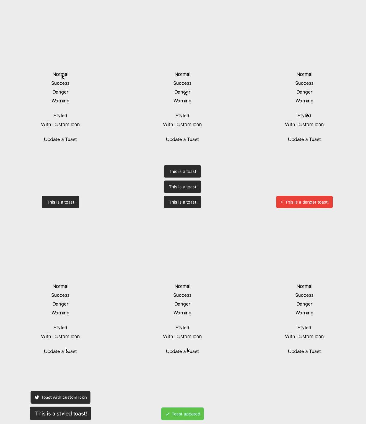
A Toast component for react-native, supports Android, IOS, Web, Windows
A Toast component for react-native, supports Android, IOS, Web, Windows

Open a Terminal in the project root and run:
yarn add react-native-fast-toast
import React, { useEffect, useRef } from "react";
import Toast from "react-native-fast-toast";

export default function App() {
  const toast = useRef(null);

  useEffect(() => {
    toast.current.show("Task finished successfully");
  }, []);

  return (
    <>
      <RestOfYourApp />
      <Toast ref={toast} />
    </>
  );
If you want to have one Toast and use it everywhere on your app. do this in root component of your app (index.js or App.js)
import Toast from "react-native-fast-toast";

export default function App() {
  return (
    <>
      <RestOfYourApp />
      <Toast ref={(ref) => global['toast'] = ref} />
    </>
  );
now you can call toast.show() everywhere on app. like alert.
Check index.d.ts in example app for typescript.
toast.current.show("Task finished successfully", { type: "success" });
toast.current.show("Task finished successfully", { icon: <Icon /> });
or
<Toast
  ref={toast}
  icon={<Icon />}
  successIcon={<SuccessIcon />}
  dangerIcon={<DangerIcon />}
  warningIcon={<WarningIcon />}
/>
}
toast.current.show("Task finished successfully", {
  duration: 5000,
  style: { padding: 0 },
  textStyle: { fontSize: 20 },
});
You can customize default options in Toast component
<Toast duration={5000} textStyle={{ fontSize: 20 }} />
<Toast
  placement="bottom | top" // default to bottom
  offset={50} // distance from bottom or top. ( default to 60 )
/>
Pull request are welcome.
While developing, you can run the example app to test your changes.
FAQs
[![Version][version-badge]][package] [![MIT License][license-badge]][license]
We found that react-native-fast-toast demonstrated a not healthy version release cadence and project activity because the last version was released a year ago. It has 1 open source maintainer collaborating on the project.
Did you know?

Socket for GitHub automatically highlights issues in each pull request and monitors the health of all your open source dependencies. Discover the contents of your packages and block harmful activity before you install or update your dependencies.

Research
Security News
The Socket Research Team has discovered six new malicious npm packages linked to North Korea’s Lazarus Group, designed to steal credentials and deploy backdoors.

Security News
Socket CEO Feross Aboukhadijeh discusses the open web, open source security, and how Socket tackles software supply chain attacks on The Pair Program podcast.

Security News
Opengrep continues building momentum with the alpha release of its Playground tool, demonstrating the project's rapid evolution just two months after its initial launch.