Security News
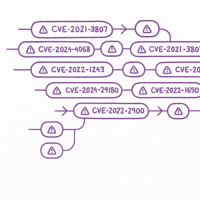
Static vs. Runtime Reachability: Insights from Latio’s On the Record Podcast
The Latio podcast explores how static and runtime reachability help teams prioritize exploitable vulnerabilities and streamline AppSec workflows.
react-native-gesture-bottom-sheet
Advanced tools
A simple and easy to use bottom sheet component with drag gestures for React Native
Need a lightweight and easy-to-use bottom sheet component? Here it is!
A cross-platform Bottom Sheet component which supports gestures.

Open a Terminal in the project root and run:
yarn add react-native-gesture-bottom-sheet
import React, { useRef } from "react";
import { SafeAreaView, TouchableOpacity, Text, StyleSheet } from "react-native";
import BottomSheet from "react-native-gesture-bottom-sheet";
import styles from "./styles";

const Example = () => {
  // Needed in order to use .show()
  const bottomSheet = useRef();

  return (
    <SafeAreaView style={styles.container}>
      <BottomSheet hasDraggableIcon ref={bottomSheet} height={600} />
      <TouchableOpacity
        style={styles.button}
        onPress={() => bottomSheet.current.show()}
      >
        <Text style={styles.text}>Open modal</Text>
      </TouchableOpacity>
    </SafeAreaView>
  );
};

const styles = StyleSheet.create({
  button: {
    height: 50,
    width: 150,
    backgroundColor: "#140078",
    justifyContent: "center",
    alignItems: "center",
    borderRadius: 20,
    shadowColor: "#8559da",
    shadowOpacity: 0.7,
    shadowOffset: {
      height: 4,
      width: 4
    },
    shadowRadius: 5,
    elevation: 6
  },
  text: {
    color: "white",
    fontWeight: "600"
  },
  container: {
    flex: 1,
    justifyContent: "center",
    alignItems: "center"
  }
});

export default Example;
height - integer (required)Sets the panel size.
hasDraggableIcon - boolean (Default - false)Controls visibility of the draggable icon on top of the modal.
draggable - boolean (Default - true)Specify whether the panel is draggable or not.
FAQs
A simple and easy to use bottom sheet component with drag gestures for React Native
The npm package react-native-gesture-bottom-sheet receives a total of 281 weekly downloads. As such, react-native-gesture-bottom-sheet popularity was classified as not popular.
We found that react-native-gesture-bottom-sheet demonstrated a not healthy version release cadence and project activity because the last version was released a year ago. It has 2 open source maintainers collaborating on the project.
Did you know?

Socket for GitHub automatically highlights issues in each pull request and monitors the health of all your open source dependencies. Discover the contents of your packages and block harmful activity before you install or update your dependencies.

Security News
The Latio podcast explores how static and runtime reachability help teams prioritize exploitable vulnerabilities and streamline AppSec workflows.

Security News
The latest Opengrep releases add Apex scanning, precision rule tuning, and performance gains for open source static code analysis.

Security News
npm now supports Trusted Publishing with OIDC, enabling secure package publishing directly from CI/CD workflows without relying on long-lived tokens.