Product
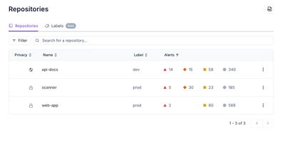
Redesigned Repositories Page: A Faster Way to Prioritize Security Risk
Our redesigned Repositories page adds alert severity, filtering, and tabs for faster triage and clearer insights across all your projects.
react-native-gesture-recognizers
Advanced tools
React Native gesture recognizer decorators. Just decorate your component and easily respond to pans and swipes!
Please report any issues you find!
Do an npm i react-native-gesture-recognizers and then try out one of the examples below!
import React, { Component, Text, View, Animated } from 'react-native';
import { pannable } from 'react-native-gesture-recognizers';

@pannable({
  setGestureState: false
})
class PanMe {

  render() {
    return (
      <View style={{width:100, height: 100, backgroundColor: 'red'}}>
        <Text>Pan me!</Text>
      </View>
    );
  }
}

class TransformOnPan extends Component {

  constructor(props, context) {
    super(props, context);
    this.state = {
      transform: new Animated.ValueXY(),
    }
  }

  onPan = ({ absoluteChangeX, absoluteChangeY }) => {
    this.state.transform.setValue({
      x: absoluteChangeX,
      y: absoluteChangeY,
    });
  }

  render() {
    const { transform } = this.state;

    return (
      // we transform the decorator instead of the decorated view,
      // so there won't be any issues with ghost panning,
      // due to the wrapping view staying in place and receiving touches
      <PanMe
        onPan={this.onPan}
        panDecoratorStyle={{transform: transform.getTranslateTransform()}} />
    );
  }
}

import React, { Component, Text, View, LayoutAnimation } from 'react-native';
import { swipeable } from 'react-native-gesture-recognizers';
const { directions: { SWIPE_UP, SWIPE_LEFT, SWIPE_DOWN, SWIPE_RIGHT } } = swipeable;

@swipeable({
  horizontal:true,
  vertical: true,
  continuous: false,
  initialVelocityThreshold: 0.7
})
class SwipeMe {

  render() {
    const { swipe: { direction } } = this.props;
    return (
      <View style={{
        width:250,
        height:250,
        alignItems: 'center',
        justifyContent: 'center'}}>
        {!direction ? <Text>Swipe me!</Text> : <Text style={{fontWeight:'700'}}>{direction}!</Text>}
      </View>
    );
  }

}

class TransformOnSwipe extends Component {

  constructor(props, context) {
    super(props, context);
    this.state = {
      color: 'yellow',
      x: 0,
      y: 0,
    }
  }

  onSwipeBegin = ({ direction, distance, velocity }) => {
    let { x, y, color } = this.state;
    // x and y values are hardcoded for an iphone6 screen
    switch (direction) {
      case SWIPE_LEFT:
        x = 0;
        color = 'yellow';
        break;
      case SWIPE_RIGHT:
        x = 125;
        color = 'blue';
        break;
      case SWIPE_UP:
        y = 0;
        color = 'green';
        break;
      case SWIPE_DOWN:
        y = 417;
        color = 'purple';
        break;
    }
    LayoutAnimation.configureNext(LayoutAnimation.Presets.spring);

    this.setState({
      x, y, color
    });
  }

  render() {
    const { transform, reset, color, x ,y } = this.state;

    return (
      <SwipeMe
        onSwipeBegin={this.onSwipeBegin}
        swipeDecoratorStyle={{
          backgroundColor: color,
          left: x,
          top: y,
          position:'absolute',
        }} />
    );
  }

}

setGestureState Boolean
Whether the decorator should pass the current pan state to the decorated child. If you only use the callbacks to react to panning, then you can set this to false.
Default: true
onPanBegin({ originX, originY }) Function
Gets called once at the begin of the gesture.
onPan({ absoluteChangeX, absoluteChangeY, changeX, changeY }) Function
Gets called whenever the touch moves.
onPanEnd() Function
Gets called when the gesture is released or terminated. (The user ended the touch or it was forcefully interrupted)
panDecoratorStyle Object
A custom style object, which will be applied to the wrapper view.
resetPan Boolean
When true is passed, it will reset the state of the panning decorator. This can be useful if you want to reset the absolute change values, since these stay stored until you reset them.
setGestureState Boolean
Whether the decorator should pass the current pan state to the decorated child. If you only use the callbacks to react to panning, then you can set this to false.
horizontal Boolean
Whether horizontal swipes should be detected.
Default: false
vertical Boolean
Whether vertical swipes should be detected.
Default: false
left Boolean
Whether left swipes should be detected.
Default: false
right Boolean
Whether right swipes should be detected.
Default: false
up Boolean
Whether upward swipes should be detected.
Default: false
up Boolean
Whether downward swipes should be detected.
Default: false
continuous Boolean
If true, then you will receive an update each time the touch moves. If false you will only receive a single notification about the touch.
Default: true
initialVelocityThreshold Number
Defines the initial velocity necessary for the swipe to be registered.
Default: 0.7
verticalThreshold Number
Defines how far the touch can stray from the x-axis in y-direction when detecting horizontal touches.
Default: 10
horizontalThreshold Number
Defines how far the touch can stray from the y-axis in x-direction when detecting vertical touches.
Default: 10
onSwipeBegin({ direction, distance, velocity }) Function
Gets called once at the begin of the gesture.
onSwipe({ direction, distance, velocity }) Function
Gets called whenever the touch moves, if continuous is true.
onSwipeEnd({ direction }) Function
Gets called when the gesture is released or terminated. (The user ended the touch or it was forcefully interrupted)
swipeDecoratorStyle Object
A custom style object, which will be applied to the wrapper view.
FAQs
Gesture recognizer decorators for react-native
The npm package react-native-gesture-recognizers receives a total of 10 weekly downloads. As such, react-native-gesture-recognizers popularity was classified as not popular.
We found that react-native-gesture-recognizers demonstrated a not healthy version release cadence and project activity because the last version was released a year ago. It has 1 open source maintainer collaborating on the project.
Did you know?

Socket for GitHub automatically highlights issues in each pull request and monitors the health of all your open source dependencies. Discover the contents of your packages and block harmful activity before you install or update your dependencies.

Product
Our redesigned Repositories page adds alert severity, filtering, and tabs for faster triage and clearer insights across all your projects.

Security News
Multiple deserialization flaws in PyTorch Lightning could allow remote code execution when loading untrusted model files, affecting versions up to 2.4.0.

Security News
NVD now marks all pre-2018 CVEs as "Deferred," signaling it will no longer enrich older vulnerabilities, further eroding trust in its data.