
Security News
Vite+ Joins the Push to Consolidate JavaScript Tooling
Evan You announces Vite+, a commercial, Rust-powered toolchain built on the Vite ecosystem to unify JavaScript development and fund open source.
By Sarah Gooding - Oct 15, 2025
react-native-in-app-notification-pink
Advanced tools
Customisable in-app notification component for React Native
:bell: Customisable in-app notification component for React Native
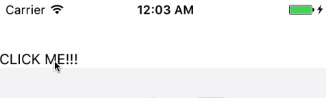
The basic look of react-native-in-app-notification:
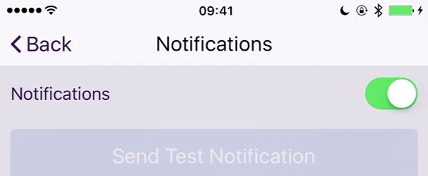
What you can make react-native-in-app-notification do with a customised component:
yarn add react-native-in-app-notification
OR
npm install react-native-in-app-notification --save
For Android you need to add the VIBRATE permission to your app AndroidManifest.xml
<manifest xmlns:android="http://schemas.android.com/apk/res/android"
    package="your.app.package.name">

    <uses-permission android:name="android.permission.INTERNET" />
    <uses-permission android:name="android.permission.SYSTEM_ALERT_WINDOW"/>

    <!-- Required by react-native-in-app-notification -->
    <uses-permission android:name="android.permission.VIBRATE" />

    ...
</manifest>
| version | RN |
|---|---|
| >=3.0.0 | >= 0.54.0 |
| <3.0.0 | >= 0.43.4 |
| Prop Name | Prop Description | Data Type | Required | Default |
|---|---|---|---|---|
| closeInterval | How long the notification stays visible | Number | No | 4000 |
| openCloseDuration | The length of the open / close animation | Number | No | 200 |
| height | The height of the Notification component | Number | No | 80 |
| backgroundColour | The background colour of the Notification component | String | No | white |
| iconApp | App Icon | ImageSourcePropType | No | null |
| notificationBodyComponent | See below about NotificationBody | React Node or Function | Recommended | ./DefaultNotificationBody |
The notification body is what is rendered inside the main Notification component and gives you the ability to customise how the notification looks. You can use the default notification body component in ./DefaultNotificationBody.js as inspiration and guidance.
Your notificationBodyComponent component is given four props:
| Prop Name | Prop Description | Data Type | Default |
|---|---|---|---|
| title | The title passed to NotificationRef.show | String | '' |
| message | The message passed to NotificationRef.show | String | '' |
| onPress | The callback passed to NotificationRef.show | Function | null |
| icon | Icon for notification passed to NotificationRef.show | ImageSourcePropType | null |
| vibrate | Vibrate on show notification passed to NotificationRef.show | Boolean | true |
Adding react-native-in-app-notification is simple;
Just wrap you main App component with the InAppNotificationProvider component exported from this module.
import { InAppNotificationProvider } from 'react-native-in-app-notification';

import App from './App.js';

class AppWithNotifications extends Component {
  render() {
    return (
      <InAppNotificationProvider>
        <App />
      </InAppNotificationProvider>
    );
  }
}
When you want to show the notification, just wrap the component which needs to display a notification with the withInAppNotification HOC and call the .showNotification methods from its props.
.showNotification can take three arguments (all of which are optional):
titlemessageonPressN.B: you should probably include at least one of title or message!
onPress doesn't need to be used for passive notifications and you can use onClose in your NotificationBody component to allow your users to close the notification.
import React, { Component } from 'react';
import { View, Text, TouchableHighlight } from 'react-native';
import { withInAppNotification } from 'react-native-in-app-notification';

class MyApp extends Component {
  render() {
    return (
      <View>
        <Text>This is my app</Text>
        <TouchableHighlight
          onPress={() => {
            this.props.showNotification({
              title: 'You pressed it!',
              message: 'The notification has been triggered',
              onPress: () => Alert.alert('Alert', 'You clicked the notification!')
            });
          }}
        >
          <Text>Click me to trigger a notification</Text>
        </TouchableHighlight>
      </View>
    );
  }
}

export default withInAppNotification(MyApp);
FAQs
Customisable in-app notification component for React Native
We found that react-native-in-app-notification-pink demonstrated a not healthy version release cadence and project activity because the last version was released a year ago. It has 1 open source maintainer collaborating on the project.
Did you know?

Socket for GitHub automatically highlights issues in each pull request and monitors the health of all your open source dependencies. Discover the contents of your packages and block harmful activity before you install or update your dependencies.
Security News
Evan You announces Vite+, a commercial, Rust-powered toolchain built on the Vite ecosystem to unify JavaScript development and fund open source.

Security News
Ruby Central’s incident report on the RubyGems.org access dispute sparks backlash from former maintainers and renewed debate over project governance.

Research
/Security News
Socket researchers uncover how threat actors weaponize Discord across the npm, PyPI, and RubyGems ecosystems to exfiltrate sensitive data.