
Research
wget to Wipeout: Malicious Go Modules Fetch Destructive Payload
Socket's research uncovers three dangerous Go modules that contain obfuscated disk-wiping malware, threatening complete data loss.
By Kush Pandya - May 01, 2025
react-native-js-shimmer-placeholder
Advanced tools
Shimmering effect using react-native-reanimated, react-native-linear-gradient and react-native-masked-view
npm install react-native-js-shimmer-placeholder
or using yarn
yarn add react-native-js-shimmer-placeholder
To use shimmering effect for View
import { ViewPlaceholder } from "react-native-js-shimmer-placeholder";

<ViewPlaceholder
  show={true}
  width={100}
  height={100}
  style={{
    borderWidth: 1,
    borderColor: "lightgrey",
    borderRadius: 50,
  }}
  gradientContainerStyle={{ borderRadius: 50 }}
>
  <View
    style={{
      height: 100,
      backgroundColor: "#318fb5",
      borderRadius: 50,
      alignItems: "center",
      justifyContent: "center",
    }}
  >
    <Text style={{ fontSize: 30 }}>🚀</Text>
  </View>
</ViewPlaceholder>;
To use shimmering effect for Text
import { TextPlaceholder } from "react-native-js-shimmer-placeholder";

<TextPlaceholder
  show={true}
  textStyle={{ fontSize: 24, fontWeight: "bold" }}
  style={{
    flex: 1,
    width: "100%",
    justifyContent: "center",
    alignItems: "center",
  }}
  textColor={"#318fb5"}
>
  Hey React Native devs!
</TextPlaceholder>;
| Prop | Description | Default |
|---|---|---|
baseColor | The base color of the linear gradient | white |
canTriggerAnimationCompletion | Conditional trigger of Animation completion (useful for lists) | true |
end | Same as the prop used in Linear Gradient | { x: 1, y:0 } |
gradientStyle | Style for the Linear Gradient itself | {} |
highlightColor | The highlight color for the shimmer | rgba(211,211,211,0.5) |
locations | Same as the prop used in Linear Gradient | [0, 0.5, 1] |
onAnimationComplete | Triggers on animation completion | emptyFn |
show | Whether to show the shimmer effect | true |
start | Same as the prop used in Linear Gradient | { x: 0, y:0 } |
totalDuration | Duration of the single shimmer cycle | 1500 |
| Prop | Description | Default |
|---|---|---|
children | Child to render inside placeholder | null |
childrenWrapperStyle | Wrapper style for the children | {} |
style | Container style for shimmer which wraps the Linear Gradient and the children you pass | {} |
gradientContainerStyle | Container style for gradient | {} |
height | Height of the shimmer | 100% |
width | Width of the Shimmer | Required |
To pass View props just pass the props as you do for a View Component
| Prop | Description | Default |
|---|---|---|
children | Text to be shimmered | undefined |
style | Style for the MaskedView | { flex:1 } |
viewBehindMaskStyle | Children of MaskedView which gives the actual color for the Text | { flex:1, width:"100%" } |
textStyle | Style for Text to be rendered | {} |
textColor | Text color of the children | #5F717B |
To pass Text Props just pass the props as you do for a Text Component
Any help to improve the module is appreciated
react-native-js-shimmer-placeholder is licensed under The MIT License
FAQs
A Shimmer using React Native Reanimated
The npm package react-native-js-shimmer-placeholder receives a total of 9 weekly downloads. As such, react-native-js-shimmer-placeholder popularity was classified as not popular.
We found that react-native-js-shimmer-placeholder demonstrated a not healthy version release cadence and project activity because the last version was released a year ago. It has 1 open source maintainer collaborating on the project.
Did you know?

Socket for GitHub automatically highlights issues in each pull request and monitors the health of all your open source dependencies. Discover the contents of your packages and block harmful activity before you install or update your dependencies.
Research
Socket's research uncovers three dangerous Go modules that contain obfuscated disk-wiping malware, threatening complete data loss.
Research
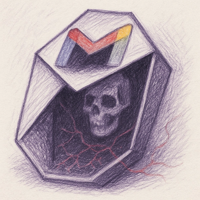
Socket uncovers malicious packages on PyPI using Gmail's SMTP protocol for command and control (C2) to exfiltrate data and execute commands.
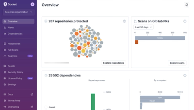
Product
We redesigned Socket's first logged-in page to display rich and insightful visualizations about your repositories protected against supply chain threats.