Product
Introducing Tier 1 Reachability: Precision CVE Triage for Enterprise Teams
Socket’s new Tier 1 Reachability filters out up to 80% of irrelevant CVEs, so security teams can focus on the vulnerabilities that matter.
react-native-keyboard-accessory
Advanced tools
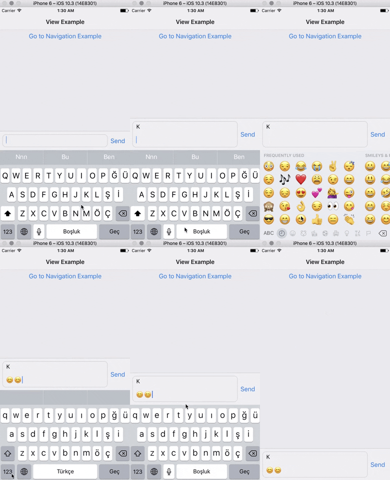
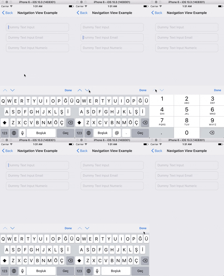
A React Native Keyboard Accessory (View, Navigation) Component. Sticky views on keyboard.
A React Native Keyboard Accessory (View, Navigation) Component. Sticky views on keyboard.


Expo Snack Playground
https://snack.expo.io/@ardaogulcan/react-native-keyboard-accessory-playground
Via npm:
npm install react-native-keyboard-accessory --save
Via Yarn:
yarn add react-native-keyboard-accessory
You can use the KeyboardAccessoryView or the KeyboardAccessoryNavigation
components.
Import react-native-keyboard-accessory
import { KeyboardAccessoryView } from 'react-native-keyboard-accessory'
Use it inside your render() function:
<KeyboardAccessoryView>
  <View>
    <TextInput />
  </View>
</KeyboardAccessoryView>
Important: KeyboardAccessoryView should be positioned inside the Root Element which is covering the screen, mostly the top most view styled as { flex: 1 }.
Alternatively, you can also pass a function as the children prop of the component. This allows you to access an isKeyboardVisible prop which is useful to render things conditionally based on the visibility of the keyboard:
<KeyboardAccessoryView>
  {({ isKeyboardVisible }) => {
    return (
      <>
        <Text>Always visible</Text>
        {!isKeyboardVisible ? (
          <Text>Hidden when keyboard is visible</Text>
        ) : null}
      </>
    );
  }}
</KeyboardAccessoryView>
Import react-native-keyboard-accessory
import { KeyboardAccessoryNavigation } from 'react-native-keyboard-accessory'
And use it inside your render() function:
<KeyboardAccessoryNavigation />
Important: KeyboardAccessoryNavigation should be positioned inside the Root Element which is covering the screen, mostly the top most view styled as { flex: 1 }.
For Android, make sure you have set android:windowSoftInputMode to adjustResize in android/app/src/main/AndroidManifest.xml
And set androidAdjustResize to true. For example,
<KeyboardAccessoryView androidAdjustResize />
// or
<KeyboardAccessoryNavigation androidAdjustResize />
<KeyboardAccessoryNavigation avoidKeyboard />
| Prop | Type | Default | Description |
|---|---|---|---|
style | object | null | Style object or StyleSheet reference which will be applied to Accessory View |
animateOn | enum:string | 'ios' | Enables show/hide animation on given platform. Values: ['ios', 'android', 'all', 'none']. |
animationConfig | function or object | null | For passing custom animations to show/hide. If given prop is function, duration and easing parameters from Keyboard event will be passed to the function, function should return LayoutAnimation compatible animation config. Or you can directly pass animation config object. |
alwaysVisible | boolean | false | When set to true Accessory View will be always visible at the bottom of the screen. Good for sticky TextInput's |
bumperHeight | number | 15 | Bumper height to prevent visual glitches if animation couldn't keep up with the keyboard animation. |
visibleOpacity | number | 1 | Opacity of the Accessory when it is visible. Note: Opacity is used for hiding the accessory to prevent render delays. |
heightProperty | enum:string | height | Control how the component manages its height. The component listens for children changes and automatically adjusts its height, so height is usually sufficient. For use with a multiline, autogrowing TextInput, minHeight is recommended. Values: ['height', 'minHeight'] |
hiddenOpacity | number | 0 | Opacity of the Accessory when it is hidden. |
hideBorder | boolean | false | Set true if you want to hide top border of the Accessory |
inSafeAreaView | boolean | false | Set true if you want to adapt SafeAreaView on iPhone X |
androidAdjustResize | boolean | false | Set true in ejected apps to adjust resize |
avoidKeyboard | boolean | false | Set true if you want accessory to maintain KeyboardAvoidingView behavior. You shouldn't use any other Keyboard Avoiding library when you set this to true |
All the KeyboardAccessoryView props will be passed.
| Prop | Type | Default | Description |
|---|---|---|---|
doneButtonTitle | string | 'Done' | Title text to show on the right Button of Navigation View |
tintColor | string | '#007AFF' | Tint color for the arrows and done button |
doneButton | node | null | Replace default Done Button. Non-Touchable node should be provided. |
nextButton | node | null | Replace default Next Button. Non-Touchable node should be provided. |
previousButton | node | null | Replace default Previous Button. Non-Touchable node should be provided. |
doneDisabled | boolean | false | Disables Done Button |
nextDisabled | boolean | false | Disables Next Button |
previousDisabled | boolean | false | Disables Previous Button |
doneHidden | boolean | false | Hides Done Button |
nextHidden | boolean | false | Hides Next Button |
previousHidden | boolean | false | Hides Previous Button |
accessoryStyle | object | null | Style object or StyleSheet reference which will be applied to Navigation Accessory View. |
doneButtonStyle | object | null | Style object or StyleSheet reference which will be applied to Done Button View |
doneButtonTitleStyle | object | null | Style object or StyleSheet reference which will be applied to Done Button Text |
doneButtonHitslop | Insets | { left: 0, top: 0, right: 0, bottom: 0 } | This defines how far your touch can start away from the doneButton |
previousButtonStyle | object | 0 | Style object or StyleSheet reference which will be applied to Previous Button View |
nextButtonStyle | object | 0 | Style object or StyleSheet reference which will be applied to Next Button View |
nextButtonDirection | enum:string | 'down' | Arrow direction for the Next Button. Values: ['down', 'up', 'right', 'left']. |
nextButtonHitslop | Insets | { left: 0, top: 0, right: 0, bottom: 0 } | This defines how far your touch can start away from the nextButton |
previousButtonDirection | enum:string | 'up' | Arrow direction for the Previous Button. Values: ['down', 'up', 'right', 'left']. |
previousButtonHitslop | Insets | { left: 0, top: 0, right: 0, bottom: 0 } | This defines how far your touch can start away from the previousButton |
onDone | function | null | Triggered on Done Button press |
onNext | function | null | Triggered on Next Button press |
onPrevious | function | null | Triggered on Previous Button press |
| Prop | Type | Default | Description |
|---|---|---|---|
TabBarComponent | node, function | Provide TabBarComponent to render. Usually from react-navigation |
FAQs
A React Native Keyboard Accessory (View, Navigation) Component. Sticky views on keyboard.
We found that react-native-keyboard-accessory demonstrated a not healthy version release cadence and project activity because the last version was released a year ago. It has 1 open source maintainer collaborating on the project.
Did you know?

Socket for GitHub automatically highlights issues in each pull request and monitors the health of all your open source dependencies. Discover the contents of your packages and block harmful activity before you install or update your dependencies.

Product
Socket’s new Tier 1 Reachability filters out up to 80% of irrelevant CVEs, so security teams can focus on the vulnerabilities that matter.

Research
/Security News
Ongoing npm supply chain attack spreads to DuckDB: multiple packages compromised with the same wallet-drainer malware.

Security News
The MCP Steering Committee has launched the official MCP Registry in preview, a central hub for discovering and publishing MCP servers.