Research
PyPI Package Disguised as Instagram Growth Tool Harvests User Credentials
A deceptive PyPI package posing as an Instagram growth tool collects user credentials and sends them to third-party bot services.
react-native-loading-spinner-overlay
Advanced tools
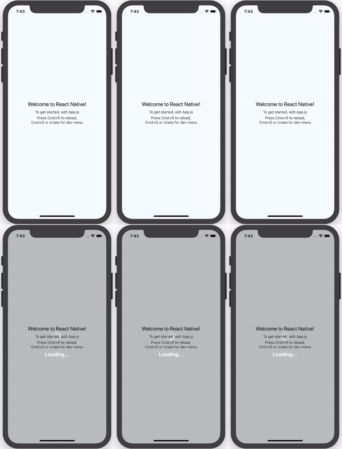
The only pure React Native Native iOS and Android loading spinner (progress bar indicator) overlay

npm:
npm install react-native-loading-spinner-overlay
yarn:
yarn add react-native-loading-spinner-overlay
See the example App.js file for an example implementation.
| Property | Type | Default | Description |
|---|---|---|---|
| cancelable | Boolean | false | Android: If set to false, it will prevent spinner from hiding when pressing the hardware back button. If set to true, it will allow spinner to hide if the hardware back button is pressed. |
| color | String | "white" | Changes the spinner's color (example values are red, #ff0000, etc). For adjusting the contrast see overlayColor prop below. |
| animation | String (enum) none, slide, fade | "none" | Changes animation on show and hide spinner's view. |
| overlayColor | String | rgba(0, 0, 0, 0.25) | Changes the color of the overlay. |
| size | String (enum) small, normal, large | "large" | Sets the spinner's size. No other cross-platform sizes are supported right now. |
| textContent | String | "" | Optional text field to be shown. |
| textStyle | StyleSheet | - | The style to be applied to the <Text> that displays the textContent. |
| visible | Boolean | false | Controls the visibility of the spinner. |
| indicatorStyle | StyleSheet | undefined | Additional styles for the ActivityIndicator to inherit |
| customIndicator | Element | undefined | An alternative, custom component to use instead of the default <ActivityIndicator /> |
| children | Element | undefined | Children element(s) to nest inside the spinner |
We recommend that you follow two rules when implementing this component.
Integrate it inside the parent-most/top-level/root component in your app
Wrap usage of actions after attempting to stop the spinner with setTimeout to avoid the non-stop spinner issue:
this.setState({ spinner: false });

setTimeout(() => {
  Alert.alert('Oops!', err.message);
}, 100);
| Name | Website |
|---|---|
| Nick Baugh | http://niftylettuce.com |
| Rohit Bhatia | http://blendtale.com |
| Spencer Snyder | http://spencersnyder.io |
| Luciano Lima | |
| George Savvidis | |
| Sandro Machado | |
| Ben Sutter | |
| Ivan Kuznetsov | |
| Darren Camp | |
| Rigo B Castro | |
| Raj Kissu | |
| Ivan Pusic | |
| Antonio Grass | |
| Vijay Chouhan | |
| Jacob Lee | |
| Matt Labrum |
MIT © Nick Baugh
FAQs
The only pure React Native Native iOS and Android loading spinner (progress bar indicator) overlay
The npm package react-native-loading-spinner-overlay receives a total of 13,150 weekly downloads. As such, react-native-loading-spinner-overlay popularity was classified as popular.
We found that react-native-loading-spinner-overlay demonstrated a not healthy version release cadence and project activity because the last version was released a year ago. It has 2 open source maintainers collaborating on the project.
Did you know?

Socket for GitHub automatically highlights issues in each pull request and monitors the health of all your open source dependencies. Discover the contents of your packages and block harmful activity before you install or update your dependencies.

Research
A deceptive PyPI package posing as an Instagram growth tool collects user credentials and sends them to third-party bot services.

Product
Socket now supports pylock.toml, enabling secure, reproducible Python builds with advanced scanning and full alignment with PEP 751's new standard.

Security News
Research
Socket uncovered two npm packages that register hidden HTTP endpoints to delete all files on command.