Security News
tea.xyz Spam Plagues npm and RubyGems Package Registries
Tea.xyz, a crypto project aimed at rewarding open source contributions, is once again facing backlash due to an influx of spam packages flooding public package registries.
react-native-modal-dropdown-v2
Advanced tools
Readme
A react-native dropdown/picker/selector component for both Android & iOS.
This is the most up to date fork of https://github.com/sohobloo/react-native-modal-dropdown and will be maintained. A discussion about that can be found here: https://github.com/sohobloo/react-native-modal-dropdown/issues/251


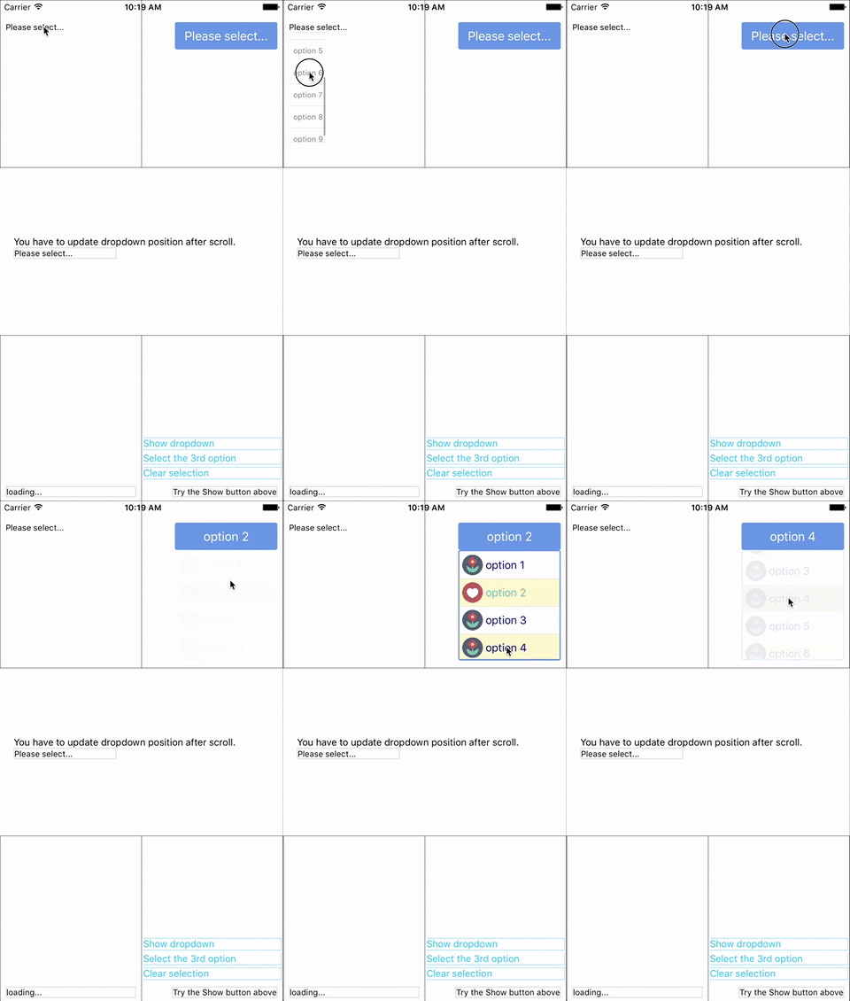
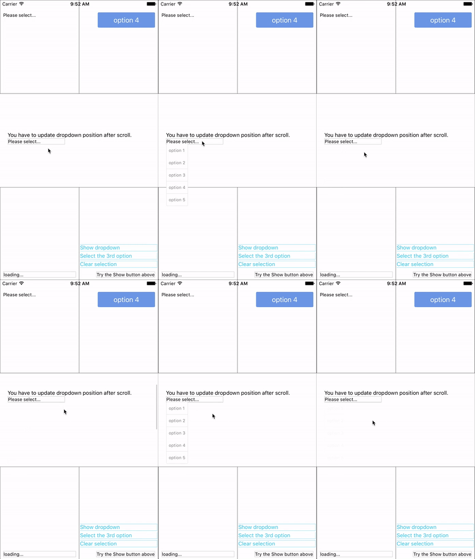
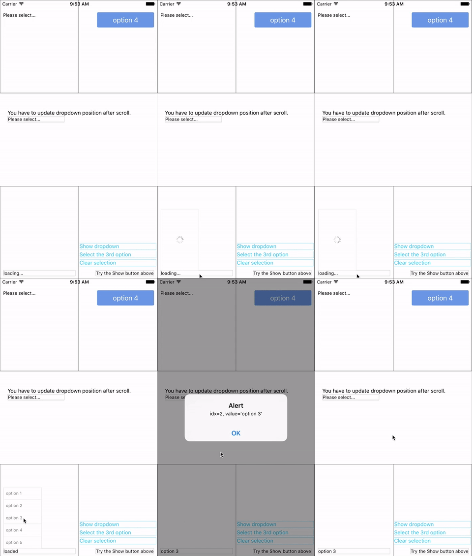
You can find them in the example.
npm i https://github.com/Kishanjvaghela/react-native-modal-dropdown -save
or
yarn add https://github.com/Kishanjvaghela/react-native-modal-dropdown
Import this module:
import ModalDropdown from 'react-native-modal-dropdown';
Use as a component:
<ModalDropdown options={['option 1', 'option 2']}/>
Use as a wrapper / container:
<ModalDropdown options={['option 1', 'option 2']}>
  ...
</ModalDropdown>
Give the style props as your choice:
style: Change the style of the button (basic mode) / container (wrapper mode).textStyle: Change the style of text of the button. Invalid in wrapper mode.dropdownStyle: Change the style of dropdown container.You can also render your option row and row separator by implement renderRow and renderSeparator function.
| Prop | Type | Optional | Default | Description |
|---|---|---|---|---|
disabled | bool | Yes | false | disable / enable the component. |
defaultIndex | number | Yes | -1 | Init selected index. -1: None is selected. This only change the highlight of the dropdown row, you have to give a defaultValue to change the init text. |
defaultValue | string | Yes | Please select... | Init text of the button. Invalid in wrapper mode. |
options | array | Yes | Options. The dropdown will show a loading indicator if options is null/undefined. | |
animated | bool | Yes | true | Disable / enable fade animation. |
isFullWidth | bool | Yes | false | Disable / enable is dropdown render as full width. |
showsVerticalScrollIndicator | bool | Yes | true | Show / hide vertical scroll indicator. |
style | object | Yes | Style of the button. | |
textStyle | object | Yes | Style of the button text. Invalid in wrapper mode. | |
defaultTextStyle | object | Yes | Overried Style of the button text for default value. Invalid in wrapper mode. | |
dropdownStyle | object | Yes | Style of the dropdown list. | |
dropdownTextStyle | object | Yes | Style of the dropdown option text. | |
dropdownTextHighlightStyle | object | Yes | Style of the dropdown selected option text. | |
dropdownTextProps | object | Yes | Add custom props to the dropdown option text | |
adjustFrame | func | Yes | This is a callback after the frame of the dropdown have been calculated and before showing. You will receive a style object as argument with some of the props like width height top left and right. Change them to appropriate values that accord with your requirement and make the new style as the return value of this function. | |
renderRow | func | Yes | Customize render option rows: function(option,index,isSelected) Will render a default row if null/undefined. | |
renderRowComponent | Component | Yes | TouchableOpacity for iOS and TouchableHighlight for Android | Customize the touchable component of the rows |
renderRowProps | object | Yes | Add custom props to the touchable component of the rows | |
renderSeparator | func | Yes | Customize render dropdown list separators. Will render a default thin gray line if null/undefined. | |
renderButtonText | func | Yes | Use this to extract and return text from option object. This text will show on button after option selected. Invalid in wrapper mode. | |
renderRowText | func | Yes | Use this to extract and return text from option object. This text will show on row Invalid in wrapper mode. | |
renderButtonComponent | Component | Yes | TouchableOpacity | Customize the touchable component of the button |
renderRightComponent | Component | Yes | View | Custom component/Image to display on right side as dropdown icon |
renderButtonProps | object | Yes | Add custom props to the touchable component of the button | |
onDropdownWillShow | func | Yes | Trigger when dropdown will show by touching the button. Return false can cancel the event. | |
onDropdownWillHide | func | Yes | Trigger when dropdown will hide by touching the button. Return false can cancel the event. | |
onSelect | func | Yes | Trigger when option row touched with selected index and value. Return false can cancel the event. | |
accessible | bool | Yes | true | Set accessibility of dropdown modal and dropdown rows |
keyboardShouldPersistTaps | enum('always', 'never', 'handled') | Yes | 'never' | See react-native ScrollView props |
multipleSelect | bool | Yes | false | Remove event closing modal when calling onSelect. |
| Method | Description |
|---|---|
show() | Show the dropdown. Won't trigger onDropdownWillShow. |
hide() | Hide the dropdown. Won't trigger onDropdownWillHide. |
select(idx) | Select the specified option of the idx. Select -1 will reset it to display defaultValue. Won't trigger onSelect. |
Any suggestion is welcome.
FAQs
A react-native dropdown component for both iOS and Android.
The npm package react-native-modal-dropdown-v2 receives a total of 497 weekly downloads. As such, react-native-modal-dropdown-v2 popularity was classified as not popular.
We found that react-native-modal-dropdown-v2 demonstrated a not healthy version release cadence and project activity because the last version was released a year ago. It has 1 open source maintainer collaborating on the project.
Did you know?

Socket for GitHub automatically highlights issues in each pull request and monitors the health of all your open source dependencies. Discover the contents of your packages and block harmful activity before you install or update your dependencies.

Security News
Tea.xyz, a crypto project aimed at rewarding open source contributions, is once again facing backlash due to an influx of spam packages flooding public package registries.

Security News
As cyber threats become more autonomous, AI-powered defenses are crucial for businesses to stay ahead of attackers who can exploit software vulnerabilities at scale.

Security News
UnitedHealth Group disclosed that the ransomware attack on Change Healthcare compromised protected health information for millions in the U.S., with estimated costs to the company expected to reach $1 billion.