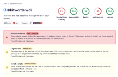
Research
/Security News
Bitwarden CLI Compromised in Ongoing Checkmarx Supply Chain Campaign
Bitwarden CLI 2026.4.0 was compromised in the Checkmarx supply chain campaign after attackers abused a GitHub Action in Bitwarden’s CI/CD pipeline.
react-native-modal-selector
Advanced tools
A cross-platform (iOS / Android), selector/picker component for React Native that is highly customizable and supports sections.
A cross-platform (iOS / Android), selector/picker component for React Native that is highly customizable and supports sections.
This project is the official continuation of the abandoned react-native-modal-picker repo. Contributors are welcome to request a promotion to collaborator status.

npm i react-native-modal-selector --save
You can either use this component as an wrapper around your existing component or use it in its default mode. In default mode a customizable button is rendered.
See SampleApp for an example how to use this component.
import ModalSelector from 'react-native-modal-selector'

class SampleApp extends Component {

    constructor(props) {
        super(props);

        this.state = {
            textInputValue: ''
        }
    }

    render() {
        let index = 0;
        const data = [
            { key: index++, section: true, label: 'Fruits' },
            { key: index++, label: 'Red Apples' },
            { key: index++, label: 'Cherries' },
            { key: index++, label: 'Cranberries' },
            // etc...
            // Can also add additional custom keys which are passed to the onChange callback
            { key: index++, label: 'Vegetable', customKey: 'Not a fruit' }
        ];

        return (
            <View style={{flex:1, justifyContent:'space-around', padding:50}}>

                // Default mode
                <ModalSelector
                    data={data}
                    initValue="Select something yummy!"
                    onChange={(option)=>{ alert(`${option.label} (${option.key}) nom nom nom`) }} />

                // Wrapper
                <ModalSelector
                    data={data}
                    initValue="Select something yummy!"
                    supportedOrientations={['landscape']}
                    onChange={(option)=>{ this.setState({textInputValue:option.label})}}>

                    <TextInput
                        style={{borderWidth:1, borderColor:'#ccc', padding:10, height:30}}
                        editable={false}
                        placeholder="Select something yummy!"
                        value={this.state.textInputValue} />

                </ModalSelector>
            </View>
        );
    }
}
| Prop | Type | Optional | Default | Description |
|---|---|---|---|---|
data | array | No | [] | array of objects with a unique key and label to select in the modal. |
onChange | function | Yes | () => {} | callback function, when the users has selected an option |
initValue | string | Yes | Select me! | text that is initially shown on the button |
cancelText | string | Yes | cancel | text of the cancel button |
animationType | string | Yes | slide | type of animation to be used to show the modal. Must be one of none, slide or fade. |
disabled | bool | Yes | false | true disables opening of the modal |
supportedOrientations | ['portrait', 'landscape'] | Yes | both | orientations the modal supports |
keyboardShouldPersistTaps | string / bool | Yes | always | passed to underlying ScrollView |
style | object | Yes | style definitions for the root element | |
selectStyle | object | Yes | {} | style definitions for the select element (available in default mode only!). NOTE: Due to breaking changes in React Native, RN < 0.39.0 should pass flex:1 explicitly to selectStyle as a prop. |
selectTextStyle | object | Yes | {} | style definitions for the select element (available in default mode only!) |
overlayStyle | object | Yes | { flex: 1, padding: '5%', justifyContent: 'center', backgroundColor: 'rgba(0,0,0,0.7)' } | style definitions for the overlay background element. RN <= 0.41 should override this with pixel value for padding. |
sectionStyle | object | Yes | {} | style definitions for the section element |
sectionTextStyle | object | Yes | {} | style definitions for the select text element |
optionStyle | object | Yes | {} | style definitions for the option element |
optionTextStyle | object | Yes | {} | style definitions for the option text element |
optionContainerStyle | object | Yes | {} | style definitions for the option container element |
cancelStyle | object | Yes | {} | style definitions for the cancel element |
cancelTextStyle | object | Yes | {} | style definitions for the cancel text element |
backdropPressToClose | bool | Yes | false | true makes the modal close when the overlay is pressed |
FAQs
A cross-platform (iOS / Android), selector/picker component for React Native that is highly customizable and supports sections.
The npm package react-native-modal-selector receives a total of 110,647 weekly downloads. As such, react-native-modal-selector popularity was classified as popular.
We found that react-native-modal-selector demonstrated a not healthy version release cadence and project activity because the last version was released a year ago. It has 2 open source maintainers collaborating on the project.
Did you know?

Socket for GitHub automatically highlights issues in each pull request and monitors the health of all your open source dependencies. Discover the contents of your packages and block harmful activity before you install or update your dependencies.

Research
/Security News
Bitwarden CLI 2026.4.0 was compromised in the Checkmarx supply chain campaign after attackers abused a GitHub Action in Bitwarden’s CI/CD pipeline.

Research
/Security News
Docker and Socket have uncovered malicious Checkmarx KICS images and suspicious code extension releases in a broader supply chain compromise.

Product
Stay on top of alert changes with filtered subscriptions, batched summaries, and notification routing built for triage.