

react-native-qrcode-styled
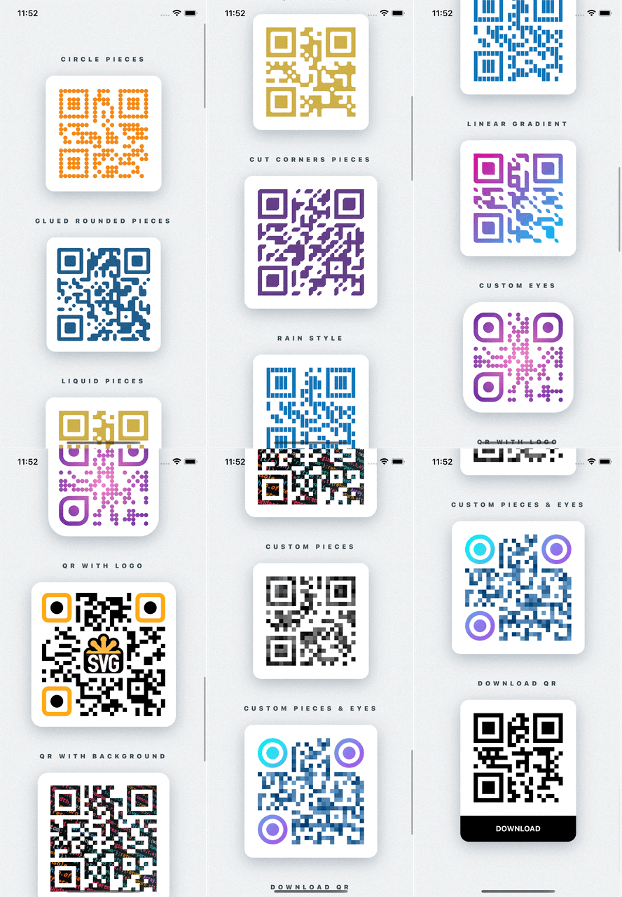
Fully customizable QR Codes generator for React Native using react-native-svg

Installation
npm i react-native-svg react-native-qrcode-styled
or with yarn
yarn add react-native-svg react-native-qrcode-styled
If you use typescript, run:
yarn add -D @types/qrcode
Usage
Simple usage is:
import QRCodeStyled from 'react-native-qrcode-styled';

<QRCodeStyled
  data={'Simple QR Code'}
  style={{backgroundColor: 'white'}}
  padding={20}
  pieceSize={8}
/>
For more examples check out the Example app
Props
| data | "I'm QR Code!" | string | Message for encoding. Can also be an array. More info HERE. |
| size | 160 | number | Size of each piece of the QR code |
| pieceScale | 1.03(to avoid gaps) | SvgProps['scale'] | Scale of each piece of the QR code |
| pieceRotation | undefined | SvgProps['rotation'] | Angle of rotation of each piece of the QR code (in degrees) |
| pieceCornerType | 'rounded' | 'rounded' | 'cut' | Type of piece corner |
| pieceBorderRadius | 0 | number | number[] | Border radius of all corners of each piece. Can also be an array to define different border radius for each corner (start from top-left corner) |
| pieceStroke | undefined | ColorValue | Border color of each piece |
| pieceStrokeWidth | undefined | number | Border with of each piece |
| pieceLiquidRadius | undefined | number | Level of liquid effect between pieces. If you have pieceBorderRadius set isPiecesGlued to true |
| isPiecesGlued | false | boolean | If true between pieces will be glue effect. You will see this if you have pieceBorderRadius > 0 |
| outerEyesOptions | undefined | EyeOptions | AllEyesOptions | Configurations for outer eyes of QR code. If they defined, previous piece configurations won't be work |
| innerEyesOptions | undefined | EyeOptions | AllEyesOptions | The same as outerEyesOptions prop but for inner eyes |
| color | 'black' | ColorValue | Color of QR code |
| gradient | undefined | GradientProps | Gradient of QR code. Can be two types: 'linear' | 'radial'. By default 'linear' |
| padding | undefined | number | Padding inside <Svg/> component from QR code |
| logo | undefined | LogoOptions | Configurations for logo. Support svg's <Image/> props |
| backgroundImage | undefined | svg's <Image/> props type | Background image for QR code |
| version | undefined | number | Description |
| maskPattern | undefined | number | Description |
| toSJISFunc | undefined | function | Description |
| errorCorrectionLevel | 'M' | 'L' | 'M' | 'Q' | 'H' | Description |
| renderCustomPieceItem | undefined | RenderCustomPieceItem | Render custom piece of QR code. It must return svg component. If it defined, previous piece and eyes configurations won't be work |
| renderBackground | undefined | (pieceSize: number, bitMatrix: number[][]) => SvgProps['children'] | Ability to add any additional svg components behind qr code |
| children | undefined | (pieceSize: number, bitMatrix: number[][]) => SvgProps['children'] | Ability to add any additional svg components as children |
...rest <Svg/> props | | | |
Types
GradientProps
type GradientType = 'linear' | 'radial';
type LinearGradientProps = {
colors?: ColorValue[];
start?: [number, number];
end?: [number, number];
locations?: number[];
};
type RadialGradientProps = {
colors?: ColorValue[];
center?: [number, number];
radius?: [number, number];
locations?: number[];
};
type GradientProps = {
type?: GradientType;
options?: LinearGradientProps | RadialGradientProps;
};
EyeOptions
type EyeOptions = {
scale?: PathProps['scale'];
rotation?: string | number;
borderRadius?: number | number[];
color?: ColorValue;
gradient?: GradientProps;
stroke?: ColorValue;
strokeWidth?: number;
}
AllEyesOptions
type EyePosition = 'topLeft' | 'topRight' | 'bottomLeft';

type AllEyesOptions = { [K in EyePosition]?: EyeOptions }
RenderCustomPieceItem
type RenderCustomPieceItem = ({x, y, pieceSize, qrSize, bitMatrix}: {
  x: number;
  y: number;
  pieceSize: number;
  qrSize: number;
  bitMatrix: number[][];
}) => React.ReactElement | null;
LogoOptions
export type LogoArea = {
  x: number;
  y: number;
  width: number;
  height: number;
};

export type LogoOptions = {
  hidePieces?: boolean;
  padding?: number;
  scale?: number;
  onChange?: (logoArea?: LogoArea) => void;
} & SVGImageProps;
Troubleshooting
Gaps between pieces

If you'll see that gaps between pieces on Android, just scale pieces up a little bit:
<QRCodeStyled
...
pieceScale={1.03}
/>
Contributing
See the contributing guide to learn how to contribute to the repository and the development workflow.
License
MIT
Made with create-react-native-library


