
Research
Malicious fezbox npm Package Steals Browser Passwords from Cookies via Innovative QR Code Steganographic Technique
A malicious package uses a QR code as steganography in an innovative technique.
By Olivia Brown - Sep 22, 2025
react-native-select-dropdown
Advanced tools
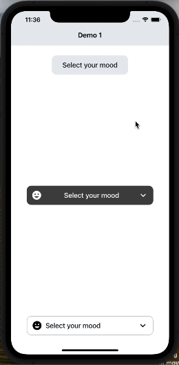
react-native-select-dropdown is a highly customized dropdown | select | picker | menu for react native that works for andriod and iOS platforms.
react-native-select-dropdown is a highly customized dropdown | select | picker | menu for react native that works for android and iOS platforms.
npm install react-native-select-dropdown
yarn add react-native-select-dropdown
import SelectDropdown from 'react-native-select-dropdown'
import Icon from 'react-native-vector-icons/MaterialCommunityIcons';
...
  const emojisWithIcons = [
    {title: 'happy', icon: 'emoticon-happy-outline'},
    {title: 'cool', icon: 'emoticon-cool-outline'},
    {title: 'lol', icon: 'emoticon-lol-outline'},
    {title: 'sad', icon: 'emoticon-sad-outline'},
    {title: 'cry', icon: 'emoticon-cry-outline'},
    {title: 'angry', icon: 'emoticon-angry-outline'},
    {title: 'confused', icon: 'emoticon-confused-outline'},
    {title: 'excited', icon: 'emoticon-excited-outline'},
    {title: 'kiss', icon: 'emoticon-kiss-outline'},
    {title: 'devil', icon: 'emoticon-devil-outline'},
    {title: 'dead', icon: 'emoticon-dead-outline'},
    {title: 'wink', icon: 'emoticon-wink-outline'},
    {title: 'sick', icon: 'emoticon-sick-outline'},
    {title: 'frown', icon: 'emoticon-frown-outline'},
  ];
...
  <SelectDropdown
    data={emojisWithIcons}
    onSelect={(selectedItem, index) => {
      console.log(selectedItem, index);
    }}
    renderButton={(selectedItem, isOpened) => {
      return (
        <View style={styles.dropdownButtonStyle}>
          {selectedItem && (
            <Icon name={selectedItem.icon} style={styles.dropdownButtonIconStyle} />
          )}
          <Text style={styles.dropdownButtonTxtStyle}>
            {(selectedItem && selectedItem.title) || 'Select your mood'}
          </Text>
          <Icon name={isOpened ? 'chevron-up' : 'chevron-down'} style={styles.dropdownButtonArrowStyle} />
        </View>
      );
    }}
    renderItem={(item, index, isSelected) => {
      return (
        <View style={{...styles.dropdownItemStyle, ...(isSelected && {backgroundColor: '#D2D9DF'})}}>
          <Icon name={item.icon} style={styles.dropdownItemIconStyle} />
          <Text style={styles.dropdownItemTxtStyle}>{item.title}</Text>
        </View>
      );
    }}
    showsVerticalScrollIndicator={false}
    dropdownStyle={styles.dropdownMenuStyle}
  />
...
  const styles = StyleSheet.create({
    dropdownButtonStyle: {
      width: 200,
      height: 50,
      backgroundColor: '#E9ECEF',
      borderRadius: 12,
      flexDirection: 'row',
      justifyContent: 'center',
      alignItems: 'center',
      paddingHorizontal: 12,
    },
    dropdownButtonTxtStyle: {
      flex: 1,
      fontSize: 18,
      fontWeight: '500',
      color: '#151E26',
    },
    dropdownButtonArrowStyle: {
      fontSize: 28,
    },
    dropdownButtonIconStyle: {
      fontSize: 28,
      marginRight: 8,
    },
    dropdownMenuStyle: {
      backgroundColor: '#E9ECEF',
      borderRadius: 8,
    },
    dropdownItemStyle: {
      width: '100%',
      flexDirection: 'row',
      paddingHorizontal: 12,
      justifyContent: 'center',
      alignItems: 'center',
      paddingVertical: 8,
    },
    dropdownItemTxtStyle: {
      flex: 1,
      fontSize: 18,
      fontWeight: '500',
      color: '#151E26',
    },
    dropdownItemIconStyle: {
      fontSize: 28,
      marginRight: 8,
    },
  });
array of data that will be represented in dropdown 'can be array of objects
| Type | Required |
|---|---|
| array | Yes |
function recieves selected item and its index in data array
| Type | Required |
|---|---|
| function | Yes |
function returns React component for the dropdown button
| Type | Required |
|---|---|
| function | Yes |
function returns React component for each dropdown item
| Type | Required |
|---|---|
| function | Yes |
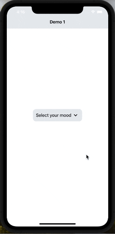
default selected item in dropdown ( check examples in Demo1)
| Type | Required |
|---|---|
| any | No |
default selected item index
| Type | Required |
|---|---|
| integer | No |
disable dropdown
| Type | Required |
|---|---|
| boolean | No |
array of disabled items index
| Type | Required |
|---|---|
| array | No |
disable auto scroll to selected value
| Type | Required |
|---|---|
| boolean | No |
dropdown menu testID
| Type | Required |
|---|---|
| string | No |
function fires when dropdown is opened
| Type | Required |
|---|---|
| function | No |
function fires when dropdown is closed
| Type | Required |
|---|---|
| function | No |
function fires when dropdown scrolls to the end (for paginations)
| Type | Required |
|---|---|
| function | No |
required to set true when statusbar is translucent (android only)
| Type | Required |
|---|---|
| boolean | No |
style object for dropdown view
| Type | Required |
|---|---|
| object | No |
backdrop color when dropdown is opened
| Type | Required |
|---|---|
| string | No |
When true, shows a vertical scroll indicator.
| Type | Required |
|---|---|
| boolean | No |
enable search functionality
| Type | Required |
|---|---|
| boolean | No |
style object for search input
| Type | Required |
|---|---|
| object | No |
text color for search input
| Type | Required |
|---|---|
| string | No |
style object for search input text
| Type | Required |
|---|---|
| object | No |
placeholder text for search input
| Type | Required |
|---|---|
| string | No |
text color for search input placeholder
| Type | Required |
|---|---|
| string | No |
function returns React component for search input icon
| Type | Required |
|---|---|
| function | No |
function returns React component for search input icon
| Type | Required |
|---|---|
| function | No |
function callback when the search input text changes, this will automatically disable the dropdown's internal search to be implemented manually outside the component
| Type | Required |
|---|---|
| function | No |
| Method | Description |
|---|---|
reset() | Remove selection & reset it |
openDropdown() | Open the dropdown. |
closeDropdown() | Close the dropdown. |
selectIndex(index) | Select a specific item by index. |
FAQs
react-native-select-dropdown is a highly customized dropdown | select | picker | menu for react native that works for andriod and iOS platforms.
The npm package react-native-select-dropdown receives a total of 20,833 weekly downloads. As such, react-native-select-dropdown popularity was classified as popular.
We found that react-native-select-dropdown demonstrated a not healthy version release cadence and project activity because the last version was released a year ago. It has 1 open source maintainer collaborating on the project.
Did you know?

Socket for GitHub automatically highlights issues in each pull request and monitors the health of all your open source dependencies. Discover the contents of your packages and block harmful activity before you install or update your dependencies.
Research
A malicious package uses a QR code as steganography in an innovative technique.

Research
/Security News
Socket identified 80 fake candidates targeting engineering roles, including suspected North Korean operators, exposing the new reality of hiring as a security function.

Application Security
/Research
/Security News
Socket detected multiple compromised CrowdStrike npm packages, continuing the "Shai-Hulud" supply chain attack that has now impacted nearly 500 packages.