react-native-select-dropdown
react-native-select-dropdown is a highly customized dropdown | select | picker | menu for react native that works for andriod and iOS platforms.
Installation
# Using npm
npm install react-native-select-dropdown
# Using yarn
yarn add react-native-select-dropdown
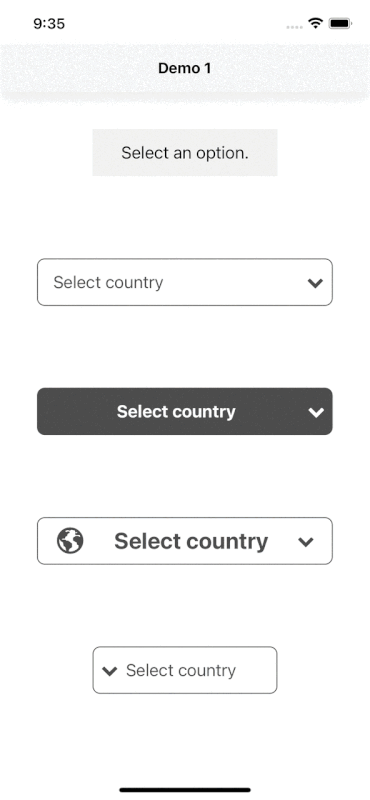
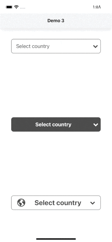
Demo
Code provided in Examples folder.

Search Functionality (Code provided in Examples folder).
Usage
import SelectDropdown from 'react-native-select-dropdown'
...
const countries = ["Egypt", "Canada", "Australia", "Ireland"]
...
<SelectDropdown
	data={countries}
	onSelect={(selectedItem, index) => {
		console.log(selectedItem, index)
	}}
	buttonTextAfterSelection={(selectedItem, index) => {
		// text represented after item is selected
		// if data array is an array of objects then return selectedItem.property to render after item is selected
		return selectedItem
	}}
	rowTextForSelection={(item, index) => {
		// text represented for each item in dropdown
		// if data array is an array of objects then return item.property to represent item in dropdown
		return item
	}}
/>
Props
Methods
data
array of data that will be represented in dropdown 'can be array of objects
onSelect
function recieves selected item and its index in data array
defaultButtonText
default button text when no item is selected
buttonTextAfterSelection
function recieves selected item and its index, this function should return a string that will be represented in button after item is selected
| function | Yes "unless you customized button using renderCustomizedButtonChild" |
rowTextForSelection
function recieves item and index for each row in dropdown, this function shoud return a string that will be represented in each row in dropdown
| function | Yes "unless you customized button using renderCustomizedRowChild" |
defaultValue
default selected item in dropdown ( check examples in Demo1)
defaultValueByIndex
default selected item index
disabled
disable dropdown
disableAutoScroll
disable auto scroll to selected value
onFocus
function fires when dropdown is opened
onBlur
function fires when dropdown is closed
buttonStyle
style object for button
buttonTextStyle
style object for button text
renderCustomizedButtonChild
function recieves selected item and its index, this function should return a React component as a child for dropdown button buttonStyle should be used for parent button view style.
# check examples folder to make things clear
renderDropdownIcon
function that should return a React component for dropdown icon
dropdownIconPosition
dropdown icon position "left" || "right"
statusBarTranslucent
required to set true when statusbar is translucent (android only)
dropdownStyle
style object for dropdown view
dropdownOverlayColor
backdrop color when dropdown is opened
dropdownBackgroundColor
background color behind list items when dropdown is opened
rowStyle
style object for row
rowTextStyle
style object for row text
selectedRowStyle
style object for selected row
selectedRowTextStyle
style object for selected row text
renderCustomizedRowChild
function recieves item and its index, this function should return React component as a child for customized row rowStyle should be used for parent row view style.
# check examples folder to make things clear
search
enable search functionality
searchInputStyle
style object for search input
searchInputTxtColor
text color for search input
searchPlaceHolder
placeholder text for search input
searchPlaceHolderColor
text color for search input placeholder
renderSearchInputLeftIcon
function returns React component for search input icon
renderSearchInputRightIcon
function returns React component for search input icon
License
MIT


