📲 react-native-slider-intro


A simple and full customizable React Native package which implements a unique slider.
Installation
yarn add react-native-slider-intro
or
npm install react-native-slider-intro --save
Running the example project
iOS
yarn example ios
Android
yarn example android
Usage
Basic example
import React from 'react';
import SliderIntro from 'react-native-slider-intro';
const slides = [
{
index: 1,
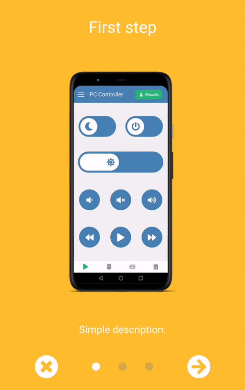
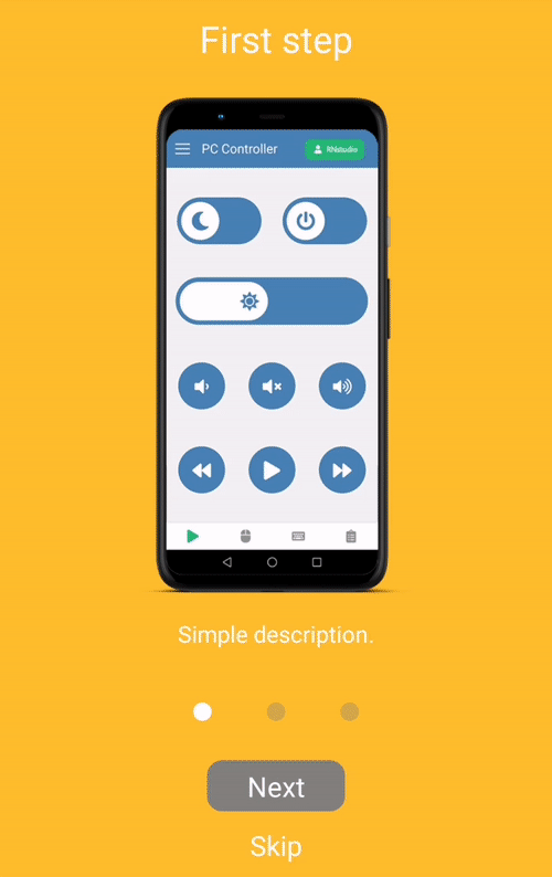
title: 'First step',
text: 'Simple description.',
link: 'https://pccontroller.rnstudio.hu',
image: require('./images/step1.png'),
backgroundColor: '#febe29',
},
{
index: 2,
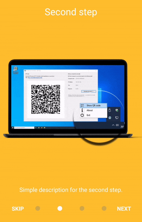
title: 'Second step',
text: 'Simple description for the second step.',
image: require('./images/step2.png'),
backgroundColor: '#febe29',
},
];
const BasicExample = ({ closeExample }: { closeExample: () => void }) => {
return (
<SliderIntro data={slides} onDone={closeExample} onSkip={closeExample} />
);
};
export default BasicExample;
The package includes two render options. Besides the default render when you can pass data as an array of ISliderIntroItem props, you can use a custom render with children and numberOfSlides properties.
Properties
| Name | Type | Default value | Description |
|---|
data | array | [] | Default render - array of items. Children will be ignored if data is passed. |
numberOfSlides | array | number | Custom render - if children is passed, data will be ignored. numberOfSlides is required in this case. |
children | ReactNode | null | Custom render - JSX elements to render. |
navigationBarBottom | number | 0 | Custom value of dot navigation container bottom position |
navigationBarHeight | number | 70 | Height of dot navigation container |
animateSlideSpeed | number | 15 | Speed of slider animation |
navContainerMaxSizePercent | number | 0.5 | Percent value of navigation container's width |
dotWidth | number | 12 | The radius of the 'dot' circle of navigation |
fixDotOpacity | number | 0.35 | Each dots opacity which don't have animation |
fixDotBackgroundColor | color | grey | Each dots background which don't have an animation |
animatedDotBackgroundColor | color | white | Each dots background which have an animation |
animateDotSpeed | number | 8 | Speed of dot animation |
animateDotBouncing | number | 2 | The 'bounciness' value of all animations. https://reactnative.dev/docs/animated#spring |
hasReactNavigation | boolean | false | There is a trouble with backButton behaviour when you're using react-navigation. You should use useFocusEffect in this case for reach the expected behaviour. More info: https://reactnavigation.org/docs/custom-android-back-button-handling/#why-not-use-component-lifecycle-methods |
useCustomBackHandlerEffect | function | none | As I mentioned above, sometimes we should rewrite the basic backHandler behaviour. This property will be a custom hook. See the example for more info: React navigation custom hook example |
backHandlerBehaviour | string | activeMinusOne | This prop can controls the backButton behaviour. The value should be activeMinusOne or previous |
skipLabel | string | Skip | Custom label of skip button |
nextLabel | string | Next | Custom label of next button |
doneLabel | string | Done | Custom label of done button |
renderSkipButton | function | Default skip/previous button renderer | Use to supply your own skip/previous button |
renderNextButton | function | Default next button renderer | Use to supply your own next button |
renderDoneButton | function | Default done button renderer | Use to supply your own done button |
onDone | function | none | Behaviour of done button |
onSkip | function | none | Behaviour of skip button |
showLeftButton | boolean | true | Show skip or previous button on the left side |
leftButtonType | string | skip | The button type on the left side should be skip or previous |
columnButtonStyle | boolean | false | Buttons will show up in a column |
showStatusBar | boolean | false | Show status bar on top of screen. You can make your own status bar outside of this component |
statusBarColor | color | #febe29 | Background color of status bar |
renderStatusBar | function | Default status bar renderer | Use to supply your own status bar component |
Examples
Troubleshooting
TouchableOpacity onPress function: I've created a new issue on official react-native repository, because TouchableOpacity, Button and Pressable don't working inside PanResponder with react-navigation NavigationContainer. My solution: Import TouchableWithoutFeedback from react-native-gesture-handler instead of react-native and use onPressIn instead of onPress function then overwrite the renderItem function.
Contributing
See the contributing guide to learn how to contribute to the repository and the development workflow.
License
MIT


