
Research
2025 Report: Destructive Malware in Open Source Packages
Destructive malware is rising across open source registries, using delays and kill switches to wipe code, break builds, and disrupt CI/CD.
By Kush Pandya - Dec 24, 2025
react-native-ui-stepper
Advanced tools


A react-native component which mirrors the functionality of UIStepper from iOS.
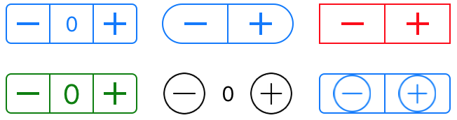
A stepper control provides a user interface for incrementing or decrementing a value. A stepper displays two buttons, one with a minus (“–”) symbol and one with a plus (“+”) symbol.
You can now configure your react-native-ui-stepper to be vertical
npm i react-native-ui-stepper
import UIStepper from 'react-native-ui-stepper';
...
setValue = (value) => {
  // do something with value
}
render() {
  return (
      <UIStepper
        onValueChange={(value) => { this.setValue(value) }}
      />
  )
}
You can now use custom images, from your local file system or from the Internet. See Props for more details.

| Name | Type | Description | Default |
|---|---|---|---|
initialValue | Number | Start value | 0 |
value | Number | Forcibly override the value | 0 |
minimumValue | Number | Minimum value | 0 |
maximumValue | Number | Maximum value | 100 |
steps | Number | Increment value | 1 |
displayValue | Boolean | Displays the stepper value between the increment and decrement button | false |
incrementImage | String or Number | Override the default increment image | require('./assets/increment.png') |
decrementImage | String or Number | Override the default decrement image | require('./assets/decrement.png') |
wraps | Boolean | When set to true, incrementing beyond the maximumValue will set the value to minimumValue and vice versa | false |
tintColor | String | Changes the color of all the non-transparent pixels to the tintColor. | #0076FF |
overrideTintColor | Boolean | When using an external image, set whether you want the tintColor to be applied to non-transparent pixels. | false |
backgroundColor | String | Background color | transparent |
vertical | Boolean | Display a vertical UI Stepper. You must specify a height and a width. | false |
displayDecrementFirst | Boolean | Display the decrement button above the increment button, only works when vertical is true | false |
width | Number | Width | 94 |
height | Number | Height | 29 |
textColor | String | The desired text colour which will be used when displayValue is set to true | #0076FF |
fontFamily | String | The font family used on the value displayed when displayValue is set to true | System |
fontSize | Number | The font size used on the value displayed when displayValue is set to true | 15 |
borderColor | String | Color used for the border | #0076FF |
borderWidth | Number | Width of the border | 1 |
borderRadius | Number | Radius of the border | 4 |
onValueChange | Function | Executed when the value changes. The value is passed as a parameter | null |
onIncrement | Function | Executed when the User clicks the increment (+) button. The value is passed as a parameter | null |
onDecrement | Function | Executed when the User clicks the decrement (+) button. The value is passed as a parameter | null |
onMinimumReached | Function | Executed when the minimumValue is reached. The value is passed as a parameter | null |
onMaximumReached | Function | Executed when the maximumValue is reached. The value is passed as a parameter | null |
innerRef | Function | A reference to the rendered UIStepper. You can use this to gain access to class-based methods. increment(), decrement(), resetValue() and setValue() are most commonly used | null |
There are no requirements for contributing to the react-native-ui-stepper package. You can browse or raise issues that you are would like to contribute to.
$ git clone https://github.com/hannigand/react-native-ui-stepper.git
$ cd example
$ yarn # or npm install
$ react-native run-ios
FAQs
A react-native implementation of the iOS UIStepper
The npm package react-native-ui-stepper receives a total of 22 weekly downloads. As such, react-native-ui-stepper popularity was classified as not popular.
We found that react-native-ui-stepper demonstrated a not healthy version release cadence and project activity because the last version was released a year ago. It has 1 open source maintainer collaborating on the project.
Did you know?

Socket for GitHub automatically highlights issues in each pull request and monitors the health of all your open source dependencies. Discover the contents of your packages and block harmful activity before you install or update your dependencies.
Research
Destructive malware is rising across open source registries, using delays and kill switches to wipe code, break builds, and disrupt CI/CD.

Security News
Socket CTO Ahmad Nassri shares practical AI coding techniques, tools, and team workflows, plus what still feels noisy and why shipping remains human-led.

Research
/Security News
A five-month operation turned 27 npm packages into durable hosting for browser-run lures that mimic document-sharing portals and Microsoft sign-in, targeting 25 organizations across manufacturing, industrial automation, plastics, and healthcare for credential theft.