react-native-user-avatar
Advanced tools

Comparing version 1.0.5 to 1.0.6
@@ -25,2 +25,10 @@ { | ||
| "rules": { | ||
| "require-jsdoc": [ | ||
| "error", | ||
| { | ||
| "require": { | ||
| "FunctionDeclaration": false | ||
| } | ||
| } | ||
| ] | ||
| }, | ||
@@ -27,0 +35,0 @@ "settings": { |
| import React from 'react' | ||
| import { ViewStyle, ImageStyle, StyleProp } from 'react-native' | ||
| import { ImageStyle, StyleProp } from 'react-native' | ||
| type UserAvatarPropsType = { | ||
| src?: string | ||
| name: string | ||
| color?: string | ||
| textColor?: string | ||
| colors?: string[] | ||
| size?: number | ||
| containerStyle?: ViewStyle | ||
| imageStyle?: ImageStyle | ||
| defaultName?: string | ||
| borderRadius?: number | ||
| style?: StyleProp | ||
| src: string | ||
| bgColor: string | ||
| bgColors: string[] | ||
| textColor: string | ||
| size: number | ||
| imageStyle: ImageStyle | ||
| style: StyleProp | ||
| borderRadius: number | ||
| component: Object | ||
| } | ||
@@ -16,0 +15,0 @@ |
197
index.js
@@ -1,142 +0,70 @@ | ||
| import React from 'react'; | ||
| import React, {useState, useEffect} from 'react'; | ||
| import PropTypes from 'prop-types'; | ||
| import {View, Image, Text} from 'react-native'; | ||
| import initials from 'initials'; | ||
| import {View} from 'react-native'; | ||
| import { | ||
| TextAvatar, | ||
| ImageAvatar, | ||
| } from './components/'; | ||
| import { | ||
| fetchImage, | ||
| getContainerStyle, | ||
| generateBackgroundStyle, | ||
| } from './helpers'; | ||
| // from https://flatuicolors.com/ | ||
| const defaultColors = [ | ||
| '#2ecc71', // emerald | ||
| '#3498db', // peter river | ||
| '#8e44ad', // wisteria | ||
| '#e67e22', // carrot | ||
| '#e74c3c', // alizarin | ||
| '#1abc9c', // turquoise | ||
| '#2c3e50', // midnight blue | ||
| ]; | ||
| const UserAvatar = (props) => { | ||
| const { | ||
| name, | ||
| src, | ||
| bgColor, | ||
| bgColors, | ||
| textColor, | ||
| size, | ||
| imageStyle, | ||
| style, | ||
| borderRadius, | ||
| component, | ||
| } = props; | ||
| /** | ||
| * Helper function to calculate the number of characters | ||
| * @constructor | ||
| * @param {string} str - The string we want to ab. | ||
| */ | ||
| function sumChars(str) { | ||
| let sum = 0; | ||
| for (let i = 0; i < str.length; i++) { | ||
| sum += str.charCodeAt(i); | ||
| // Validations | ||
| if (typeof (size) !== 'number') { | ||
| throw new Error('size prop should be a number'); | ||
| } | ||
| return sum; | ||
| } | ||
| const [inner, setInner] = useState( | ||
| <TextAvatar textColor={textColor} size={size} name={name} />, | ||
| ); | ||
| /** | ||
| * Main Class | ||
| * @constructor | ||
| */ | ||
| class UserAvatar extends React.PureComponent { | ||
| /** | ||
| * Render function | ||
| * @constructor | ||
| */ | ||
| render() { | ||
| let { | ||
| src, | ||
| name, | ||
| color, | ||
| textColor = '#fff', | ||
| colors = defaultColors, | ||
| size = 32, | ||
| imageStyle, | ||
| defaultName, | ||
| borderRadius, | ||
| style, | ||
| } = this.props; | ||
| if (!name && !src) throw new Error('Avatar requires a name or source'); | ||
| if (typeof size !== 'number') size = parseInt(size); | ||
| let abbr = initials(name); | ||
| if (name.startsWith('+')) { | ||
| abbr = `+${abbr}`; | ||
| } | ||
| if (!abbr) abbr = defaultName; | ||
| if (isNaN(borderRadius)) { | ||
| borderRadius = size * 0.5; | ||
| } | ||
| const imageLocalStyle = { | ||
| borderRadius, | ||
| }; | ||
| const localStyle = { | ||
| borderRadius, | ||
| borderWidth: 1, | ||
| borderColor: 'transparent', | ||
| justifyContent: 'center', | ||
| alignItems: 'center', | ||
| }; | ||
| const containerStyle = { | ||
| height: size, | ||
| width: size, | ||
| }; | ||
| let colorStyle = {}; | ||
| let inner; | ||
| useEffect(() => { | ||
| if (component) setInner(component); | ||
| if (src) { | ||
| const sizeStyle = { | ||
| width: size, | ||
| height: size, | ||
| }; | ||
| const props = { | ||
| style: [imageLocalStyle, sizeStyle, imageStyle], | ||
| source: {uri: src}, | ||
| }; | ||
| inner = React.createElement(this.props.component || Image, props); | ||
| } else { | ||
| let background; | ||
| if (color) { | ||
| background = color; | ||
| } else { | ||
| // Pick a deterministic color from the list | ||
| const i = sumChars(name) % colors.length; | ||
| background = colors[i]; | ||
| } | ||
| colorStyle = {backgroundColor: background}; | ||
| const textContainerStyle = { | ||
| flexDirection: 'column', | ||
| alignItems: 'center', | ||
| justifyContent: 'center', | ||
| marginTop: -(size / 20), | ||
| }; | ||
| const sizeStyle = { | ||
| height: size, | ||
| width: size, | ||
| }; | ||
| inner = ( | ||
| <View style={[textContainerStyle, sizeStyle]}> | ||
| <Text | ||
| style={{ | ||
| color: textColor, | ||
| fontSize: size / 2.5, | ||
| }} | ||
| adjustsFontSizeToFit={true} | ||
| > | ||
| {abbr} | ||
| </Text> | ||
| </View> | ||
| ); | ||
| fetchImage(src).then((isImage) => { | ||
| if (isImage) { | ||
| setInner( | ||
| <ImageAvatar src={src} size={size} imageStyle={imageStyle} />, | ||
| ); | ||
| } | ||
| }); | ||
| } | ||
| return ( | ||
| <View style={[localStyle, colorStyle, containerStyle, style]}> | ||
| {inner} | ||
| </View> | ||
| ); | ||
| } | ||
| } | ||
| }, []); | ||
| return ( | ||
| <View style={[ | ||
| generateBackgroundStyle(name, bgColor, bgColors), | ||
| getContainerStyle(size, src, borderRadius), | ||
| style]} | ||
| > | ||
| {inner} | ||
| </View> | ||
| ); | ||
| }; | ||
| UserAvatar.propTypes = { | ||
| name: PropTypes.string, | ||
| src: PropTypes.string, | ||
| name: PropTypes.string, | ||
| color: PropTypes.string, | ||
| colors: PropTypes.array, | ||
| bgColor: PropTypes.string, | ||
| bgColors: PropTypes.array, | ||
| textColor: PropTypes.string, | ||
| size: PropTypes.number, | ||
| containerStyle: PropTypes.object, | ||
| imageStyle: PropTypes.object, | ||
| style: PropTypes.object, | ||
| defaultName: PropTypes.string, | ||
| borderRadius: PropTypes.number, | ||
@@ -146,2 +74,17 @@ component: PropTypes.any, | ||
| module.exports = UserAvatar; | ||
| UserAvatar.defaultProps = { | ||
| size: 32, | ||
| textColor: '#fff', | ||
| name: 'John Doe', | ||
| bgColors: [ // from https://flatuicolors.com/ | ||
| '#2ecc71', // emerald | ||
| '#3498db', // peter river | ||
| '#8e44ad', // wisteria | ||
| '#e67e22', // carrot | ||
| '#e74c3c', // alizarin | ||
| '#1abc9c', // turquoise | ||
| '#2c3e50', // midnight blue | ||
| ], | ||
| }; | ||
| export default UserAvatar; |
| { | ||
| "name": "react-native-user-avatar", | ||
| "version": "1.0.5", | ||
| "version": "1.0.6", | ||
| "description": "React Native component for a user avatar with fallback to colored initials", | ||
@@ -5,0 +5,0 @@ "main": "index.js", |
@@ -10,3 +10,5 @@ # React Native User Avatar | ||
| 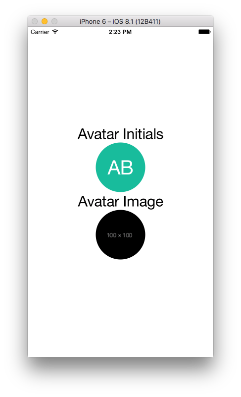 | ||
| iOS Screenshot | Android Screenshot | ||
| :-------------------------:|:-------------------------: | ||
| <img src="./screenshots/ios.png" title="iOS Screenshot" width="250"> | <img src="./screenshots/android.png" title="Android Screenshot" width="250"> | ||
@@ -19,25 +21,40 @@ ## Installation | ||
| The fallback avatar's color may be set by passing in the `bgColor` prop, or you can customize the range of colors | ||
| used by passing in an array of `bgColors`. The component uses a simple calculation to consistently use the same | ||
| color for the same user's name every time. | ||
| ### UserAvatar Component | ||
| ```jsx | ||
| import UserAvatar from 'react-native-user-avatar'; | ||
| <UserAvatar size="100" name="Avishay Bar" /> | ||
| <UserAvatar size="100" name="Avishay Bar" src="https://dummyimage.com/100x100/000/fff" /> | ||
| <UserAvatar size="50" name="John Doe" colors={['#ccc', '#fafafa', '#ccaabb']}/> | ||
| <UserAvatar size="50" name="John Doe" /> | ||
| <UserAvatar size="50" name="Jane Doe" color="#000" /> | ||
| const App: () => React$Node = () => { | ||
| return ( | ||
| <> | ||
| ... | ||
| <View> | ||
| <UserAvatar size="100" name="Avishay Bar" /> | ||
| <UserAvatar size="100" name="Avishay Bar" src="https://dummyimage.com/100x100/000/fff" /> | ||
| <UserAvatar size="50" name="John Doe" colors={['#ccc', '#fafafa', '#ccaabb']}/> | ||
| <UserAvatar size="50" name="John Doe" /> | ||
| <UserAvatar size="50" name="Jane Doe" color="#000" /> | ||
| </View> | ||
| ... | ||
| ``` | ||
| ## User-defined Image-Component | ||
| ### UserAvatar Props | ||
| It is also possible to use another Image-Component than the built-in `<Image>`. | ||
| Attribute | Type | Default Value | Description | ||
| ---------------- | --------------- | ------------- | ----------- | ||
| `name` | string | `'John Doe'` | name used for generating initials | ||
| `src` | string | `undefined` | source image on the internet to display | ||
| `bgColor` | string | `undefined` | custom background color for the initials | ||
| `bgColors` | array | see index.js | custom array of background colors to choose from | ||
| `textColor` | string | `'#fff'` | custom text color for the initials font | ||
| `size` | number | `32` | custom size that defines both the avatar and the initials font size | ||
| `imageStyle` | object | `undefined` | custom image styling to append to the `Image` component displays the source image | ||
| `style` | object | `undefined` | custom style to append to the `UserAvatar` component container | ||
| `borderRadius` | number | `size * 0.5` | custom border radius for the component | ||
| `component` | React.Component | `undefined` | custom component to display instead of initials or source image | ||
| ```jsx | ||
| <UserAvatar size="50" name="John Doe" component={CachedImage} /> | ||
| ``` | ||
| The fallback avatar's color may be set by passing in the `color` prop, or you can customize the range of colors | ||
| used by passing in an array of `colors`. The component uses a simple calculation to consistently use the same | ||
| color for the same user's name every time. | ||
| ## Credits | ||
@@ -44,0 +61,0 @@ |
New alerts
Major refactor
Supply chain riskPackage has recently undergone a major refactor. It may be unstable or indicate significant internal changes. Use caution when updating to versions that include significant changes.
Found 1 instance in 1 package
Network access
Supply chain riskThis module accesses the network.
Found 1 instance in 1 package
Fixed alerts
Major refactor
Supply chain riskPackage has recently undergone a major refactor. It may be unstable or indicate significant internal changes. Use caution when updating to versions that include significant changes.
Found 1 instance in 1 package
Improved metrics
- Total package byte prevSize
- increased by26.51%
10943
- Number of package files
- increased by42.86%
10
- Lines of code
- increased by34.9%
259
- Number of lines in readme file
- increased by35.42%
65
Worsened metrics
- Number of medium supply chain risk alerts
- increased by100%
2