react-native-woodpicker
Customisable picker and datePicker react-native components for Android and iOS.
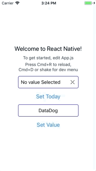
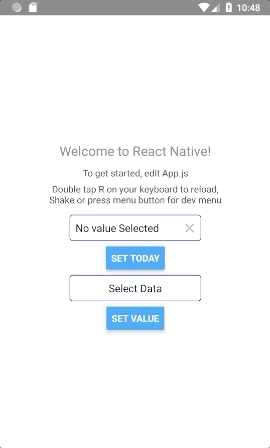
Preview
Installation
yarn add react-native-woodpicker @react-native-community/datetimepicker @react-native-picker/picker
or
npm install react-native-woodpicker @react-native-community/datetimepicker @react-native-picker/picker --save
Expo
// add react-native-woodpicker with your package manager (yarn / npm / ...) and :
expo install @react-native-community/datetimepicker @react-native-picker/picker
Version
0.1.0
New Version 0.1.0 integrate new React-Native component DateTimePicker from @react-native-community/datetimepicker and Hooks.
Don't forget to add it to your project.
0.2.0
New Version 0.2.0 integrate new React-Native component Picker from @react-native-community/picker.
0.3.0
New Version 0.3.0 use Typescript and change the picker dependency from @react-native-community/picker to @react-native-picker/picker.
Contribution
Thanks to everyone for your contribution!
I try my best to review and update this repository.
PR and feedback are welcomed!
Usage
Picker
You can use Picker to pick values/objects.
import type { PickerItem } from 'react-native-woodpicker'
import { Picker } from 'react-native-woodpicker'

[...]

const ExampleApp = (): JSX.Element => {
  const [pickedData, setPickedData] = useState<PickerItem>();

  const data: Array<PickerItem> = [
    { label: "DataCat", value: 1 },
    { label: "DataDog", value: 2 },
    { label: "DataSnake", value: 3 },
    { label: "DataPlatypus", value: 4 },
    { label: "DataWhale", value: 5 }
  ];

  return (
    <View>
      <Picker
        item={pickedData}
        items={data}
        onItemChange={setPickedData}
        title="Data Picker"
        placeholder="Select Data"
        isNullable={false}
      //backdropAnimation={{ opacity: 0 }}
      //mode="dropdown"
      //isNullable
      //disable
    />
    </View>
  );
}
DatePicker
You can use DatePicker to pick Dates.
Unlike the Picker, you need to handle the placeholder.
import { DatePicker } from 'react-native-woodpicker'

[...]

const ExampleApp = (): JSX.Element => {
  const [pickedDate, setPickedDate] = useState<Date>();

  const handleText = (): string => pickedDate
      ? pickedDate.toDateString()
      : "No value Selected";

  return (
    <View>
      <DatePicker
        value={pickedDate}
        onDateChange={handleDateChange}
        title="Date Picker"
        text={handleText()}
        isNullable={false}
        iosDisplay="inline"
        //backdropAnimation={{ opacity: 0 }}
        //minimumDate={new Date(Date.now())}
        //maximumDate={new Date(Date.now()+2000000000)}
        //iosMode="date"
        //androidMode="countdown"
        //iosDisplay="spinner"
        //androidDisplay="spinner"
        //locale="fr"
      />
    </View>
  );
}
Props
General
| Name | type | Required | Description |
|---|
| title | string | false | Change DoneBar title |
| doneButtonLabel | string | false | Change done button label |
| style | ViewStyle | false | Configure the input style (View) |
| containerStyle | ViewStyle | false | Configure the input container style (View) |
| textInputStyle | TextStyle | false | Configure the input text style (Text) |
| disabled | boolean | false | Disable the input |
| isNullable | boolean | false | Picker : Add null value on items, DatePicker: add reset button |
| InputComponent | React.ElementType | false | Component to replace input. |
| DoneBarComponent | React.ElementType | false | Component to replace iOS Picker Done Bar |
| onOpen | function | false | Triggered when the picker is opening |
| onClose | function | false | Triggered when the picker is closing |
| backdropAnimation | Object | false | Configure backdrop animation property. Default: {opacity: 0.5 , duration: 1000, delay: 300} |
| iOSCustomProps | Object | false | Configure iOS props to pass to the native component (Picker or DatePicker) from react-native-community |
| androidCustomProps | Object | false | Configure Android props to pass to the native component (Picker or DatePicker) from react-native-community |
Picker
| Name | type | Required | Description |
|---|
| item | PickerItem ({ label: string, value: any }) | true | Configure the current selected item |
| placeholder | string | false | Configure the picker label if no item is selected |
| onItemChange | (item: PickerItem, index: number) => void; | true | Add listener on change event |
| items | Array | true | Configure the list of available items |
| mode (Android Only) | "dialog" or "dropdown" | false | Configure the android picker mode |
| itemFontFamily | string | false | Configure the default font family for items (each item can have a fontFamily property) |
| itemColor | string | false | Configure the default color for items (each item can have a color property) |
DatePicker
| Name | type | Required | Description |
|---|
| value | Date | true | Configure the picker title (not the placeholder) |
| onDateChange | (date: ?Date) => {} | true | Configure the placeholder when no value is selected |
| locale | string (Locale IDs) | false | Change the iOS picker locale |
| iosMode (iOS Only) | "date" or "time" or "datetime" | false | Change the iOS picker mode |
| androidMode (Android Only) | "calendar" or "spinner" or "default" | false | Change the Android picker mode |
| iosDisplay (iOS Only) | "default" or "spinner" or "inline" or "compact" | false | Change the iOS picker display |
| androidDisplay (Android Only) | "default" or "spinner" or "calendar" or "clock" | false | Change the Android picker display |
| minimumDate | Date | false | Restrict date selection with a minimum date |
| maximumDate | Date | false | Restrict date selection with a minimum date |
| neutralButtonLabel (Android Only) | string | false | Change "clear" button label |
| is24Hour (Android Only) | boolean | false | Changing timepicker to 24h format |
| textColor (iOS Only) | string | false | Change text color on "spinner" display |
| text | string | false | Change picker button text |
| onOpen | () => void | false | Add listener on modal open event |
| onClose | () => void | false | Add listener on modal close event |
| minuteInterval | number : 1 or 2 or 3 or 4 or 5 or 6 or 10 or 12 or 15 or 20 or 30 | false | The interval at which minutes can be selected |
| timeZoneOffsetInMinutes | number | false | Change the timeZone of the date picker |
| iosCompactHiddenStyle (iOS only) | ViewStyle | false | Change style for the ios picker in compact mode |
| touchableStyle | ViewStyle | false | Change style touchable view in the picker |
ItemComponent specific
| Name | type | Description |
|---|
| resetValue | () => void | Reset value to null if nullable (DatePicker only) |
| togglePicker | (event: GestureResponderEvent) => void | Close Picker (iOS only) |
| text | string | Input text recieved from the current element |
| textInputStyle | StyleObj | textInputStyle props configured in the picker component |
| isNullable | boolean | isNullable props configured in the picker component |
| isCompactHiddenPickerNeeded (iOS only) | boolean | true if you need to use renderHiddenCompactIOSPicker |
| renderHiddenCompactIOSPicker (iOS only) | () => JSX.Element | Render the DateTimePicker as a invisible button that overlay his parent |
DoneBar Picker specific (iOS only)
| Name | type | Description |
|---|
| title | string | title props configured in the picker component |
| doneButtonLabel | string | doneButtonLabel props configured in the picker component |
| onDonePress | (event: GestureResponderEvent) => void | Close the picker and trigger onChange |


