React Navigation TabBar Collection

Collection of Animated 60 FPS TabBar Components based on React Navigation.
Features
- 60 FPS Animation
- Beautiful TabBar Components
- Based on
React Navigation v5 or higher - Easy to use
- Dark Mode Support
- Many Beautiful TabBars will be added into the collection in the future
Installation
This TabBar Collection is based on @react-navigation/bottom-tabs and require React Navigation v5 or higher so first thing first you must install @react-navigation/native and @react-navigation/bottom-tabs in your project.
via NPM
npm install react-navigation-tabbar-collection
via Yarn
yarn add react-navigation-tabbar-collection
TabBar Collection
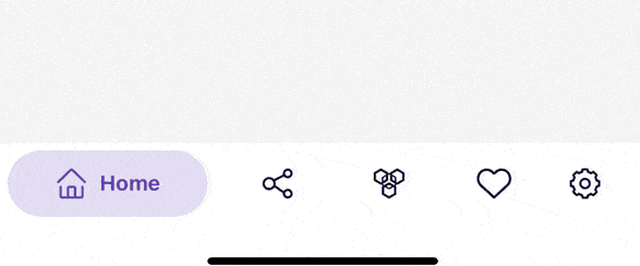
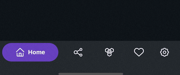
Colorful TabBar
This TabBar is inspired by Aurélien Salomon's works on Dribbble.
import { ColorfulTabBar } from 'react-navigation-tabbar-collection';

const App = () => {
    return (
        <NavigationContainer>
            <Tab.Navigator
                tabBar={(props) => <ColorfulTabBar {...props} />} //Add Here
            >
                {/* Your Screens Here ~ */}
            </Tab.Navigator>
        </NavigatorContainer>
    )
}
Example
import React from 'react';
import { NavigationContainer } from '@react-navigation/native';
import { createBottomTabNavigator } from '@react-navigation/bottom-tabs';
import { StyleSheet, Text, View } from 'react-native';
import { ColorfulTabBar } from 'react-navigation-tabbar-collection';
import Icon from 'react-native-vector-icons/AntDesign';

const Tab = createBottomTabNavigator();

const DemoScreen = ({ route }) => (
  <View style={styles.screen}>
    <Text>{route.name}</Text>
  </View>
);

const App = () => {
  return (
    <NavigationContainer>
      <Tab.Navigator
        initialRouteName="Home"
        tabBar={(props) => <ColorfulTabBar {...props} />}
      >
        <Tab.Screen
          name="Home"
          component={DemoScreen}
          options={{
            title: 'Home',
            icon: ({ focused, color, size }) => (
              <Icon name="home" size={size} color={color} />
            ),
            color: 'primary',
          }}
        />
        <Tab.Screen
          name="News"
          component={DemoScreen}
          options={{
            title: 'News',
            icon: ({ focused, color, size }) => (
              <Icon name="sharealt" size={size} color={color} />
            ),
            color: 'info',
          }}
        />
        <Tab.Screen
          name="Chat"
          component={DemoScreen}
          options={{
            title: 'Chat',
            icon: ({ focused, color, size }) => (
              <Icon name="API" size={size} color={color} />
            ),
            color: 'warning',
          }}
        />
        <Tab.Screen
          name="Likes"
          component={DemoScreen}
          options={{
            title: 'Likes',
            icon: ({ focused, color, size }) => (
              <Icon name="hearto" size={size} color={color} />
            ),
            color: 'danger',
          }}
        />
        <Tab.Screen
          name="Settings"
          component={DemoScreen}
          options={{
            title: 'Settings',
            icon: ({ focused, color, size }) => (
              <Icon name="setting" size={size} color={color} />
            ),
            color: 'success',
          }}
        />
      </Tab.Navigator>
    </NavigationContainer>
  );
};

export default App;

const styles = StyleSheet.create({
  screen: {
    width: '100%',
    height: '100%',
    flex: 6,
    justifyContent: 'center',
    alignItems: 'center',
  },
});
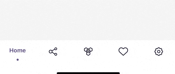
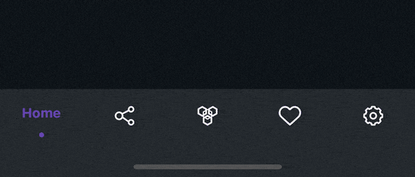
Clean TabBar
This TabBar is inspired by Cuberto's works on Dribbble.
import { CleanTabBar } from 'react-navigation-tabbar-collection';

const App = () => {
    return (
        <NavigationContainer>
            <Tab.Navigator
                tabBar={(props) => <CleanTabBar {...props} />} //Add Here
            >
                {/* Your Screens Here ~ */}
            </Tab.Navigator>
        </NavigatorContainer>
    )
}
Example
import React from 'react';
import { NavigationContainer } from '@react-navigation/native';
import { createBottomTabNavigator } from '@react-navigation/bottom-tabs';
import { StyleSheet, Text, View } from 'react-native';
import { CleanTabBar } from 'react-navigation-tabbar-collection';
import Icon from 'react-native-vector-icons/AntDesign';

const Tab = createBottomTabNavigator();

const DemoScreen = ({ route }) => (
  <View style={styles.screen}>
    <Text>{route.name}</Text>
  </View>
);

const App = () => {
  return (
    <NavigationContainer>
      <Tab.Navigator
        initialRouteName="Home"
        tabBar={(props) => <CleanTabBar {...props} />}
      >
        <Tab.Screen
          name="Home"
          component={DemoScreen}
          options={{
            title: 'Home',
            icon: ({ focused, color, size }) => (
              <Icon name="home" size={size} color={color} />
            ),
            color: 'primary',
          }}
        />
        <Tab.Screen
          name="News"
          component={DemoScreen}
          options={{
            title: 'News',
            icon: ({ focused, color, size }) => (
              <Icon name="sharealt" size={size} color={color} />
            ),
            color: 'info',
          }}
        />
        <Tab.Screen
          name="Chat"
          component={DemoScreen}
          options={{
            title: 'Chat',
            icon: ({ focused, color, size }) => (
              <Icon name="API" size={size} color={color} />
            ),
            color: 'warning',
          }}
        />
        <Tab.Screen
          name="Likes"
          component={DemoScreen}
          options={{
            title: 'Likes',
            icon: ({ focused, color, size }) => (
              <Icon name="hearto" size={size} color={color} />
            ),
            color: 'danger',
          }}
        />
        <Tab.Screen
          name="Settings"
          component={DemoScreen}
          options={{
            title: 'Settings',
            icon: ({ focused, color, size }) => (
              <Icon name="setting" size={size} color={color} />
            ),
            color: 'success',
          }}
        />
      </Tab.Navigator>
    </NavigationContainer>
  );
};

export default App;

const styles = StyleSheet.create({
  screen: {
    width: '100%',
    height: '100%',
    flex: 6,
    justifyContent: 'center',
    alignItems: 'center',
  },
});
Props
| Name | Description | Required | Type | Default | Supported Component |
|---|
{...props} | Default Bottom Tab React Navigation Props | YES | | | All |
maxWidth | TabBar Content Max Width | NO | number | 600 | All |
height | TabBar Container Height | NO | number | | All |
darkMode | TabBar Style Mode | NO | boolean | false | All |
colorPalette | TabBar Color Palette | NO | object | see down here | All |
Default colorPalette value
{
primary: "#5b37b7",
secondary: "#6c757d",
success: "#198754",
danger: "#c9379d",
warning: "#e6a919",
info: "#00bcd4",
light: "#ffffff",
dark: "#212529",
}
Background and Foreground Color are Inverted when the darkMode is true
Screen Options
These options came from React Navigation options or screenOptions with additional new options to configure the TabBar Item.
| Name | Description | Type |
|---|
title, label or tabBarLabel | Title string of a tab displayed in the tab bar. | string |
labelStyle or tabBarLabelStyle | Style object for the tab label. | StyleProp |
icon or tabBarIcon | Function that is given the focused state, color, and size params. | ({focused: boolean, color: string, size: number}) => void |
color or tabBarActiveTintColor | Color for the icon and label in the active tab. enum options are from the colorPalette primary, secondary, success, danger, warning, info, light, dark. or just a string of hex | enum | string |
tabBarTestID | ID to locate this tab button in tests. | string |
Author
Contributing
See the contributing guide to learn how to contribute to the repository and the development workflow.
License
MIT
Built With
Requirements


