Product
Introducing Data Exports
Export Socket alert data to your own cloud storage in JSON, CSV, or Parquet, with flexible snapshot or incremental delivery.
react-next-carousel
Advanced tools
Typescript Supported Powerful, lightweight and fully customizable carousel component for React.js and Next.js apps.
I don't have any time available to keep maintaining this package. If you have any request, try to sort it within the community. I'm able to merge pull requests that look safe from time to time but no commitment on timelines here. Feel free to fork it and publish under other name if you are in a hurry or to use another component.
http://leandrowd.github.io/react-responsive-carousel/
Check it out these cool demos created using storybook.
yarn add react-next-carousel
import React, { Component } from 'react';
import ReactDOM from 'react-dom';
import "react-next-carousel/lib/styles/carousel.min.css"; // requires a loader
import { Carousel } from 'react-next-carousel';

class DemoCarousel extends Component {
   const slides = [
    "https://fastly.picsum.photos/id/11/2500/1667.jpg?hmac=xxjFJtAPgshYkysU_aqx2sZir-kIOjNR9vx0te7GycQ",
    "https://fastly.picsum.photos/id/13/2500/1667.jpg?hmac=SoX9UoHhN8HyklRA4A3vcCWJMVtiBXUg0W4ljWTor7s",
    "https://fastly.picsum.photos/id/12/2500/1667.jpg?hmac=Pe3284luVre9ZqNzv1jMFpLihFI6lwq7TPgMSsNXw2w",
    "https://fastly.picsum.photos/id/27/3264/1836.jpg?hmac=p3BVIgKKQpHhfGRRCbsi2MCAzw8mWBCayBsKxxtWO8g",
    "https://fastly.picsum.photos/id/28/4928/3264.jpg?hmac=GnYF-RnBUg44PFfU5pcw_Qs0ReOyStdnZ8MtQWJqTfA",
    "https://fastly.picsum.photos/id/29/4000/2670.jpg?hmac=rCbRAl24FzrSzwlR5tL-Aqzyu5tX_PA95VJtnUXegGU",
   ]
    render() {
        return (
            <Carousel slides={slides}/>
        );
    }
});

ReactDOM.render(<DemoCarousel />, document.querySelector('.demo-carousel'));

// Don't forget to include the css in your page

// Using webpack or parcel with a style loader
// import styles from 'react-responsive-carousel/lib/styles/carousel.min.css';

// Using html tag:
// <link rel="stylesheet" href="<NODE_MODULES_FOLDER>/react-responsive-carousel/lib/styles/carousel.min.css"/>
| Name | Value | Description |
|---|---|---|
| autoPlay | boolean | Change the slide automatically based on interval prop. |
| interval | number | Interval in milliseconds to automatically go to the next item when autoPlay is true, defaults to 2000. |
| showCarouselArrow | boolean | Enable previous and next arrow, defaults to true. |
| showIndicators | boolean | Enable indicators to select items, defaults to true. |
| showThumbs | boolean | Enable thumbs, defaults to true. |
| thumbWidth | number | Width of the thumb, defaults to 80. |
| width | number or string | The width of the carousel, defaults to 100%. |
FAQs
react.js and next.js carousel with typescript
We found that react-next-carousel demonstrated a not healthy version release cadence and project activity because the last version was released a year ago. It has 1 open source maintainer collaborating on the project.
Did you know?

Socket for GitHub automatically highlights issues in each pull request and monitors the health of all your open source dependencies. Discover the contents of your packages and block harmful activity before you install or update your dependencies.

Product
Export Socket alert data to your own cloud storage in JSON, CSV, or Parquet, with flexible snapshot or incremental delivery.

Research
/Security News
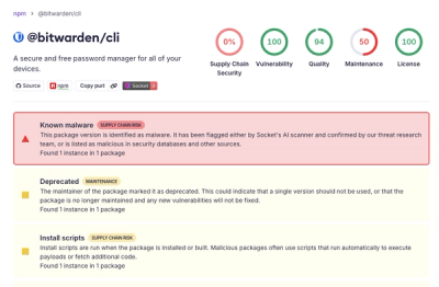
Bitwarden CLI 2026.4.0 was compromised in the Checkmarx supply chain campaign after attackers abused a GitHub Action in Bitwarden’s CI/CD pipeline.

Research
/Security News
Docker and Socket have uncovered malicious Checkmarx KICS images and suspicious code extension releases in a broader supply chain compromise.