
Product
Introducing Webhook Events for Pull Request Scans
Add real-time Socket webhook events to your workflows to automatically receive pull request scan results and security alerts in real time.
By Jeppe Hasseriis - Oct 22, 2025
react-rnd
Advanced tools
Resizable and draggable component for React.


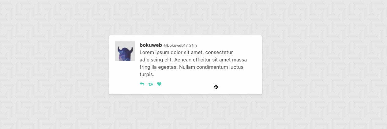
See demo: http://bokuweb.github.io/react-rnd/
demo Code: https://github.com/bokuweb/react-rnd/blob/master/docs/src/example.js
background image : Background vector created by Starline - Freepik.com
npm i -S react-rnd
yarn add react-rnd
<Rnd
  default={{
    x: 0,
    y: 0,
    width: 320,
    height: 200,
  }}
>
  Rnd
</Rnd>
default: { x: number; y: number; width: number | string; height: number | string; };The width and height property is used to set the default size of a component.
The x and y property is used to set the default position of the component.
className?: string;The className property is used to set the custom className of a resizable component.
style?: any;The style property is used to set the custom style of a resizable component.
width?: (number | string);The width property is used to set the initial width of a resizable component.
For example, you can set 300, '300px', 50%.
If omitted, set 'auto'.
height?: (number | string);The height property is used to set the initial height of a resizable component.
For example, you can set 300, '300px', 50%.
If omitted, set 'auto'.
minWidth?: number;The minWidth property is used to set the minimum width of a resizable component.
minHeight?: number;The minHeight property is used to set the minimum height of a resizable component.
maxWidth?: number;The maxWidth property is used to set the maximum width of a resizable component.
maxHeight?: number;The maxHeight property is used to set the maximum height of a resizable component.
z?: number;The z property is used to set the zIndex of a component.
resizeGrid?: [number, number];The resizeGrid property is used to specify the increments that resizing should snap to. Defaults to [1, 1].
dragGrid?: [number, number];The dragGrid property is used to specify the increments that moving should snap to. Defaults to [1, 1].
lockAspectRatio?: boolean;The lockAspectRatio property is used to lock aspect ratio.
If omitted, set false.
dragHandlerClassName?: string;Specifies a selector to be used as the handle that initiates drag. Example: '.handle'.
resizeHandlerStyles?: HandlersStyles;The resizeHandleStyles property is used to override the style of one or more resize handlers.
Only the axis you specify will have its handler style replaced.
If you specify a value for right it will completely replace the styles for the right resize handler,
but other handler will still use the default styles.
export type HandlerStyles = {
  bottom?: any,
  bottomLeft?: any,
  bottomRight?: any,
  left?: any,
  right?: any,
  top?: any,
  topLeft?: any,
  topRight?: any
}
resizeHandlerClasses?: HandlersClassName;The resizeHandlerClasses property is used to set the className of one or more resize handlers.
type HandlerClasses = {
  bottom?: string;
  bottomLeft?: string;
  bottomRight?: string;
  left?: string;
  right?: string;
  top?: string;
  topLeft?: string;
  topRight?: string;
}
enableResizing?: ?Enable;The enableResizing property is used to set the resizable permission of a resizable component.
The permission of top, right, bottom, left, topRight, bottomRight, bottomLeft, topLeft direction resizing.
If omitted, all resizer are enabled.
If you want to permit only right direction resizing, set { top:false, right:true, bottom:false, left:false, topRight:false, bottomRight:false, bottomLeft:false, topLeft:false }.
export type Enable = {
  bottom?: boolean;
  bottomLeft?: boolean;
  bottomRight?: boolean;
  left?: boolean;
  right?: boolean;
  top?: boolean;
  topLeft?: boolea;
  topRight?: boolean;
}
extendsProps?: any;This property is used to pass the other props to the component.
e.g.
const extendsProps = {
  data-foo: 'foo',
  onMouseOver: () => {},
};

<Rnd extendsProps={extendsProps} />
dragAxis?: 'x' | 'y' | 'both' | 'none'The direction of allowed movement (dragging) allowed ('x','y','both','none').
bounds?: string;Specifies movement boundaries. Accepted values:
parent restricts movement within the node's offsetParent
(nearest node with position relative or absolute), or.fooClassName.onResizeStart?: ResizeStartCallBack;ResizeStartCallBack type is below.
type ResizeStartCallBack = (
  e: SyntheticMouseEvent | SyntheticTouchEvent,
  dir: Direction,
  refToElement: HTMLElement,
) => void;
Calls when resizable component resize start.
onResize?: Callback;Callback type is below.
type Callback = (
  event: MouseEvent | TouchEvent,
  direction: Direction,
  refToElement: HTMLElement,
  delta: NumberSize,
) => void;
Calls when resizable component resizing.
onResizeStop?: Callback;Callback type is below.
type Callback = (
  event: MouseEvent | TouchEvent,
  direction: Direction,
  refToElement: HTMLElement,
  delta: NumberSize,
) => void;
Calls when resizable component resize startStop.
onDragStart: DraggableEventHandler;Callback called on dragging start.
type DraggableData = {
  node: HTMLElement,
  x: number,
  y: number,
  deltaX: number, deltaY: number,
  lastX: number, lastY: number
};

type DraggableEventHandler = (
  e: SyntheticMouseEvent | SyntheticTouchEvent, data: DraggableData,
) => void | false;
onDrag: DraggableEventHandler;onDrag called with the following parameters:
type DraggableData = {
  node: HTMLElement,
  x: number,
  y: number,
  deltaX: number, deltaY: number,
  lastX: number, lastY: number
};

type DraggableEventHandler = (
  e: SyntheticMouseEvent | SyntheticTouchEvent, data: DraggableData,
) => void | false;
onDragStop: DraggableEventHandler;onDragStop called on dragging stop.
type DraggableData = {
  node: HTMLElement,
  x: number,
  y: number,
  deltaX: number, deltaY: number,
  lastX: number, lastY: number
};

type DraggableEventHandler = (
  e: SyntheticMouseEvent | SyntheticTouchEvent, data: DraggableData,
) => void | false;
updateSize(size: { x: string | number, y: string | number })Update component size.
grid ,max/minWidth, max/minHeight props is ignored, when this method called.
class YourComponent extends Component {

  ...

  update() {
    this.rnd.updateSize({ width: 200, height: 300 });
  }

  render() {
    return (
      <Rnd ref={c => { this.rnd = c; }}>
        example
      </Rnd>
    );
  }

  ...
}
updatePosition({ x: number, x: number })Update component size.
grid bounds props is ignored, when this method called.
class YourComponent extends Component {

  ...

  update() {
    this.rnd.updatePosition({ x: 200, y: 300 });
  }

  render() {
    return (
      <Rnd ref={c => { this.rnd = c; }}>
        example
      </Rnd>
    );
  }

  ...
}
updateZIndex(z: number)Update component z-index.
class YourComponent extends Component {

  ...

  update() {
    this.rnd.updateZIndex(200);
  }

  render() {
    return (
      <Rnd ref={c => { this.rnd = c; }}>
        example
      </Rnd>
    );
  }

  ...
}
npm t
updateZIndex.updateSize.react-draggable.updateZIndex, method to updated component zIndex state.react-rnd.canUpdatePositionByParent property.canUpdateSizeByParent property.initiAsResizing property.x, y, width and height property to initial.updateSize, updatePosition, method to updated conponent state.lockAspectRatio property to lock aspect ratio when resizing.canUpdatePositionByParent property.grid props to snap grid. (thanks @paulyoung)canUpdateSizeByParent props #38requireThe MIT License (MIT)
Copyright (c) 2017 bokuweb
Permission is hereby granted, free of charge, to any person obtaining a copy of this software and associated documentation files (the "Software"), to deal in the Software without restriction, including without limitation the rights to use, copy, modify, merge, publish, distribute, sublicense, and/or sell copies of the Software, and to permit persons to whom the Software is furnished to do so, subject to the following conditions:
The above copyright notice and this permission notice shall be included in all copies or substantial portions of the Software.
THE SOFTWARE IS PROVIDED "AS IS", WITHOUT WARRANTY OF ANY KIND, EXPRESS OR IMPLIED, INCLUDING BUT NOT LIMITED TO THE WARRANTIES OF MERCHANTABILITY, FITNESS FOR A PARTICULAR PURPOSE AND NONINFRINGEMENT. IN NO EVENT SHALL THE AUTHORS OR COPYRIGHT HOLDERS BE LIABLE FOR ANY CLAIM, DAMAGES OR OTHER LIABILITY, WHETHER IN AN ACTION OF CONTRACT, TORT OR OTHERWISE, ARISING FROM, OUT OF OR IN CONNECTION WITH THE SOFTWARE OR THE USE OR OTHER DEALINGS IN THE SOFTWARE.
react-draggable is a package that provides draggable functionality for React components. It is simpler and more focused on dragging compared to react-rnd, which also includes resizing capabilities.
react-resizable is a package that provides resizable functionality for React components. It is more focused on resizing compared to react-rnd, which also includes dragging capabilities.
react-grid-layout is a package that provides a grid layout system with draggable and resizable widgets. It is more complex and feature-rich compared to react-rnd, offering a complete layout system.
FAQs
A draggable and resizable React Component
The npm package react-rnd receives a total of 326,903 weekly downloads. As such, react-rnd popularity was classified as popular.
We found that react-rnd demonstrated a healthy version release cadence and project activity because the last version was released less than a year ago. It has 1 open source maintainer collaborating on the project.
Did you know?

Socket for GitHub automatically highlights issues in each pull request and monitors the health of all your open source dependencies. Discover the contents of your packages and block harmful activity before you install or update your dependencies.
Product
Add real-time Socket webhook events to your workflows to automatically receive pull request scan results and security alerts in real time.

Research
The Socket Threat Research Team uncovered malicious NuGet packages typosquatting the popular Nethereum project to steal wallet keys.
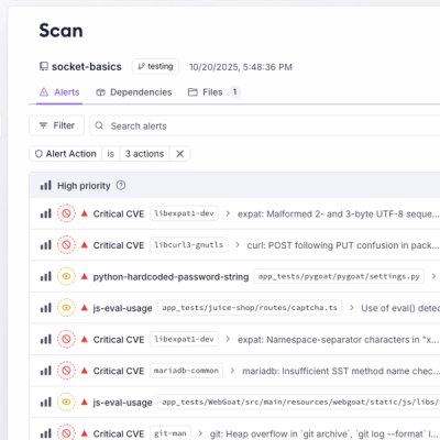
Product
A single platform for static analysis, secrets detection, container scanning, and CVE checks—built on trusted open source tools, ready to run out of the box.