Product
Introducing License Overlays: Smarter License Management for Real-World Code
Customize license detection with Socket’s new license overlays: gain control, reduce noise, and handle edge cases with precision.
react-scroll-to-bottom
Advanced tools
React container that will auto scroll to bottom or top if new content is added and viewport is at the bottom, similar to tail -f. Otherwise, a "jump to bottom" button will be shown to allow user to quickly jump to bottom.
This project scaffolding is from react-component-template.
Try out the demo at https://compulim.github.io/react-scroll-to-bottom/.
import { css } from 'glamor';
import ScrollToBottom from 'react-scroll-to-bottom';

const ROOT_CSS = css({
  height: 600,
  width: 400
});

export default props =>
  <ScrollToBottom className={ ROOT_CSS }>
    <p>Nostrud nisi duis veniam ex esse laboris consectetur officia et. Velit cillum est veniam culpa magna sit exercitation excepteur consectetur ea proident. Minim pariatur nisi dolore Lorem ipsum adipisicing do. Ea cupidatat Lorem sunt fugiat. Irure est sunt nostrud commodo sint.</p>
    <p>Duis consectetur ad in fugiat et aliquip esse adipisicing occaecat et sunt ea occaecat ad. Tempor anim consequat commodo veniam nostrud sunt deserunt adipisicing Lorem Lorem magna irure. Eu ut ipsum magna nulla sunt duis Lorem officia pariatur. Nostrud nisi anim nostrud ea est do nostrud cupidatat occaecat dolor labore do anim. Laborum quis veniam ipsum ullamco voluptate sit ea qui adipisicing aliqua sunt dolor nulla. Nulla consequat sunt qui amet. Pariatur esse pariatur veniam non fugiat laboris eu nulla incididunt.</p>
    <p>Laboris duis do consectetur aliquip non aliquip ad ad quis minim. Aute magna tempor occaecat magna fugiat culpa. Commodo id eiusmod ea pariatur consequat fugiat minim est anim. Ipsum amet ipsum eu nisi. Exercitation minim amet incididunt tempor do ut id in officia eu sit est. Dolor qui laboris laboris tempor sunt velit eiusmod non ipsum exercitation ut sint ipsum officia.</p>
  </ScrollToBottom>
We use
glamorfor component styles. It is not required, but we don't supportstyleprops for performance reason.
| Name | Type | Default | Description |
|---|---|---|---|
checkInterval | number | 150 | Recurring interval of stickiness check, in milliseconds (minimum is 17 ms) |
className | string | Set the class name for the root element | |
debounce | number | 17 | Set the debounce for tracking the onScroll event |
followButtonClassName | string | Set the class name for the follow button | |
mode | string | "bottom" | Set it to "bottom" for scroll-to-bottom, "top" for scroll-to-top |
scrollViewClassName | string | Set the class name for the container element that house all props.children |
We use 2 different contexts with different performance characteristics to provide better overall performance. Function context contains immutable functions. State context may change when the user scroll the panel.
This context contains functions used to manipulate the container. And will not update throughout the lifetime of the composer.
| Name | Type | Description |
|---|---|---|
scrollTo | `(scrollTop: number | '100%') => void` |
scrollToBottom | () => void | Scroll panel to bottom |
scrollToEnd | () => void | Scroll panel to end (depends on mode) |
scrollToStart | () => void | Scroll panel to start (depends on mode) |
scrollToTop | () => void | Scroll panel to top |
This context contains state of the container.
| Name | Type | Description |
|---|---|---|
animating | boolean | true if the panel is animating scroll effect |
atBottom | boolean | true if the panel is currently near bottom |
atEnd | boolean | true if the panel is currently near the end (depends on mode) |
atStart | boolean | true if the panel is currently near the start (depends on mode) |
atTop | boolean | true if the panel is currently near top |
mode | string | "bottom" for scroll-to-bottom, "top" for scroll-to-top |
sticky | boolean | true if the panel is sticking to the end |
atEndandstickyare slightly different. During scroll animation, the panel is not at the end yet, but it is still sticky.
Like us? Star us.
Want to make it better? File us an issue.
Don't like something you see? Submit a pull request.
FAQs
React container that will auto scroll to bottom
The npm package react-scroll-to-bottom receives a total of 49,075 weekly downloads. As such, react-scroll-to-bottom popularity was classified as popular.
We found that react-scroll-to-bottom demonstrated a not healthy version release cadence and project activity because the last version was released a year ago. It has 2 open source maintainers collaborating on the project.
Did you know?

Socket for GitHub automatically highlights issues in each pull request and monitors the health of all your open source dependencies. Discover the contents of your packages and block harmful activity before you install or update your dependencies.

Product
Customize license detection with Socket’s new license overlays: gain control, reduce noise, and handle edge cases with precision.

Product
Socket now supports Rust and Cargo, offering package search for all users and experimental SBOM generation for enterprise projects.

Product
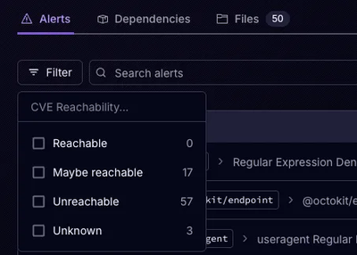
Socket’s precomputed reachability slashes false positives by flagging up to 80% of vulnerabilities as irrelevant, with no setup and instant results.