Company News
Socket Has Acquired Secure Annex
Socket has acquired Secure Annex to expand extension security across browsers, IDEs, and AI tools.
react-select-virtualized
Advanced tools
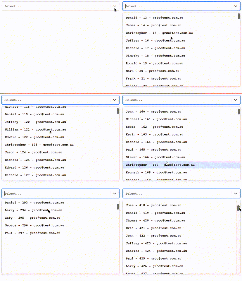
Select virtualized component using: react-select v3 + react-virtualized + react hooks

react-select v3 + react-virtualized + react hooks!
This project came up after hours of trying to find an autocomplete component that supports large sets of data to be displayed and searched for while maintain performance. The only libraries out there that allow this functionality are either not maintained anymore, use outdated libraries or are poorly performant.
I created a component that uses the Airbnb library called react-virtualized for the virtual data loading of elements and plugged it to the react-select (the most used autocomplete library for react) menu list.

npm install --save react-select-virtualized
remember to install them (if they are not already in your project).
{
    "react": "^16.8.x || 16.9.x || 16.10.x || 16.11.x",
    "react-dom": "^16.8.x || 16.9.x || 16.10.x || || 16.11.x",
    "react-virtualized": "^9.21.1",
    "react-select": "^3.0.x"
  }
The select component will be the same from react-select v3 so you will be able to use it with any select you already have.
https://codesandbox.io/s/vigilant-mclean-wpbk7
Do you want to see it working? -> https://serene-hawking-021d7a.netlify.com/
Components: Select, Async, Creatable
We support all the UI related props for the input. Extension also.
List: (...To be completed)
We do not support any related prop to the popup list. We extend it. *Sorry no extension of any component inside the list.*
List Props Supported: (...To be completed)
| Props | Type | Default | Description |
|---|---|---|---|
| grouped | boolean | false | specify if options are grouped |
| formatGroupHeaderLabel | function({ label, options}) => component | will render a custom component in the popup grouped header (only for grouped) | |
| formatOptionLabel (coming from react-select) | function(option, { context }) => component | will render a custom component in the label | |
| optionHeight | number | 31 | height of each option |
| groupHeaderHeight | number | header row height in the popover list | |
| maxHeight (coming from react-select) | number | auto | max height popover list |
| defaultValue | option | will set default value and set the component as an uncontrolled component | |
| value | option | will set the value and the component will be a controlled component | |
| onCreateOption (Only for Creatable) | function(option) => nothing | will be executed when a new option is created , it is only for controlled components |
Check storybook for more examples, it can be used controlled/uncontrolled.
const options = [
  {
    value: 1,
    label: `guiyep`,
  },
  ...
];
import React from 'react';

import Select from 'react-select-virtualized';

const Example1 = () => <Select options={options}/>

const Example2 = () => <Select options={options} {..ANY_REACT_SELECT_V2_PROP}/>
Check storybook for more examples, it can be used controlled/uncontrolled.
const options = [
  {
    value: 1,
    label: `guiyep`,
  },
  ...
];


const opsGroup = [
  { label: `Group Name Header`, options },
  ...
]
import React from 'react';

import Select from 'react-select-virtualized';

const Example1 = () => <Select options={options} grouped/>

const Example2 = () => <Select options={options} {..ANY_REACT_SELECT_V2_PROP} grouped/>
Check storybook for more examples, it can be used controlled/uncontrolled.
CLARIFICATION: you are in charge of filtering the data.
import React from 'react';

import { Async } from 'react-select-virtualized';

const loadOptions = (input, callback) => {...};

const Example1 = () => <Async loadOptions={loadOptions}/>

const Example2 = () => <Async defaultOptions={options} {..ANY_REACT_ASYNC_SELECT_V2_PROP} loadOptions={loadOptions}/>

const Example3 = () => <Async defaultOptions={opsGroup} {..ANY_REACT_ASYNC_SELECT_V2_PROP} loadOptions={loadOptions} grouped/>
Check storybook for more examples, it can be used controlled/uncontrolled.
UNCONTROLLED:
import React from 'react';

import { Creatable } from 'react-select-virtualized';

const Example1 = () => <Creatable options={options} {..ANY_REACT_CREATABLE_SELECT_V2_PROP} />;
CONTROLLED:
import React from 'react';

import { Creatable } from 'react-select-virtualized';

const onCreateOption = (newItem) => {
  store.set({ options: store.state.options.concat([newItem]) });
  store.set({ selected: newItem });
};

const onChange = (item) => {
  store.set({ selected: item });
};

const Example1 = () => (
  <Creatable
    options={store.state.options}
    value={store.state.selected}
    onCreateOption={onCreateOption}
    onChange={onChange}
    {..ANY_REACT_CREATABLE_SELECT_V2_PROP}
  />
);
NOT YET DONE.
When you use the defaultValue you will be using the component as uncontrolled and the state will be managed for you internally. There are some prop that cannot be mixed and the component will let you know when that is the case. Same happens when you use value, but will render the component as a controlled component where you will be in charge of the component internal state.
fast-react-select.
-- v 1.0.0 --
-- v 1.1.0 --
-- v 1.2.0 --
-- v 2.0.0 --
-- v 2.1.0 --
-- v 2.2.0 --
-- v 2.3.0 --
-- v 2.4.0 --
MIT © guiyep
FAQs
Select virtualized component using: react-select v4 + react-virtualized + react hooks
The npm package react-select-virtualized receives a total of 2,992 weekly downloads. As such, react-select-virtualized popularity was classified as popular.
We found that react-select-virtualized demonstrated a not healthy version release cadence and project activity because the last version was released a year ago. It has 1 open source maintainer collaborating on the project.
Did you know?

Socket for GitHub automatically highlights issues in each pull request and monitors the health of all your open source dependencies. Discover the contents of your packages and block harmful activity before you install or update your dependencies.

Company News
Socket has acquired Secure Annex to expand extension security across browsers, IDEs, and AI tools.

Research
/Security News
Socket is tracking cloned Open VSX extensions tied to GlassWorm, with several updated from benign-looking sleepers into malware delivery vehicles.

Product
Reachability analysis for PHP is now available in experimental, helping teams identify which vulnerabilities are actually exploitable.