Socket
Socket
Sign inDemoInstall

react-simple-steps

Package Overview
Dependencies
297
Maintainers
1
Versions
16
Alerts
File Explorer

Advanced tools

Install Socket

Detect and block malicious and high-risk dependencies

Install

    react-simple-steps

![steps.png](https://raw.githubusercontent.com/woltsu/react-simple-steps/master/steps.png)


Version published
Maintainers
1
Created

Readme

Source

react-simple-steps

steps.png

Importing

import Steps from 'react-simple-steps'

How to use

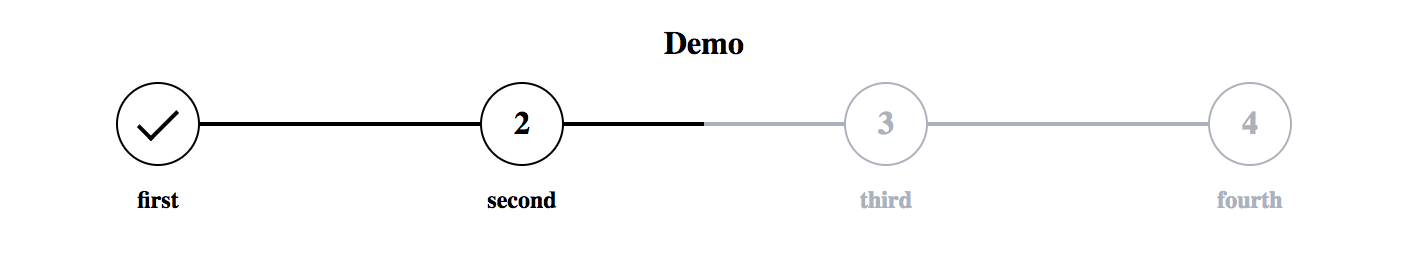
<Steps title='Demo' steps={['first', 'second', 'third', 'fourth']} />

Optional props

title = String
showTitles = Boolean, default = true
showCheckmarks = Boolean, default = true
current = Number, index of the step to show
onStepChange = Function, gets the index of the clicked step as a parameter
disabled = Boolean, default = false, makes clicking of the steps have no effect and sets the cursor to default (onStepChange will still be triggered)
colors = Array, custom colors for steps in order, f.ex. ['pink', 'red', '#FFFFFF',...]

Notes

For custom control one can use the onStepChange function and the current attribute:
<Steps steps={['first', 'second', 'third', 'fourth']} current={this.state.step} onStepChange={(step) => this.setState({ step })} />

Changelog

[1.2.0] Added custom colors prop, cleaned code and improved documentation

Keywords

FAQs

Last updated on 02 Jan 2019

Did you know?

Socket for GitHub automatically highlights issues in each pull request and monitors the health of all your open source dependencies. Discover the contents of your packages and block harmful activity before you install or update your dependencies.

Install

Related posts

SocketSocket SOC 2 Logo

Product

  • Package Alerts
  • Integrations
  • Docs
  • Pricing
  • FAQ
  • Roadmap

Stay in touch

Get open source security insights delivered straight into your inbox.


  • Terms
  • Privacy
  • Security

Made with ⚡️ by Socket Inc