Product
Introducing Webhook Events for Alert Changes
Add real-time Socket webhook events to your workflows to automatically receive software supply chain alert changes in real time.
react-skeleton-loaders
Advanced tools
A lightweight, customizable React component for rendering skeleton loaders while content is loading.


className and stylenpm install react-skeleton-loaders
yarn add react-skeleton-loaders
import React from 'react';
import Skeleton from 'react-skeleton-loaders';

const MyComponent = () => {
  return (
    <div>
      <Skeleton width="100%" height="20px" />
      <Skeleton width="60%" height="20px" style={{ marginTop: 10 }} />
      <Skeleton circle width="40px" height="40px" />
    </div>
  );
};
import React from 'react';
import Skeleton from 'react-skeleton-loaders';

const App = () => {
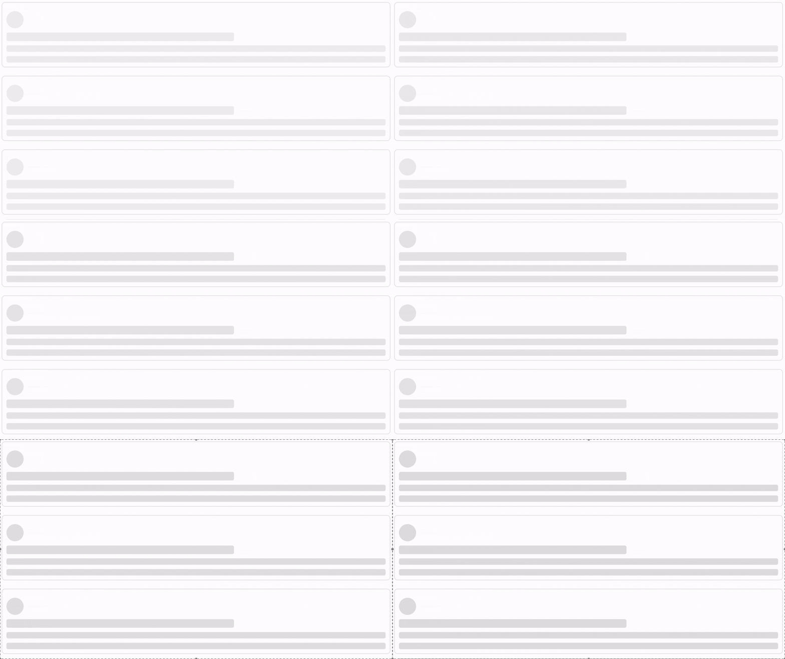
  const posts = [1, 2, 3, 4, 5, 6];

  return (
    <div style={{
      display: 'grid',
      gridTemplateColumns: 'repeat(auto-fill, minmax(500px, 1fr))',
      gap: '20px',
      margin: '10px',
    }}>
      {posts.map((post, index) => (
        <div key={index} style={{ padding: '10px', border: '1px solid #ddd', borderRadius: '8px' }}>
          <Skeleton circle width="40px" height="40px" />
          <Skeleton width="60%" height="20px" />
          <Skeleton width="100%" height="15px" />
          <Skeleton width="100%" height="15px" />
        </div>
      ))}
    </div>
  );
};

export default App;
| Prop | Type | Default | Description |
|---|---|---|---|
width | string | number | "100%" | Width of the skeleton |
height | string | number | "1rem" | Height of the skeleton |
circle | boolean | false | Renders as a circle |
className | string | "" | Custom class for styling |
style | React.CSSProperties | {} | Inline styles |
npm run build
MIT License © Victor Olayemi
FAQs
A customizable React skeleton loader component
We found that react-skeleton-loaders demonstrated a healthy version release cadence and project activity because the last version was released less than a year ago. It has 1 open source maintainer collaborating on the project.
Did you know?

Socket for GitHub automatically highlights issues in each pull request and monitors the health of all your open source dependencies. Discover the contents of your packages and block harmful activity before you install or update your dependencies.

Product
Add real-time Socket webhook events to your workflows to automatically receive software supply chain alert changes in real time.

Security News
ENISA has become a CVE Program Root, giving the EU a central authority for coordinating vulnerability reporting, disclosure, and cross-border response.

Product
Socket now scans OpenVSX extensions, giving teams early detection of risky behaviors, hidden capabilities, and supply chain threats in developer tools.