react-skills


A dependency-free, pure-css animated, resizable, customizable, skill bars panel React component.
Links
Installation
npm i react-skills
Usage
import { SkillBars } from 'react-skills';
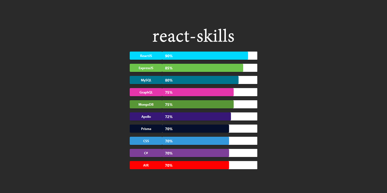
const skillsData= [
{
name: 'ReactJS',
level: 100,
color: 'blue',
},
{
name: 'SomeOtherTech',
level: 85,
color: 'red',
}
]
<SkillBars skills={skillsData} />
or you can use the SkillBar (singular) component this way:
import { SkillBar } from 'react-skills';
<SkillBar name="ReactJS" level={100} color="blue" />
<SkillBar name="SomeOtherTech" level={80} color="red" />
Developers
Start
npm run start or yarn start
Runs the library in development mode. Open http://localhost:3000 to view it in the browser.
Test
npm run test or yarn test
Runs the test watcher in an interactive mode.
Build
npm run build or yarn build
Builds the library for production to the build folder.
It correctly bundles React in production mode and optimizes the build for the best performance.
Deploy
npm run deploy or yarn deploy
Builds the component then push it on NPM as new version.
Builds the github page app for production to the demo folder.
Creates a gh-page github branch and push the demo build on that branch.
Props API
SkillBar
Displays a animated skill bar
| name | string | yes | | The name of the skill. |
| level | number | yes | | The skill level. |
| color | string | yes | | The background color. |
| duration | number | no | 2 | The animation duration in seconds. |
| height | number | no | 30 | The component height. |
| levelProgress | bool | no | false | Whether or not the level text should increment as the bar grows up or directly display the level value. |
| flat | bool | no | false | Whether the component owns a box shadow or not. |
| labelWidth | number | no | 100 | The label width. |
| customLabel | func | no | null | User defined function that takes a skill parameter and returns a React component to display instead of the default label. |
SkillBars
Group your Skillbars components together
| skills | arrayOf | yes | | An array of SkillBar props data |
| duration | number | no | 2 | The animation duration in seconds. |
| levelProgress | bool | no | false | Whether or not the level text should increment as the bar grow up or directly display the level value. |
| flat | bool | no | false | Whether the skillbars own a box shadow or not. |
| barsHeight | number | no | 30 | The SkillBar component height. |
| labelsWidth | number | no | 100 | The SkillBar component label width. |
| spacing | number | no | 15 | The spacing between each SkillBar row. |
| customLabels | func | no | null | User defined function that takes a skill parameter and returns a React component to display instead of the default labels. |
This document was generated by the Create React Readme v1.0.2.


