React Stepper Component
React Stepper Component is a simple yet customizable component using SVG that will help you to make you application more intutive and appealing. This will help you make you stepper more responsive.
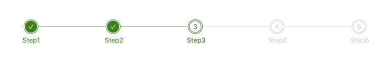
Screenshot
Features!
- Highly customizable
- Easy to manage
- Can set color for outer circle, inner circle & counter
- Can set custom label
- Can set color for label
- Can set custom color for completed steps, Connector, Completed Label and active Step
- Have a callback function for click
- Works completely based on an Object
Installation
npm install --save react-stepper-component-with-svg
Usage
import  Stepper  from 'react-stepper-component-with-svg';

<Stepper onClickCallback={callbackFunctionName} stepperData={stepperData}/>
Props for Stepper
| Props | Option | Default | Description |
|---|
| onClickCallback | function | none | Callback function for click on step item |
| stepperData | StepperDTO | none | Object that manages the stepper |
Sample Data Object
  const stepperData = {
    currentStep: 2,
    outerCircleBorderColor: "#ccc",
    innerCircleBorderColor: "#ccc",
    counterTextColor: "#ccc",
    labelTextColor: "#ccc",
    completedIndicatorColor: "green",
    completedTextColor: "#fff",
    connectorColor: "#ccc",
    completedLabelColor: "green",
    activeIndicator: "#006400",
    steps: [
        {
            title: 'Step1'
        },
        {
            title: 'Step2'
        },
        {
            title: 'Step3'
        },
        {
            title: 'Step4'
        },
        {
          title: 'Step5'
        }
    ]
};
stepperDTO
| Props | Option | Default | Description |
|---|
| currentStep | number | none | Value for active step |
| outerCircleBorderColor | string | | Color code for the outer circle |
| innerCircleBorderColor | string | | Color code for the inner circle |
| counterTextColor | string | | Color code for counter text |
| labelTextColor | string | | Color code for label |
| completedIndicatorColor | string | | Color code for completion indicator |
| completedTextColor | string | | Color code for completed text |
| connectorColor | string | | Color code for connector line |
| completedLabelColor | string | | Color code for completed label |
| activeIndicator | string | | Color code for active step indicator |
| steps | [StepsDTO] | none | Array of objects with label for step |
StepsDTO
| Props | Option | Default | Description |
|---|
| title | string | none | Label for the stepper |


