Security Fundamentals
Turtles, Clams, and Cyber Threat Actors: Shell Usage
The Socket Threat Research Team uncovers how threat actors weaponize shell techniques across npm, PyPI, and Go ecosystems to maintain persistence and exfiltrate data.
react-tailwindcss-datetimepicker
Advanced tools
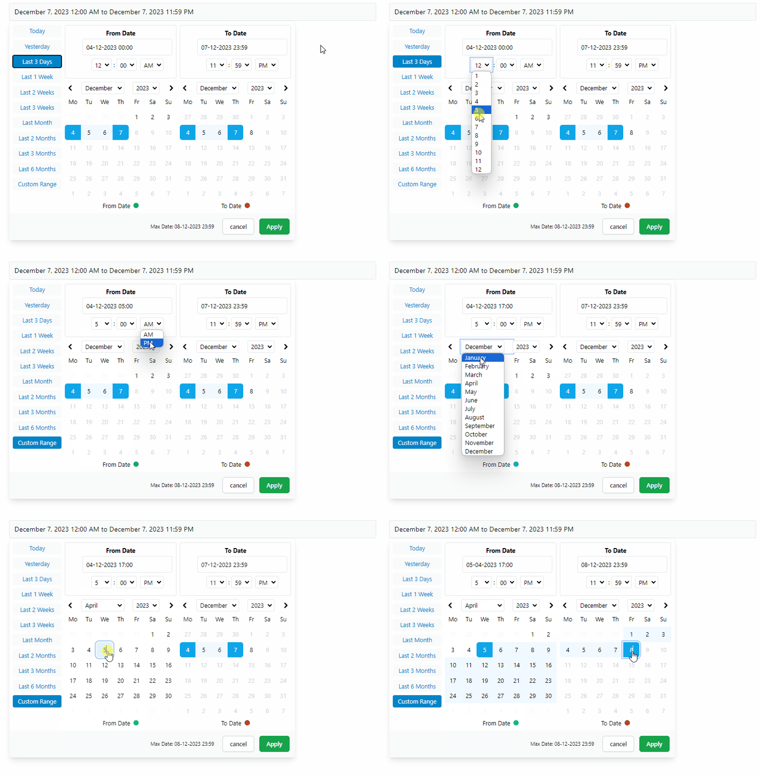
This is a feature rich React date-time picker component built with **React 18** and [Vitejs](https://vitejs.dev/) offering the following functionalities:
This is a feature rich React date-time picker component built with React 18 and Vitejs offering the following functionalities:
This project is a fork of react-datetimepicker with significant alterations including:


Check out the online demo at codesandbox.io

// Npm
npm i react-tailwindcss-datetimepicker
// Yarn
yarn add react-tailwindcss-datetimepicker
If you're already including TailwindCSS in your project, just open up your tailwind.config.js file and add the following line to your content array so that tailwind could find CSS classes used in picker and add those to your project's global css file:
// tailwind.config.js

module.exports = {
  content: [
    './src/**/*.{js,jsx,ts,tsx}',
    './node_modules/react-tailwindcss-datetimepicker/dist/react-tailwindcss-datetimepicker.js',
    // ^^^^^^^^^
    // Add this line
  ],
};
If you don't use TailwindCSS in your project you can simply import the shipped standalone CSS file needed for this component like so:
// src/main.tsx

import DateTimePicker from 'react-tailwindcss-datetimepicker';
import 'react-tailwindcss-datetimepicker/style.css'
import { useState } from 'react';
import DateTimePicker from 'react-tailwindcss-datetimepicker';
import moment, { type Moment } from 'moment-timezone';

function App() {
  const start = moment(new Date());
  const end = moment(start).add(1, 'days').subtract(1, 'seconds');
  const [range, setRange] = useState({start, end });

  function handleApply(startDate: Moment, endDate: Moment) {
    setRange({ start: startDate, end: endDate });
  }

  return (
    <DateTimePicker
      ranges={{
        Today: [moment(start), moment(end)],
        '1 Month': [moment(start).subtract(1, 'months'), moment(end)]
      }}
      start={range.start}
      end={range.end}
      local={{
        format: 'DD-MM-YYYY HH:mm',
        sundayFirst: false,
      }}
      maxDate={moment(start).add(24, 'hour')}
      applyCallback={handleApply}
    >
      <input
        placeholder="Enter date..."
        value={`${range.start} - ${range.end}`}
        disabled
      />
    </DateTimePicker>
  );
}

export default App;
import React from 'react';
import DateTimePicker from 'react-tailwindcss-datetimepicker';
import moment, { type Moment } from 'moment-timezone';

class App extends React.Component {
  constructor(props) {
    super(props);
    const now = new Date();
    const start = moment(
      new Date(now.getFullYear(), now.getMonth(), now.getDate(), 0, 0, 0, 0)
    );
    const end = moment(start).add(1, 'days').subtract(1, 'seconds');
    this.state = {
      start: start,
      end: end,
    };
  }

  applyCallback = (startDate: Moment, endDate: Moment) => {
    this.setState({
      start: startDate,
      end: endDate,
    });
  }

  render() {
    const now = new Date();
    const start = moment(
      new Date(now.getFullYear(), now.getMonth(), now.getDate(), 0, 0, 0, 0)
    );
    const end = moment(start).add(1, 'days').subtract(1, 'seconds');
    const ranges = {
      Today: [moment(start), moment(end)],
      '1 Month': [moment(start).subtract(1, 'months'), moment(end)],
    };
    const local = {
      format: 'DD-MM-YYYY HH:mm',
      sundayFirst: false,
    };
    let maxDate = moment(start).add(24, 'hour');
    return (
      <DateTimePicker
        ranges={ranges}
        start={this.state.start}
        end={this.state.end}
        local={local}
        maxDate={maxDate}
        applyCallback={this.applyCallback}
      >
        <input
          placeholder="Enter date..."
          value={`${range.start} - ${range.end}`}
          disabled
        />
      </DateTimePicker>
    );
  }
}

export default App;
| Option | Required | Type | Default | Description |
|---|---|---|---|---|
ranges | Required | Object | undefined | A record of ranges defined using a tuple of Moment times. |
start | Required | Moment Date | undefined | Initial start Date set in the picker |
end | Required | Moment Date | undefined | Initial end Date set in the picker |
local | Required | Object | undefined | locale format for date labels |
applyCallback | Required | Function | null | Function which is called when the apply button is clicked |
rangeCallback | optional | Function | null | Function which is called when one of the preset ranges is clicked |
maxDate | optional | Moment Date | undefined | Maximum date that can be selected in calendar |
autoApply | optional | Boolean | false | Set dates as soon as they're clicked without pressing apply |
descendingYears | optional | Boolean | false | Set years be displayed in descending order |
years | optional | Array | [1900, now] | Limit the years shown in calendar |
smartMode | optional | Boolean | false | Switch the month on the right hand side (RHS) when two dates in the same month |
pastSearchFriendly | optional | Boolean | false | Optimize calendar for past searches |
darkMode | optional | Boolean | false | Changes UI to dark |
noMobileMode | optional | Boolean | false | Picker will always be displayed in full screen mode |
forceMobileMode | optional | Boolean | false | Picker will always be displayed in condensed mode all the time |
twelveHoursClock | optional | Boolean | false | Display time values in a 12-hour format rather than a 24-hour format |
standalone | optional | Boolean | false | When set the picker will be open by default |
leftMode | optional | Boolean | false | Picker will open to the left |
centerMode | optional | Boolean | false | Picker will open in center |
ranges(Required)
Record<string, [Moment, Moment]>
A record of ranges defined using a tuple of Moment times.
const ranges = {
  'Today': [moment(start), moment(end)],
  'Yesterday': [
    moment(start).subtract(1, 'days'),
    moment(end).subtract(1, 'days'),
  ],
  'Last 3 Days': [moment(start).subtract(3, 'days'), moment(end)],
};
start(Required)
Moment
Initial start Date set in the picker
end(Required)
Moment
Initial end Date set in the picker
local(Required)
Defines a locale format for date labels to be shown as. Can also set Sunday to be first day or Monday. Locale object has 2 required keys only:
format: Moment display format.sundayFirst: true if Sunday is the first day of the week. false if Monday is the first.Example:
const locale = {
  // Mandatory
  format: 'DD-MM-YYYY HH:mm', // See: https://momentjs.com/docs/#/parsing/special-formats/
  sundayFirst: false,

  // Optional
  days: ['Mo', 'Tu', 'We', 'Th', 'Fr', 'Sa', 'So'],
  months: [
    'January',
    'February',
    'March',
    'April',
    'May',
    'June',
    'July',
    'August',
    'September',
    'October',
    'November',
    'December',
  ],
  fromDate: 'From Date',
  toDate: 'To Date',
  selectingFrom: 'Selecting From',
  selectingTo: 'Selecting To',
  maxDate: 'Max Date',
  close: 'Close',
  apply: 'Apply',
  cancel: 'Cancel',
};
applyCallback(Required) (start: Moment, end: Moment) => void
Function which is called when the apply button is clicked/pressed. Takes two params, start date and the end date which are both Moment dates.
rangeCallback(optional) (index: number, value: keyof PresetDateRanges) => void
Function which is called when one of the preset ranges is clicked/selected. Takes two params:
index is the index of item which is selectedvalue is the label of that itemmaxDate(optional) Moment
Maximum date that can be selected in calendar.
autoApply(optional)** boolean defaults to false
When set there will only be one button in the bottom right to close the screen. With this set to true upon changing anything in picker the callbackfunction will be automatically called
descendingYears(optional) boolean defaults to false
To set years be displayed in descending order in picker instead of ascending.
years(optional) [number, number] defaults to [1900, <currentYear>]
Takes a tuple where the first value is the start year and the second values is the end year. This will update the dropdown years to only show these years.
WARNING: This does not affect the ability to type in years in the text box and go beyond the values set here.
Example:
years={[1900, 2023]}
Takes an array where the first value is the start year and the second values is the end year. This will
update the dropdown years to only show these years.
WARNING: This does not affect the ability to type in years in the text box and go beyond the values set here.
smartMode(optional) boolean defaults to false
The date time picker will switch the month on the right hand side (RHS) when two dates in the same month are selected. Can be used in
conjunction with pastSearchFriendly to switch the month on the left hand side (LHS) when the two dates are from the same month.
pastSearchFriendly(optional) boolean
Note: Requires smartMode to be enabled.
Changes the mode of the date time picker to be optimised for past searches. Where possible, the start and end time will be shown on the RHS when the month and year are equal. This allows for the previous month to be shown on the LHS to allow easier backwards searching.
This setting is false by default meaning that the LHS is used when dates are selected in the same month & year
darkMode(optional) boolean defaults to false
Changes the DateTimePicker to be in Dark Mode.
noMobileMode(optional) boolean defaults to false
When set the mobile breakpoint to be ignored. Picker will always be displayed in full screen mode.
forceMobileMode(optional) boolean
When set the mobile breakpoint to be ignored. Picker will always be displayed in condensed mode all the time.
twelveHoursClock(optional) boolean defaults to false
When enabled, the picker will display time values in a 12-hour format rather than a 24-hour format.
standalone(optional) boolean
When set the picker will be open by default.
leftMode(optional) boolean
When set and changed the picker will open to the left (right to left) instead of the default which is to open to the right (left to right)
centerMode(optional) boolean
To allow flexibility, center mode has been added where leftMode or default is not enough.
Runs the app in the development mode.
npm run dev
Open http://localhost:3000 to view it in the browser.
Hot module reloading is enabled in dev mode.
npm run build
Builds the app for production to the /dist folder using vite's library mode. Type declarations are also created in the same directory.
FAQs
Feature-rich React date-time picker with range selection, customizable presets, keyboard navigation, TypeScript support, dark mode, and no date library dependency. Fully responsive. Built on top of **React 18** and [Vitejs](https://vitejs.dev/).
We found that react-tailwindcss-datetimepicker demonstrated a healthy version release cadence and project activity because the last version was released less than a year ago. It has 0 open source maintainers collaborating on the project.
Did you know?

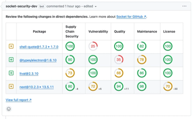
Socket for GitHub automatically highlights issues in each pull request and monitors the health of all your open source dependencies. Discover the contents of your packages and block harmful activity before you install or update your dependencies.

Security Fundamentals
The Socket Threat Research Team uncovers how threat actors weaponize shell techniques across npm, PyPI, and Go ecosystems to maintain persistence and exfiltrate data.

Security News
At VulnCon 2025, NIST scrapped its NVD consortium plans, admitted it can't keep up with CVEs, and outlined automation efforts amid a mounting backlog.

Product
We redesigned our GitHub PR comments to deliver clear, actionable security insights without adding noise to your workflow.