Research
PyPI Package Disguised as Instagram Growth Tool Harvests User Credentials
A deceptive PyPI package posing as an Instagram growth tool collects user credentials and sends them to third-party bot services.
react-textfield
Advanced tools

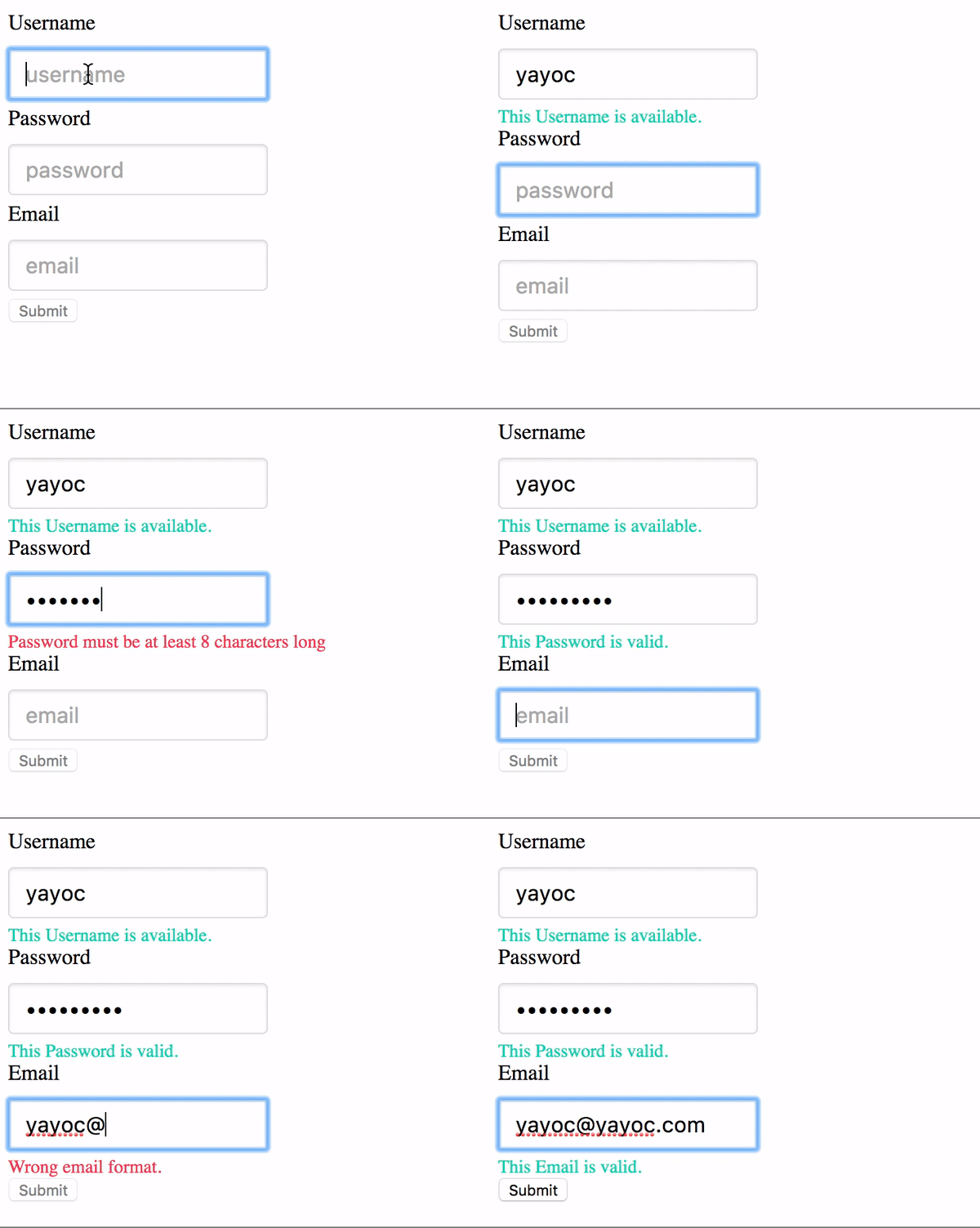
Elegant textfield of React Component.
For examples of the react-textfield in action, go to http://blog.yayoc.com/react-textfield.
OR
To run that demo on your own computer:
npm installnpm run storybookEnsure packages are installed with correct version numbers by running:
(
  export PKG=react-textfield;
  npm info "$PKG" peerDependencies --json | command sed 's/[\{\},]//g ; s/: /@/g; s/ *//g' | xargs npm install --save "$PKG"
)
Which produces and runs a command like:
npm install --save react-textfield
import { TextField, validator } from 'react-textfield';
<ReactTextField
  name="username"
  type="text"
  placeholder="username"
  validators={usernameValidators}
  successMessage="This Username is available."
/>
We have one component and validators for all of your textfield needs.
ReactTextFieldThis controlled components is designed to make input textfield with some messages easily.
We will make accessible and convenient form for end-users by showing appropriate success or error messages.
propsType: This props will pass as a type attribute of Input tag.
type: PropTypes.oneOf([
  'text',
  'password',
  'email',
  'tel',
  'url',
])
Name:
This props will pass as a name attribute of Input tag.
If you are using multiple components, This props must be unique.
Validators:
This props is array of validator object which contains both error message and handler as properties.
Args of the handler is string value ( text field value ), Return value is boolean type.
You can set validator from utilities, or register custom validator by yourself.
Indeed, it is possible to confirm validator methods provided here.
About using custom validater, please check example.
// One of Error object includes validater and error message.
validators: PropTypes.arrayOf(React.PropTypes.shape({
  message: PropTypes.string.isRequired,
  validator: PropTypes.func.isRequired,
})),
Placehodler: This props will pass as placeholder attribute of Input tag.
successMessage:
The success message will appear when validation is passed.
Unless you set this props, success message will not appear.
afterValidate:
A handler will execute after validating.
First args is isValid(boolean type), second args is name (string type).
onChange: A event handler of input text filed. In addition to original args, Name will pass as second args.
onBlur: A event handler of input text filed.
onFocus: A event handler of input text filed.
ValidateOnBlur: Default value is false. When embedding true, validating will be occurred onBlur event only.
Validatorslength: Validate the length of value. The second args { min: integer, max: integer }.
isAlphanumeric: Validate whether alphanumeric or not.
mustContainUpperCase: Validate whether value contains upper case at least one.
isEmail: Validate whether value is formatted of Email address.
isURL: Validate whether value is formatted of Email address.
render() {
  const usernameValidators = [
    {
      message: 'Username must be 4 - 12 characters',
      validator: value => validator.length(value, { min: 4, max: 12 }),
    },
    {
      message: 'Username must be alphanumeric.',
      validator: value => validator.isAlphanumeric(value),
    },
  ];

  <ReactTextField
    name="username"
    placeholder="username"
    validators={usernameValidators}
    successMessage="This Username is available."
  />
}
Custom validator sample
check the value of input text is some text.
const customValidator = {
  message: 'text must be some text.',
  validator: value => value === 'some text',
}
Passing style props make override default style by embedding inline style. Style object must be following format.
const style = {
  container: {
    textAlign: 'center',
  },
  input: {
    margin: '30px',
  },
  successMessage: {
    fontSize: '20px',
    color: '#3949AB',
  },
  errorMessage: {
    fontSize: '20px',
    color: '#E91E63',
  },
};
npm test
FAQs
Elegant text filed of React Component.
We found that react-textfield demonstrated a not healthy version release cadence and project activity because the last version was released a year ago. It has 1 open source maintainer collaborating on the project.
Did you know?

Socket for GitHub automatically highlights issues in each pull request and monitors the health of all your open source dependencies. Discover the contents of your packages and block harmful activity before you install or update your dependencies.

Research
A deceptive PyPI package posing as an Instagram growth tool collects user credentials and sends them to third-party bot services.

Product
Socket now supports pylock.toml, enabling secure, reproducible Python builds with advanced scanning and full alignment with PEP 751's new standard.

Security News
Research
Socket uncovered two npm packages that register hidden HTTP endpoints to delete all files on command.