Product
Introducing Pull Request Stories to Help Security Teams Track Supply Chain Risks
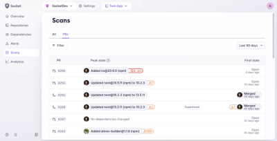
Socket’s new Pull Request Stories give security teams clear visibility into dependency risks and outcomes across scanned pull requests.
react-tiny-popover
Advanced tools
A simple and highly customizable popover react higher order component with no other dependencies!

A lightweight, highly customizable, non-intrusive, and Typescript friendly popover react HOC with no other dependencies!
The component renders its child directly, without wrapping it with anything on the DOM, and in addition renders solely the JSX you provide when shown. It simply grabs the child component's coordinates and provides a robust and non-intrusive way for you to position your own content around the child. Your content will be appended to document.body (or an element of your choice) when shown, and removed when hidden. You can use it to generate little popups around input or button elements, menu fly-outs, or in pretty much any situation where you want some content to appear and disappear dynamically around a target. You can also specify your own location for your popover content or hook into the existing positioning process, allowing you to essentially make modal windows and the like, as well!
react-tiny-popover can also guard against container boundaries and reposition itself to prevent any kind of hidden overflow. You can specify a priority of desired positions to fall back to, if you'd like.
Optionally, you can provide a renderer function for your popover content that injects the popover's current position, in case your content needs to know where it sits in relation to its target.
Since react-tiny-popover tries to be as non-invasive as possible, it will simply render the content you provide with the position and padding from the target that you provide. If you'd like an arrow pointing to the target to appear along with your content and don't feel like building it yourself, you may be interested in wrapping your content with the customizable ArrowContainer component, also provided! ArrowContainer's arrow will follow its target dynamically, and handles boundary collisions as well.
npm i react-tiny-popover --save
import { Popover } from 'react-tiny-popover'

...

<Popover
  isOpen={isPopoverOpen}
  positions={['top', 'bottom', 'left', 'right']} // preferred positions by priority
  content={<div>Hi! I'm popover content.</div>}
>
  <div onClick={() => setIsPopoverOpen(!isPopoverOpen)}>
    Click me!
  </div>
</Popover>;
import { Popover } from 'react-tiny-popover'

...

<Popover
  isOpen={isPopoverOpen}
  positions={['top', 'left']} // if you'd like, you can limit the positions
  padding={10} // adjust padding here!
  reposition={false} // prevents automatic readjustment of content position that keeps your popover content within its parent's bounds
  onClickOutside={() => setIsPopoverOpen(false)} // handle click events outside of the popover/target here!
  content={({ position, nudgedLeft, nudgedTop }) => ( // you can also provide a render function that injects some useful stuff!
    <div>
      <div>Hi! I'm popover content. Here's my current position: {position}.</div>
      <div>I'm {` ${nudgedLeft} `} pixels beyond my boundary horizontally!</div>
      <div>I'm {` ${nudgedTop} `} pixels beyond my boundary vertically!</div>
    </div>
  )}
>
  <div onClick={() => setIsPopoverOpen(!isPopoverOpen)}>Click me!</div>
</Popover>;
import { useRef } from 'react';
import { Popover, ArrowContainer } from 'react-tiny-popover'

const clickMeButtonRef = useRef<HTMLButtonElement | undefined>();

<Popover
  isOpen={isPopoverOpen}
  positions={['top', 'right', 'left', 'bottom']}
  padding={10}
  onClickOutside={() => setIsPopoverOpen(false)}
  ref={clickMeButtonRef} // if you'd like a ref to your popover's child, you can grab one here
  content={({ position, childRect, popoverRect }) => (
    <ArrowContainer // if you'd like an arrow, you can import the ArrowContainer!
      position={position}
      childRect={childRect}
      popoverRect={popoverRect}
      arrowColor={'blue'}
      arrowSize={10}
      arrowStyle={{ opacity: 0.7 }}
      className='popover-arrow-container'
      arrowClassName='popover-arrow'
    >
      <div
        style={{ backgroundColor: 'blue', opacity: 0.7 }}
        onClick={() => setIsPopoverOpen(!isPopoverOpen)}
      >
        Hi! I'm popover content. Here's my position: {position}.
      </div>
    </ArrowContainer>
  )}
>
  <button onClick={() => setIsPopoverOpen(!isPopoverOpen)}>
    Click me!
  </button>
</Popover>;
If you'd like to use a custom React element as Popover's target, you'll have to pass the ref that Popover provides to an inner DOM element of your component. The best way to accomplish this is with React's ref forwarding API. Here's a simple example, using Typescript:
import React, { useState } from 'react';
import { Popover } from 'react-tiny-popover';

interface CustomComponentProps extends React.ComponentPropsWithoutRef<'div'> {
  onClick(): void;
}

const CustomComponent = React.forwardRef<HTMLDivElement, CustomComponentProps>((props, ref) => (
  <div ref={ref} onClick={props.onClick}>
    {props.children}
  </div>
));

const App: React.FC = () => {
  const [isPopoverOpen, setIsPopoverOpen] = useState(false);
  return (
    <div>
      <Popover isOpen={isPopoverOpen} content={<div>hey from popover content</div>}>
        <CustomComponent onClick={() => setIsPopoverOpen(!isPopoverOpen)}>
          hey from a custom target component
        </CustomComponent>
      </Popover>
    </div>
  );
};

export default App;
If you prefer going completely headless (though react-tiny-popover is fairly headless as is), you may prefer usePopover and useArrowContainer instead.
To create your own custom arrow container, the useArrowContainer hook works as so:
import { useArrowContainer } from 'react-tiny-popover';

// ...

const { arrowContainerStyle, arrowStyle } = useArrowContainer({
  childRect // from PopoverState,
  popoverRect // from PopoverState,
  position // from PopoverState,
  arrowColor // string,
  arrowSize // number,
});

// ...

// You can then use these styles to render your arrow container in whatever way you'd like
return (
    <div style={arrowContainerStyle}>
      <div style={arrowStyle} />
      {children}
    </div>
);
Similarly, usePopover allows you to create your own popover component as so:
import { usePopover } from 'react-tiny-popover'

// ...

const onPositionPopover = useCallback(
  (popoverState: PopoverState) => setPopoverState(popoverState),
  [],
);

const [positionPopover, popoverRef] = usePopover({
  childRef,
  containerClassName,
  parentElement,
  transform,
  positions,
  align,
  padding,
  boundaryInset,
  boundaryElement,
  reposition,
  onPositionPopover,
});

// ...
After attaching popoverRef and childRef to the DOM, you can fire positionPopover at any time to update your popover's position.
This is a bit more advanced, but play around and see what you can come up with! Feel free to examine the internal Popover component to see how the hook is used there.
Prior to 8.1, the two DOM elements generated via React Portal by react-tiny-popover were given the ids react-tiny-popover-container and react-tiny-popover-scout. In 8.1 and above, both react-tiny-popover-container and react-tiny-popover-scout are now assigned as class names. This solves the issue of multiple DOM elements sharing the same id if you have more than one popover open at once.
If you select for react-tiny-popover-container or react-tiny-popover-scout by id in your code, you'll have to select via class name instead.
react-tiny-popover 8.0 removes the contentLocation prop and replaces it with a slightly more capable transform prop. By default, the transform prop behaves exactly as contentLocation did.
<Popover
  isOpen={isPopoverOpen}
  contentLocation={{ top: 20, left: 20 }} {/* no longer used */}
  content={<div>Hi! I'm popover content.</div>}
>
  {/* ... */}
</Popover>;
Becomes:
<Popover
  isOpen={isPopoverOpen}
  transform={{ top: 20, left: 20 }} { /* <-- you'll need to rename this prop, but that's all */}
  content={<div>Hi! I'm popover content.</div>}
>
  {/* ... */}
</Popover>;
Now, you have access to an additional handy prop, transformMode:
<Popover
  isOpen={isPopoverOpen}
  transform={{ top: 20, left: 20 }}
  transformMode='relative'{ /* <-- whoa cool */}
  content={<div>Hi! I'm popover content.</div>}
>
  {/* ... */}
</Popover>;
The above popover will now render 20 pixels down and left of where it originally would have appeared without the transform, rather than at a fixed/absolute position.
The other transformMode value, "absolute" is the default value when transformMode is omitted. This produces the same behavior that contentLocation did.
react-tiny-popover 5 and up has abandoned use of findDOMNode to gain a reference to Popover's target DOM node, and now explicitly relies on a ref. Since React has deprecated findDOMNode in StrictMode, now seems like an appropriate time to shift away from this under-the-hood logic toward a clearer and more declarative API.
If your code looked this way, it can stay this way. React elements handle refs out of the box with no issues:
<Popover
  isOpen={isPopoverOpen}
  content={<div>Hi! I'm popover content.</div>}
>
  <div onClick={() => setIsPopoverOpen(!isPopoverOpen)}>
    Click me!
  </div>
</Popover>;
However, if you use a custom component as a your Popover's child, you'll have to implement ref forwarding. Without ref forwarding, Popover will not be able to inject a reference into your component and refer to it.
For example:
interface Props extends React.ComponentPropsWithoutRef<'div'> {
  onClick(): void;
}

// this component will no longer work as a Popover child
const CustomComponent: React.FC<Props> = props => (
  <div onClick={props.onClick}>
    {props.children}
  </div>
)

// instead, you'll simply implement ref forwarding, as so:
const CustomComponent = React.forwardRef<HTMLDivElement, Props>((props, ref) => (
  <div ref={ref} onClick={props.onClick}>
    {props.children}
  </div>
));
Check out React's ref forwarding API for more info, and see the examples above.
| Property | Type | Required | Description |
|---|---|---|---|
| children | JSX.Element | ✔️ | The component you place here will render directly to the DOM. Totally headless. If you provide a custom component, it must use ref forwarding. |
| isOpen | boolean | ✔️ | When this boolean is set to true, the popover is visible and tracks the target. When the boolean is false, the popover content is neither visible nor present on the DOM. |
| content | JSX.Element or (popoverState: PopoverState) => JSX.Element | ✔️ | Here, you'll provide the content that will appear as the popover. If you're providing a function, see PopoverState below. |
| padding | number | This number determines the gap, in pixels, between your target content and your popover content. Defaults to 0. | |
| reposition | boolean | If false, rather than the popover content repositioning on a boundary collision, the popover content container will move beyond your parentElement's bounds. You are, however, supplied with nudgedLeft and nudgedTop values by the function you can opt to provide to content, so you may choose to handle content overflow as you wish. | |
| positions | string[] | You may provide a priority list of preferred positions for your popover content in relation to its target, in the form of an array. Valid values for the array are 'top', 'bottom', 'left', 'right'. If the popover reaches the edge of the window or its otherwise specified boundary (see parentElement and boundaryInset), and repositioning is enabled, it will attempt to render in the order you specify. The default order is ['top', 'left', 'right', 'bottom']. If you'd like, you can provide a shorter array like ['top', 'left']. Once the array of positions is exhausted, the popover will no longer attempt to reposition. | |
| align | string | Possible values are start, center, and end. If start is specified, the popover content's top or left location is aligned with its target's. With end specified, the content's bottom or right location is aligned with its target's. If center is specified, the popover content and target's centers are aligned. Defaults to center. | |
| ref | React.Ref | Since Popover relies on ref forwarding to access its child, it's not simple to obtain a second reference to that child. This property acts as a "pass through" for you to obtain a ref to the child you've provided Popover. The value of the ref you provide here will be Popover's child. | |
| onClickOutside | (e: MouseEvent) => void | If react-tiny-popover detects a click event outside of the target and outside of the popover, you may handle this event here. | |
| clickOutsideCapture | boolean | This boolean represents the useCapture option passed along as the third argument to the internal window.addEventListener used by onClickOutside. | |
| transform | { top: number; left: number} or (popoverState: PopoverState) => { top: number, left: number } | If you'd like to hook directly into the positioning process, you may do so here! top and left positions provided or returned here will override the popover content's (popoverRect) location in a fashion specified by the transformMode prop. | |
| transformMode | "absolute" or "relative" | A value of "absolute" will popsition the popover at precisely the top and left values provided by transform, relative to the parentElement. A value of "relative" will "nudge" the popover from where it would appear pre-transform by the top and left values provided in transform. | |
| parentElement | HTMLElement | Provide an HTML element ref here to have your popover content appended to that element rather than document.body. This is useful if you'd like your popover to sit at a particular place within the DOM. Supplying a parentElement ref will not in most cases directly affect the positioning of the popover. | |
| boundaryInset | number | This number specifies the inset around your parentElement's border that boundary violations are determined at. Defaults to 0. Can be negative. | |
| boundaryElement | HTMLElement | If provided (and reposition is enabled), your popover will adhere to the boundaries of this element as determined by Element.getBoundingDOMRect(). | |
| containerStyle | object (CSSStyleDeclaration) | Your popover content is rendered to the DOM in a single container div. If you'd like to apply style directly to this container div, you may do so here! Be aware that as this div is a DOM element and not a React element, all style values must be strings. For example, 5 pixels must be represented as '5px', as you'd do with vanilla DOM manipulation in JavaScript. | |
| containerClassName | string | If you'd like to apply styles to the single container div that your popover content is rendered within via stylesheets, you can specify a custom className for the container here. |
| Property | Type | Description |
|---|---|---|
| isPositioned | boolean | After the popover has positioned its contents, this field is true. Prior, it is false. |
| childRect | Rect | The current rect of the popover's child (i.e., the source from which the popover renders). |
| popoverRect | Rect | The current rect of the popover's contents. |
| parentRect | Rect | The current rect of the popover child's parent. |
| position | 'left' | 'right' | 'top' | 'bottom' | undefined | The current position of the popover in relation to the child. undefined implies the user has set an absolute transform. |
| align | 'start' | 'center' | 'end' | undefined | The cross-axis alignment of the popover's contents. undefined implies the user has set an explicit contentLocation. |
| padding | number | The distance between the popover's child and contents. If set to zero, the two are touching. |
| nudgedLeft | number | If the popover's contents encounter a boundary violation that does not warrant a reposition, the contents are instead "nudged" by the appropriate top and left values to keep the contents within the boundary. This is the left value. |
| nudgedTop | number | If the popover's contents encounter a boundary violation that does not warrant a reposition, the contents are instead "nudged" by the appropriate top and left values to keep the contents within the boundary. This is the top value. |
| boundaryInset | number | The popover's contents will encounter boundary violations prior to the actual parentElement's boundaries by this number in pixels. Can be negative. |
| boundaryRect | Rect | The current rect of the popover's boundaries. |
| transform | { top?: number; left?: number; } | undefined | The values you provided to the transform prop, if they exist. |
| violations | { top: number; left: number; bottom: number; right: number; } | An object containing boundary violations. Expect a value of 0 if no boundary violation exists at that bound (i.e., your popover is entirely within that bound), and expect positive values representing pixels beyond that bound if a violation exists (i.e., your popover exceeds the top bound by ten pixels, top will be 10). |
| hasViolations | boolean | true if violations exist at any boundary, false otherwise. |
| Property | Type | Required | Description |
|---|---|---|---|
| position | string | ✔️ | The ArrowContainer needs to know its own position in relation to the target, so it can point in the correct direction! |
| children | JSX.Element | ✔️ | You'll provide the ArrowContainer with a JSX.Element child to render as your popover content. |
| targetRect | object | ✔️ | The ArrowContainer must know its target's bounding rect in order to position its arrow properly. This object is of type { width: number, height: number, top: number, left: number, right: number, bottom: number }. |
| popoverRect | object | ✔️ | This allows the ArrowContainer to know its own bounding rect in order to position its arrow properly. This object is of type { width: number, height: number, top: number, left: number, right: number, bottom: number }. |
| arrowSize | number | The size of the triangle arrow. Defaults to 10 or something like that. | |
| arrowColor | string | The color of the arrow! Exciting. | |
| arrowStyle | object | You may append to the arrow's style here. | |
| style | object | If you'd like to append to the style of the ArrowContainer itself, do so here. Rad. |
[8.1.6] - 2025-2-2
FAQs
A simple and highly customizable popover react higher order component with no other dependencies!
The npm package react-tiny-popover receives a total of 99,143 weekly downloads. As such, react-tiny-popover popularity was classified as popular.
We found that react-tiny-popover demonstrated a healthy version release cadence and project activity because the last version was released less than a year ago. It has 1 open source maintainer collaborating on the project.
Did you know?

Socket for GitHub automatically highlights issues in each pull request and monitors the health of all your open source dependencies. Discover the contents of your packages and block harmful activity before you install or update your dependencies.

Product
Socket’s new Pull Request Stories give security teams clear visibility into dependency risks and outcomes across scanned pull requests.

Research
/Security News
npm author Qix’s account was compromised, with malicious versions of popular packages like chalk-template, color-convert, and strip-ansi published.

Research
Four npm packages disguised as cryptographic tools steal developer credentials and send them to attacker-controlled Telegram infrastructure.