
Product
Introducing Data Exports
Export Socket alert data to your own cloud storage in JSON, CSV, or Parquet, with flexible snapshot or incremental delivery.
By Ola Adekola - Apr 23, 2026
react-transition-state
Advanced tools
Zero dependency React transition state machine
Inspired by the React Transition Group, this tiny library helps you easily perform animations/transitions of your React component in a fully controlled manner, using a Hook API.
🤔 Not convinced? See a comparison with React Transition Group
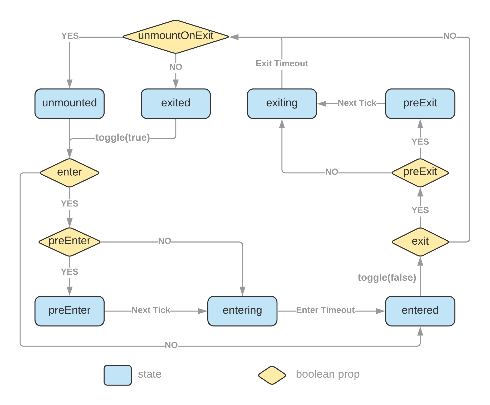 The
The initialEntered and mountOnEnter props are omitted from the diagram to keep it less convoluted. Please read more details at the API section.
# with npm
npm install react-transition-state

# with Yarn
yarn add react-transition-state
import { useTransitionState } from 'react-transition-state';

function Example() {
  const [state, toggle] = useTransitionState({ timeout: 750, preEnter: true });
  return (
    <div>
      <button onClick={() => toggle()}>toggle</button>
      <div className={`example ${state.status}`}>React transition state</div>
    </div>
  );
}

export default Example;
.example {
  transition: all 0.75s;
}

.example.preEnter,
.example.exiting {
  opacity: 0;
  transform: scale(0.5);
}

.example.exited {
  display: none;
}
import styled from 'styled-components';
import { useTransitionState } from 'react-transition-state';

const Box = styled.div`
  transition: all 500ms;

  ${({ $status }) =>
    ($status === 'preEnter' || $status === 'exiting') &&
    `
      opacity: 0;
      transform: scale(0.9);
    `}
`;

function StyledExample() {
  const [{ status, isMounted }, toggle] = useTransitionState({
    timeout: 500,
    mountOnEnter: true,
    unmountOnExit: true,
    preEnter: true
  });

  return (
    <div>
      {!isMounted && <button onClick={() => toggle(true)}>Show Message</button>}
      {isMounted && (
        <Box $status={status}>
          <p>This message is being transitioned in and out of the DOM.</p>
          <button onClick={() => toggle(false)}>Close</button>
        </Box>
      )}
    </div>
  );
}

export default StyledExample;
You can create switch transition effects using one of the provided hooks,
useTransitionState if the number of elements participating in the switch transition is static.useTransitionMap if the number of elements participating in the switch transition is dynamic and only known at runtime.You can toggle on transition with the useEffect hook.
useEffect(() => {
  toggle(true);
}, [toggle]);
| React Transition Group | This library | |
|---|---|---|
| Use derived state | Yes – use an in prop to trigger changes in a derived transition state | No – there is only a single state which is triggered by a toggle function |
| Controlled | No – Transition state is managed internally. Resort to callback events to read the internal state. | Yes – Transition state is lifted up into the consuming component. You have direct access to the transition state. |
| DOM updates | Imperative – commit changes into DOM imperatively to update classes | Declarative – you declare what the classes look like and DOM updates are taken care of by ReactDOM |
| Render something in response to state updates | Resort to side effects – rendering based on state update events | Pure – rendering based on transition state |
| Working with styled-components | Your code looks like – &.box-exit-active { opacity: 0; }&.box-enter-active { opacity: 1; } | Your code looks like – opacity: ${({ state }) => (state === 'exiting' ? '0' : '1')}; It's the way how you normally use the styled-components |
| Bundle size |  | ✅ |
| Dependency count | ✅ |
This CodeSandbox example demonstrates how the same transition can be implemented in a simpler, more declarative, and controllable manner than React Transition Group.
useTransitionState Hookfunction useTransitionState(
options?: TransitionOptions
): [TransitionState, (toEnter?: boolean) => void, () => void];
| Name | Type | Default | Description |
|---|---|---|---|
enter | boolean | true | Enable or disable enter phase transitions |
exit | boolean | true | Enable or disable exit phase transitions |
preEnter | boolean | Add a 'preEnter' state immediately before 'entering', which is necessary to change DOM elements from unmounted or display: none with CSS transition (not necessary for CSS animation). | |
preExit | boolean | Add a 'preExit' state immediately before 'exiting' | |
initialEntered | boolean | Beginning from 'entered' state | |
mountOnEnter | boolean | State will be 'unmounted' until hit enter phase for the first time. It allows you to create lazily mounted component. | |
unmountOnExit | boolean | State will become 'unmounted' after 'exiting' finishes. It allows you to transition component out of DOM. | |
timeout | number | { enter?: number; exit?: number; } | Set timeout in ms for transitions; you can set a single value or different values for enter and exit transitions. | |
onStateChange | (event: { current: TransitionState }) => void | Event fired when state has changed. Prefer to read state from the hook function return value directly unless you want to perform some side effects in response to state changes. Note: create an event handler with useCallback if you need to keep toggle or endTransition function's identity stable across re-renders. |
The useTransitionState Hook returns a tuple of values in the following order:
{
  status: 'preEnter' |
    'entering' |
    'entered' |
    'preExit' |
    'exiting' |
    'exited' |
    'unmounted';
  isMounted: boolean;
  isEnter: boolean;
  isResolved: boolean;
}
(toEnter?: boolean) => void() => voidonAnimationEnd or onTransitionEnd event.useTransitionMap HookIt's similar to the useTransitionState Hook except that it manages multiple states in a Map structure instead of a single state.
It accepts all options as useTransitionState and the following ones:
| Name | Type | Default | Description |
|---|---|---|---|
allowMultiple | boolean | Allow multiple items to be in the enter phase at the same time. |
The Hook returns an object of shape:
interface TransitionMapResult<K> {
  stateMap: ReadonlyMap<K, TransitionState>;
  toggle: (key: K, toEnter?: boolean) => void;
  toggleAll: (toEnter?: boolean) => void;
  endTransition: (key: K) => void;
  setItem: (key: K, options?: TransitionItemOptions) => void;
  deleteItem: (key: K) => boolean;
}
setItem and deleteItem are used to add and remove items from the state map.
MIT Licensed.
FAQs
Zero dependency React transition state machine.
The npm package react-transition-state receives a total of 319,416 weekly downloads. As such, react-transition-state popularity was classified as popular.
We found that react-transition-state demonstrated a healthy version release cadence and project activity because the last version was released less than a year ago. It has 1 open source maintainer collaborating on the project.
Did you know?

Socket for GitHub automatically highlights issues in each pull request and monitors the health of all your open source dependencies. Discover the contents of your packages and block harmful activity before you install or update your dependencies.
Product
Export Socket alert data to your own cloud storage in JSON, CSV, or Parquet, with flexible snapshot or incremental delivery.

Research
/Security News
Bitwarden CLI 2026.4.0 was compromised in the Checkmarx supply chain campaign after attackers abused a GitHub Action in Bitwarden’s CI/CD pipeline.

Research
/Security News
Docker and Socket have uncovered malicious Checkmarx KICS images and suspicious code extension releases in a broader supply chain compromise.