React TV Player


A React media player component for TV devices. With custom UI and arrow-key navigation, it can play a variety of URLs like file paths, HLS/DASH streams and even YouTube links directly. Packaged as an npm library.
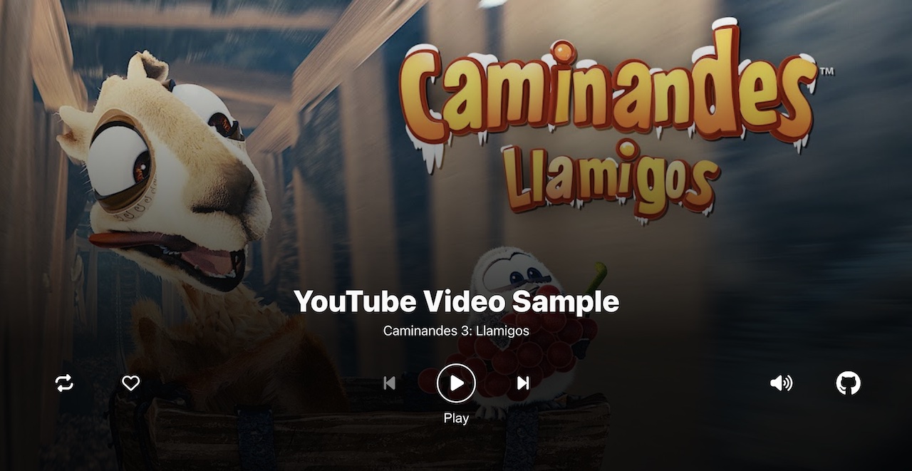
Click on the image to try out the demo on a desktop browser
Installation
npm install react-tv-player
Usage
Just import the player and render it in your app or page with props:
import { TVPlayer } from "react-tv-player";

function App() {
  return (
    <>
      <TVPlayer url="https://www.youtube.com/watch?v=SkVqJ1SGeL0" />
    </>
  );
}
The demo source code App.tsx illustrates how the component can be initialised with more props such as metadata, custom buttons, preview images and multiple media, enabling the user to cycle through videos with next/previous buttons:
<TVPlayer
  title={mediaList[mediaIndex].title}
  subTitle={mediaList[mediaIndex].subTitle}
  url={mediaList[mediaIndex].url}
  light={mediaList[mediaIndex].preview}
  customButtons={customButtons}
  mediaCount={mediaList.length}
  onLikePress={handleLike}
/>
Here is a short video of the demo runnning on a browser:
https://github.com/lewhunt/react-tv-player/assets/9886284/7baa4b75-491b-49f3-8cf1-698ae7f55941
Why Another Player?
I've dedicated years working with various OTT players on big-screen devices. During this journey, two persistent challenges surfaced time and again: performant UI and compatible media encodings. These hurdles often forced us to heavily customise libraries and tackle streaming difficulties, leading to added costs and frustrating delays. 😫
Enter ReactTVPlayer, an open-source media player component for TV devices that lowers the barrier to entry and seamlessly integrates with your React applications. :muscle:
What Sets It Apart?
It's designed for TV experiences out of the box, complete with customisable UI buttons and intuitive cursor plus arrow key navigation. 🎮 In addition to handling HLS and Dash streams effortlessly, it tackles the formidable challenge of playing YouTube and Vimeo urls directly on TV, saving you the hassle and cost of additional video encoding. 🎉
How Does It Work?
Under the hood, this component harnesses the power of open-source libraries like Norigin Media's spatial navigation hook. It builds upon the excellence of React Player, which utilises hls.js and dash.js. Powered by React TypeScript (although you don't need to use TypeScript to make the most of it), this library is packaged efficiently using Vite, making integration a breeze. 🙌
Key Features
- Versatility: Customisable UI buttons, title metadata and preview images to suit your needs. It can effortlessly handle a variety of URLs, from mp4 file paths and HLS/DASH streams to services like YouTube and Vimeo.
- Intuitive Navigation: The player has been designed with TV experiences in mind. Cursor and arrow-key navigation make the user experience smooth and intuitive across big-screen platforms.
- YouTube Integration: One of its unique strengths is its ability to play URLs directly from the likes of YouTube, Vimeo, SoundCloud and Twitch, eliminating the need for additional video encoding when it's not needed.
- DRM Considerations: While it supports HLS AES Encryption, it’s built with flexibility in mind, allowing for future DRM integration with hls.js and dash.js.
- Broad Device Support: From Amazon Fire TV, LG webOS and Samsung Tizen Smart TVs to Xbox consoles and desktop web browsers, ReactTVPlayer covers most big-screen devices running web apps with post-2017 Chromium browsers.
Props
The full list of props are below. Media related values such as playing, loop and muted are also mapped to state which can be accessed via the useTVPlayerStore hook instead of updating props.
url | The url of the media to play
◦ This can be an embedded url from YouTube/SoundCloud, a file path or a HLS or Dash manifest stream | |
playing | Set to true or false to pause or play the media.
◦ Set to true to autoplay the media (muted may also be needed in some browsers) | false |
loop | Set to true to loop the media | false |
controls | Set to true to display native HTML5 media controls instead of custom TV Player UI controls | false |
light | Set to true or a url string to show a preview image, which then loads the full player on selecting play
◦ Pass in true to use the default preview image associated with an embeded media url (e.g. YouTube/SoundCloud urls)
◦ Pass in an image URL to override any default preview image | false |
volume | Set the volume of the player, between 0 and 1 | null |
muted | Set to true to mute the player
◦ may be required if you intend to autoplay media | false |
playbackRate | Set the playback rate of the player
◦ Only supported by YouTube, Wistia, and file paths | 1 |
disableFullscreen | Set to true to disable the defaulted fullscreen width and height of the player.
◦ Width and height values below should be defined
◦ See App.tsx useEffect for example of toggling body properties based on fullscreen state | false |
disableInitNav | Set to true to disable initialisation of the norigin spatial navigation library.
◦ Set this if you are already initialising the navigation library in your own app | false |
disableNav | Set to true to pause arrow key navigation of the norigin spatial navigation library in the player.
◦ Set this if you show a custom menu and want to disable the player's key event handlers. | false |
width | Set the width of the player when fullscreen is disabled | 100% |
height | Set the height of the player when fullscreen is disabled | 350px |
style | Add inline styles to the root element | {} |
customButtons | Specify a collection of custom buttons for the player UI
◦ A set of default buttons will be used otherwise. | null |
title | Set a string title for the current media.
◦ Embedded media urls such as YouTube will attempt to pull in the default media title if not overridden here. | |
subTitle | Set a string sub-title for the current media.
◦ Embedded media urls such as YouTube will attempt to pull in the default author name if not overridden here. | |
mediaCount | Set the total number of media items if you have multiple media and want player to display next and previous buttons | 0 |
mediaIndex | Set the initial media index number if you have multiple media and want player to handle next and previous buttons | 0 |
hideControlsOnArrowUp | Set to true to hide the player UI by using the up arrow key when focussed on the player buttons | false |
Callback Props
Callback props take a function that gets fired on various player events and UI button actions:
onReady | Called when media is loaded and ready to play. If playing is set to true, media will play immediately |
onStart | Called when media starts playing |
onPlay | Called when media starts or resumes playing after pausing or buffering |
onPause | Called when media is paused |
onBuffer | Called when media starts buffering |
onEnded | Called when media finishes playing
◦ Does not fire when loop is set to true |
onError | Called when an error occurs whilst attempting to play media |
onSkipBackPress | Called when the Skip Back button is pressed |
onSkipForwardPress | Called when the Skip Forward button is pressed |
onPreviousPress | Called when the Previous button is pressed |
onNextPress | Called when the Next button is pressed |
onLikePress | Called when the Like button is pressed |
onLoopPress | Called when the Loop button is pressed |
onMutePress | Called when the Mute button is pressed |
onFullscreenPress | Called when the Fullscreen button is pressed |
Custom Buttons
As illustrated in the sample demo app, the player can be overridden with custom buttons. There is a selection of pre-built action types with their own icons and behaviours or you can add your own with the "custom" action type.
import { TVPlayer, TVPlayerButtonProps } from "react-tv-player";
import { faGithub } from "@fortawesome/free-brands-svg-icons";

const customButtons: TVPlayerButtonProps[] = [
  { action: "loop", align: "left" },
  { action: "like", align: "left" },
  { action: "previous", align: "center" },
  { action: "playpause", align: "center" },
  { action: "next", align: "center" },
  { action: "mute", align: "right" },
  {
    action: "custom",
    align: "right",
    label: "About",
    faIcon: faGithub,
    onPress: () => {
      window.location.href = "https://github.com/lewhunt/react-tv-player";
    },
  },
];

<TVPlayer
  url="https://www.youtube.com/watch?v=SkVqJ1SGeL0"
  customButtons={customButtons}
/>;
action | Choose from custom or one of the pre-built actions: like, loop, mute,next,playpause,previous,skipforward, skipback, fullscreen |
align | Alignment of the button. Choose from left,center, right |
label | A hint text label to appear below the current button in focus. Pre-built button actions use relevent labels. |
faIcon | A font-awesome icon. Pre-built button actions use relevent icons. |
onPress | Called when a button is pressed. Pre-built button actions have their own behaviours. |
onRelease | Called when a button is released. Currently unused. |
isSelectedFill | Allows support of toggle behaviour (in the form of a button fill) when set to true. |
disable | Prevents button action when set to true. |
useTVPlayerStore Hook
For more control you can import the useTVPlayerStore custom hook to globally access player state (zustand store). View the sample app and the TVPlayerUI inner component for examples of use. Below shows the basics:
import { TVPlayer, useTVPlayerStore } from "react-tv-player";
const actions = useTVPlayerStore((s) => s.actions);
const playing = useTVPlayerStore((s) => s.playing);
const player = useTVPlayerStore((s) => s.player);
const likeToggle = useTVPlayerStore((s) => s.likeToggle);
s;
const logPlaybackState = () => console.log(playing);
const handleLike = () => {
console.log("like button pressed");
actions.setLikeToggle(!likeToggle);
};
const togglePlayback = () => {
actions.setPlaying(!playing);
};
const customSeek = () => player.seekTo(player.getCurrentTime() + 10);
<TVPlayer
url="https://www.youtube.com/watch?v=SkVqJ1SGeL0"
onLikePress={handleLike}
/>;
Instance Methods
Use the state's player reference - as in the above example - to call instance methods on the player.
seekTo(amount, type) | Seek to the given number of seconds, or fraction if amount is between 0 and 1
◦ type parameter lets you specify 'seconds' or 'fraction' to override default behaviour |
getCurrentTime() | Returns the number of seconds that have been played
◦ Returns null if unavailable |
getSecondsLoaded() | Returns the number of seconds that have been loaded
◦ Returns null if unavailable or unsupported |
getDuration() | Returns the duration (in seconds) of the currently playing media
◦ Returns null if duration is unavailable |
getInternalPlayer() | Returns the internal player of whatever is currently playing
◦ eg the YouTube player instance, or the <video> element when playing a video file
◦ Use getInternalPlayer('hls') to get the hls.js player
◦ Use getInternalPlayer('dash') to get the dash.js player
◦ Returns null if the internal player is unavailable |
Support
I hope this has given a good intro to the component.
💬 Fire over a comment if you have any feedback, requests or issues 🐛
⭐ Give it a star if you like the component or want to bookmark it 🙏


