Product
Introducing Rust Support in Socket
Socket now supports Rust and Cargo, offering package search for all users and experimental SBOM generation for enterprise projects.
react-two-thumb-input-range
Advanced tools
Accessible two thumb input range component for React that implements
TwoThumbInputRange is a React component allowing users to input numeric values within a specific range.
Native HTML input type=range sliders do not support multiple thumbs yet so this component uses two range inputs and position them to look like a multi-thumb slider.
Under the hood TwoThumbInputRange uses HTML input type=range, but uses CSS Magic to allows users to adjust with 2 buttons
All examples available in Storybook
yarn add react-two-thumb-input-range

# or

npm i react-two-thumb-input-range
import { TwoThumbInputRange } from "react-two-thumb-input-range"
function App() {
  const [value, setValue] = useState([1000, 4333])

  const onValueSChange = (values) => {
    setValue(values)
  }

  return <TwoThumbInputRange onChange={onValueChange} values={value} min={1000} max={10000} />
}
| Attribute | Type | Default | Description |
|---|---|---|---|
| min | number | 0 | The minimum permitted value. |
| max | number | 100 | The maximum permitted value. |
| values | [number,number] | The current value of the Input Range. | |
| onChange | func | Callback function that is fired when the Input's value changed. onChange: ([number, number]) => void | |
| railColor | string | #EDF2F7 | Color of rail element. |
| trackColor | string | #1976d2 | Color of track element. |
| thumbColor | string | #EDF2F7 | Color of thumb element. |
| thumbStyle | React.CSSProperties | 1976d2 | Styles applied to the thumb element |
| thumbFocusStyle | React.CSSProperties | `` | Styles applied to the when thumb element focus |
| inputStyle | React.CSSProperties | `` | Styles applied to the input element |
| labelStyle | React.CSSProperties | `` | Styles applied to the label element |
| labelTextStyle | React.CSSProperties | `` | Styles applied to the label textelement |
| showLabels | boolean | true | If false, the default labels will not render. |
| ariaValueText | string | MDN Web Docs |
FAQs
Accessible two thumb input range component for React that implements
We found that react-two-thumb-input-range demonstrated a not healthy version release cadence and project activity because the last version was released a year ago. It has 1 open source maintainer collaborating on the project.
Did you know?

Socket for GitHub automatically highlights issues in each pull request and monitors the health of all your open source dependencies. Discover the contents of your packages and block harmful activity before you install or update your dependencies.

Product
Socket now supports Rust and Cargo, offering package search for all users and experimental SBOM generation for enterprise projects.

Product
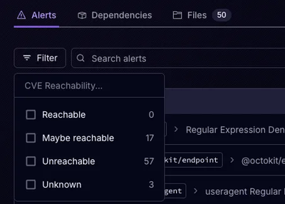
Socket’s precomputed reachability slashes false positives by flagging up to 80% of vulnerabilities as irrelevant, with no setup and instant results.

Product
Socket is launching experimental protection for Chrome extensions, scanning for malware and risky permissions to prevent silent supply chain attacks.