Product
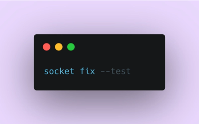
Introducing Socket Fix for Safe, Automated Dependency Upgrades
Automatically fix and test dependency updates with socket fix—a new CLI tool that turns CVE alerts into safe, automated upgrades.
By John-David Dalton - Apr 25, 2025
react-typeahead-tokenizer
Advanced tools
A typeahead/autocomplete component for React
This is a fork of https://github.com/fmoo/react-typeahead that uses ES6
react-typeahead is a javascript library that provides a react-based typeahead, or autocomplete text entry, as well as a "typeahead tokenizer", a typeahead that allows you to select multiple results.
For a typeahead input:
import { Typeahead } from 'react-typeahead';
React.render(
<Typeahead
options={['John', 'Paul', 'George', 'Ringo']}
maxVisible={2}
/>
);
For a tokenizer typeahead input:
import { Tokenizer } from 'react-typeahead';

React.render(
  <Tokenizer
    options={['John', 'Paul', 'George', 'Ringo']}
    onTokenAdd={token => console.log('token added: ', token)}
  />
);
Type: React Component
Basic typeahead input and results list.
Type: Array
Default: []
An array supplied to the filtering function. Can be a list of strings or a list of arbitrary objects. In the latter case, filterOption and displayOption should be provided.
Type: String
A default value used when the component has no value. If it matches any options a option list will show.
Type: String
Specify a value for the text input.
Type: Number
Limit the number of options rendered in the results list.
Type: String
If maxVisible is set, display this custom message at the bottom of the list of results when the result are truncated.
Type: Object
Allowed Keys: input, results, listItem, listAnchor, hover, typeahead, resultsTruncated
An object containing custom class names for child elements. Useful for integrating with 3rd party UI kits.
Type: String
Placeholder text for the typeahead input.
Type: Boolean
Set to true to add disable attribute in the <input> or <textarea> element
Type: Boolean
Set to true to use a <textarea> element rather than an <input> element
Type: Object
Props to pass directly to the <input> element.
Type: Function
Event handler for the keyDown event on the typeahead input.
Type: Function
Event handler for the keyPress event on the typeahead input.
Type: Function
Event handler for the keyUp event on the typeahead input.
Type: Function
Event handler for the blur event on the typeahead input.
Type: Function
Event handler for the focus event on the typeahead input.
Type: Function
Event handler triggered whenever a user picks an option.
Type: String or Function
A function to filter the provided options based on the current input value. For each option, receives (inputValue, option). If not supplied, defaults to fuzzy string matching.
If provided as a string, it will interpret it as a field name and fuzzy filter on that field of each option object.
Type: String or Function
A function to map an option onto a string for display in the list. Receives (option, index) where index is relative to the results list, not all the options. Must return a string.
If provided as a string, it will interpret it as a field name and use that field from each option object.
Type: String or Function
A function to map an option onto a string to include in HTML forms (see props.name). Receives (option) as arguments. Must return a string.
If specified as a string, it will interpret it as a field name and use that field from each option object.
If not specified, it will fall back onto the semantics described in props.displayOption.
This option is ignored if you don't specify the name prop. It is required if you both specify the name prop and are using non-string options. It is optional otherwise.
Type: boolean
Default: true
If false, the default classNames are removed from the typeahead.
Type: React Component
A React Component that renders the list of typeahead results. This replaces the default list of results.
This component receives the following props :
props.displayOptionsprops.customClassesprops.onOptionSelectedprops.options
props.options filtered and limited to Typeahead.props.maxVisible.props.selectionIndex
Type: boolean
Default: false
If true, options will still be rendered when there is no value.
Type: number
If 1, custom tags can be added without a matching typeahead selection
Focuses the typeahead input.
Type: React Component
Typeahead component that allows for multiple options to be selected.
Type: Array
Default: []
An array supplied to the filter function.
Type: Number
Limit the number of options rendered in the results list.
Type: String
If maxVisible is set, display this custom message at the bottom of the list of results when the result are truncated.
Type: String
The name for HTML forms to be used for submitting the tokens' values array.
Type: Object
Allowed Keys: input, results, listItem, listAnchor, hover, typeahead, resultsTruncated
An object containing custom class names for child elements. Useful for integrating with 3rd party UI kits.
Type: String
Placeholder text for the typeahead input.
Type: Boolean
Set to true to add disable attribute in the <input> or <textarea> element
Type: Object
Props to pass directly to the <input> element.
Type: Function
Event handler for the keyDown event on the typeahead input.
Type: Function
Event handler for the keyPress event on the typeahead input.
Type: Function
Event handler for the keyUp event on the typeahead input.
Type: Function
Event handler for the blur event on the typeahead input.
Type: Function
Event handler for the focus event on the typeahead input.
Type: Array
A set of values of tokens to be loaded on first render.
Type: Function
Params: (removedToken)
Event handler triggered whenever a token is removed.
Type: Function
Params: (addedToken)
Event handler triggered whenever a token is removed.
Type: String or Function
A function to map an option onto a string for display in the list. Receives (option, index) where index is relative to the results list, not all the options. Can either return a string or a React component.
If provided as a string, it will interpret it as a field name and use that field from each option object.
Type: String or Function
A function to filter the provided options based on the current input value. For each option, receives (inputValue, option). If not supplied, defaults to fuzzy string matching.
If provided as a string, it will interpret it as a field name and use that field from each option object.
Type: Function
A function to filter, map, and/or sort the provided options based on the current input value.
Receives (inputValue, options).
If not supplied, defaults to fuzzy string matching.
Note: the function can be used to store other information besides the string in the internal state of the component.
Make sure to use the displayOption, inputDisplayOption, and formInputOption props to extract/generate the correct format of data that each expects if you do this.
Type: String or Function
A function that maps the internal state of the visible options into the value stored in the text value field of the visible input when an option is selected.
Receives (option).
If provided as a string, it will interpret it as a field name and use that field from each option object.
If no value is set, the input will be set using displayOption when an option is selected.
Type: String or Function
A function to map an option onto a string to include in HTML forms as a hidden field (see props.name). Receives (option) as arguments. Must return a string.
If specified as a string, it will interpret it as a field name and use that field from each option object.
If not specified, it will fall back onto the semantics described in props.displayOption.
Type: boolean
Default: true
If false, the default classNames are removed from the tokenizer and the typeahead.
Focuses the tokenizer input.
Type: Function
A function to return the currently selected tokens.
You will need npm to develop on react-typeahead. [Installing npm][4].
Once that's done, to get started, run npm install in your checkout directory.
Use npm run build to generate the dist file.
Fork the repository and send a pull request!
FAQs
React-based typeahead and typeahead-tokenizer
The npm package react-typeahead-tokenizer receives a total of 5 weekly downloads. As such, react-typeahead-tokenizer popularity was classified as not popular.
We found that react-typeahead-tokenizer demonstrated a not healthy version release cadence and project activity because the last version was released a year ago. It has 1 open source maintainer collaborating on the project.
Did you know?

Socket for GitHub automatically highlights issues in each pull request and monitors the health of all your open source dependencies. Discover the contents of your packages and block harmful activity before you install or update your dependencies.
Product
Automatically fix and test dependency updates with socket fix—a new CLI tool that turns CVE alerts into safe, automated upgrades.

Security News
CISA denies CVE funding issues amid backlash over a new CVE foundation formed by board members, raising concerns about transparency and program governance.

Product
We’re excited to announce a powerful new capability in Socket: historical data and enhanced analytics.