
Product
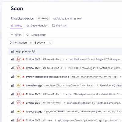
Introducing Webhook Events for Pull Request Scans
Add real-time Socket webhook events to your workflows to automatically receive pull request scan results and security alerts in real time.
By Jeppe Hasseriis - Oct 22, 2025
react-user-guide
Advanced tools

npm install --save react-user-guide
import React, { Component } from 'react';
import UserGuide from 'react-user-guide';

const style = {
  width: '20vw',
  backgroundColor: 'grey',
  marginTop: '20vh',
  marginLeft: '40vw',
  padding: 5
};

const buttonConfig = {
  yesText: 'Yes',
  noText: 'No',
  nextText: 'Next',
  skipText: 'Skip',
  finishText: 'Finish'
};

const guides = [
  {
    querySelector: '.unique-classname',
    position: 'east',
    title: 'First',
    message: 'User guide position \'east\''
  },
  {
    querySelector: '.unique-classname',
    position: 'west',
    title: 'Second',
    message: 'User guide position \'west\''
  },
  {
    querySelector: '.unique-classname',
    position: 'north',
    title: 'Third',
    message: 'User guide position \'north\''
  },
  {
    querySelector: '.unique-classname',
    tooltipWidth: 500,
    position: 'south',
    title: 'Forth',
    message: 'User guide position \'south\', with custom width'
  }
];

export default class App extends Component {
  render () {
    return (
      <UserGuide buttonConfig={buttonConfig} guides={guides}>
        <div style={style} className="unique-classname">Target element</div>
      </UserGuide>
    )
  }
}
@import '~react-user-guide/dist/custom-style.css';
// Style modal
.userGuide--modal {
  h1 {

  }

  p {

  }

  button {

  }
}

// Style mask
.userGuide--mask {

}

// Style tooltip
.userGuide--message {
  h3 {

  }

  p {

  }

  button {

  }
}
https://sandeshshrestha.github.io/react-user-guide/
Click here if images didn't load


MIT © sandeshshrestha
FAQs
React User Guide
We found that react-user-guide demonstrated a not healthy version release cadence and project activity because the last version was released a year ago. It has 1 open source maintainer collaborating on the project.
Did you know?

Socket for GitHub automatically highlights issues in each pull request and monitors the health of all your open source dependencies. Discover the contents of your packages and block harmful activity before you install or update your dependencies.
Product
Add real-time Socket webhook events to your workflows to automatically receive pull request scan results and security alerts in real time.

Research
The Socket Threat Research Team uncovered malicious NuGet packages typosquatting the popular Nethereum project to steal wallet keys.
Product
A single platform for static analysis, secrets detection, container scanning, and CVE checks—built on trusted open source tools, ready to run out of the box.