Product
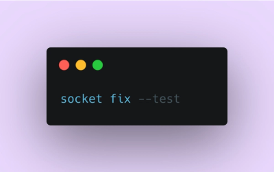
Introducing Socket Fix for Safe, Automated Dependency Upgrades
Automatically fix and test dependency updates with socket fix—a new CLI tool that turns CVE alerts into safe, automated upgrades.
By John-David Dalton - Apr 25, 2025
react-vis
Advanced tools


A collection of react components to render common data visualization charts, such as line/area/bar charts, heat maps, scatteplots, pie and donut charts, tables with fixed headers and tree maps.
Some notable features:
react-vis doesn't require any deep knowledge of data visualization libraries to start building your first visualizations.react-vis provides a set of basic building blocks for different charts. For instance, separate X and Y axis components. This provides a high level of control of chart layout for applications that need it.react-vis supports the React's lifecycle and doesn't create unnecessary nodes.Install react-vis via npm.
npm install react-vis --save
Include the built main CSS file in your HTML page or via SASS:
@import "./node_modules/react-vis/main";
You can also select only the styles you want to use. This helps minimize the size of the outputted CSS. Here's an example of importing only the legends styles:
@import "./node_modules/react-vis/dist/styles/legends";
Import the necessary components from the library...
import {XYPlot, XAxis, YAxis, HorizontalGridLines, LineSeries} from 'react-vis';
… and add the following code to your render function:
<XYPlot
  width={300}
  height={300}>
  <HorizontalGridLines />
  <LineSeries
    data={[
      {x: 1, y: 10},
      {x: 2, y: 5},
      {x: 3, y: 15}
    ]}/>
  <XAxis />
  <YAxis />
</XYPlot>
Take a look at the folder with examples or check out some docs:
To develop on this component, install the dependencies and then build and watch the static files:
npm install && npm run watch
Once complete, you can view the component's example in your browser (will open automatically). Any changes you make to the example code will run the compiler to build the files again.
To lint your code, run the tests, and create code coverage reports:
npm test
v0.10.1
In this release we release a new chart type, a large repo refactor, address a variety of bugs, and a host of additional features!
New Chart: Type: Sankey Diagram: this chart type allows users visualize data flows and transfers. We are initially releasing this chart in alpha, so that we can gather feedback, and iterate to make the best chart that we can! Check out the docs here here!
Bug Fix: Fix numerous bugs on the radial plot, including mouse interaction issues, incorrect domains, and props falling out of sync
Refactor: We reorganized the way that we are keeping/organizing our repo, installed yarn, added webpack for the examples. (Pro tip, if you are having trouble running the examples after upgrading rm -rf your dist)
Feature: Allow custom crosshair orientation
Feature: Added interaction listeners for the tree map
FAQs
Data visualization library based on React and d3.
The npm package react-vis receives a total of 54,652 weekly downloads. As such, react-vis popularity was classified as popular.
We found that react-vis demonstrated a not healthy version release cadence and project activity because the last version was released a year ago. It has 5 open source maintainers collaborating on the project.
Did you know?

Socket for GitHub automatically highlights issues in each pull request and monitors the health of all your open source dependencies. Discover the contents of your packages and block harmful activity before you install or update your dependencies.
Product
Automatically fix and test dependency updates with socket fix—a new CLI tool that turns CVE alerts into safe, automated upgrades.

Security News
CISA denies CVE funding issues amid backlash over a new CVE foundation formed by board members, raising concerns about transparency and program governance.
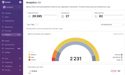
Product
We’re excited to announce a powerful new capability in Socket: historical data and enhanced analytics.