
Security News
Crates.io Implements Trusted Publishing Support
Crates.io adds Trusted Publishing support, enabling secure GitHub Actions-based crate releases without long-lived API tokens.
By Sarah Gooding - Jul 16, 2025
reactjs-bottom-navigation
Advanced tools
React bottom navigation component
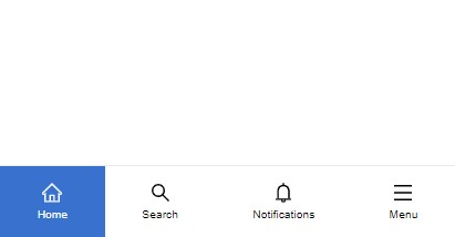
"ReactJS Bottom Navigation" is a lightweight and flexible component that provides a customizable bottom navigation experience for your React applications. This component has been fully re-implemented in TypeScript in version 2, providing a more robust and type-safe development experience. With a range of options to customize it.
npm install --save reactjs-bottom-navigation
| Props | Type | default | description |
|---|---|---|---|
| items | BottomNavigationItem[] | - | The array of items to display in the navigation |
| selected | number | null | (optional) The index of the currently selected item, used for setting a default active item and/or controlling active state manually |
| onItemClick | function | - | (optional)triggers when an item is clicked and it returns the item |
| activeBgColor | string | - | (optional) custom active background color code |
| activeTextColor | string | black | custom active text color code |
all item properties are optional, if no property is provided the item will take space and it will be empty
| Prop | Type | description |
|---|---|---|
| title | string | (optional) item title |
| icon | JSX.Element | (optional) item icon |
| activeIcon | JSX.Element | (optional) item active icon |
| onClick | function | (optional) triggers when the item is clicked and it returns the item |
| render | ({ isActive: boolean; id: number }) => JSX.Element | (optional) will replace title and icons if provided, used for rendering custom content inside bottom navigation items |
To use the component, you need to provide an array of "items" which represent the individual navigation options in the bottom navigation bar. Each item can have a "title", an "icon", or both. You can also provide a custom rendering function to create your own content for the item.
Example:
import  React  from  "react";
import { BottomNavigation } from  "reactjs-bottom-navigation";

function  App() {

const  bottomNavItems = [
	{
		title:  "Home",
		onClick: ({ id }) =>  alert("menu clicked " + id),
		icon: <HomeIcon />, // just for example
		activeIcon: <HomeIcon color="#fff" />
	},

	// items can have either title, icon or both or neither!
	{
	},
	{
		title:  "Search",
	},
	// the render method enables custom item content
	{
		render: ({ isActive, id }) =>  isActive ? <strong>{id}</strong> : <span>{id}</span>,
	},
];


return (
<div>
	<BottomNavigation
		items={bottomNavItems}
		selected={0}
		onItemClick={(item) =>  console.log(item)}
		activeBgColor="slateBlue"
		activeTextColor="white"
	/>
</div>
);

}


export  default  App;
the component elements have the following class names which you can assign new styles to them:
Bottom Navigation: bottom-nav Items: bottom-nav-item titles: bottom-nav-item–title you can also use "activeBgColor" and "activeTextColor" props and the item render method
MIT © hoseinhamzei
FAQs
Did you know?

Socket for GitHub automatically highlights issues in each pull request and monitors the health of all your open source dependencies. Discover the contents of your packages and block harmful activity before you install or update your dependencies.
Security News
Crates.io adds Trusted Publishing support, enabling secure GitHub Actions-based crate releases without long-lived API tokens.

Research
/Security News
Undocumented protestware found in 28 npm packages disrupts UI for Russian-language users visiting Russian and Belarusian domains.

Research
/Security News
North Korean threat actors deploy 67 malicious npm packages using the newly discovered XORIndex malware loader.